


As more and more people start using their mobiles to browse the web, it is more important than ever to make sure that your website is mobile friendly.
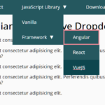
This is a modern, mobile-friendly navigation system that enables a hamburger button to expand and collapse a dropdown menu with smooth slide animations. Have fun with it.
Written entirely in plain JavaScript, HTML, and CSS. No third-party frameworks or libraries are needed.
How to use it:
1. Code the HTML for the dropdown menu.
<div class="navigation">
  <div class="userBx">
    <div class="imgBx">
      <img src="user.jpg" alt="user avatar" />
    </div>
    <p class="username">CSSScript</p>
  </div>
  <div class="menuToggle"></div>
  <ul class="menu">
    <li>
      <a href="#">Profile</a>
    </li>
    <li>
      <a href="#">Message</a
      >
    </li>
    <li>
      <a href="#">Notification</a
      >
    </li>
    <li>
      <a href="#">Settings</a>
    </li>
    <li>
      <a href="#">Help</a
      >
    </li>
    <li>
      <a href="#">Logout</a>
    </li>
  </ul>
</div>
2. The necessary CSS styles for the dropdown menu.
.navigation {
  position: fixed;
  top: 20px;
  right: 20px;
  width: 120px;
  height: 60px;
  background: #fff;
  box-shadow: 0 25px 35px rgba(0, 0, 0, 0.1);
  display: flex;
  justify-content: space-between;
  transition: height 0.5s, width 0.5s;
  transition-delay: 0s, 0.75s;
  overflow: hidden;
}
.navigation.active {
  width: 300px;
  height: 400px;
  transition: width 0.5s, height 0.5s;
  transition-delay: 0s, 0.75s;
}
.navigation .userBx {
  position: relative;
  width: 60px;
  height: 60px;
  background: #fff;
  display: flex;
  align-items: center;
  overflow: hidden;
  transition: 0.5s;
  transition-delay: 0.5s;
}
.navigation.active .userBx {
  width: calc(100% - 60px);
  transition-delay: 0s;
}
.navigation .userBx .username {
  white-space: nowrap;
  color: #555;
  font-size: 1.1em;
}
.navigation .userBx .imgBx {
  position: relative;
  min-width: 60px;
  height: 60px;
  overflow: hidden;
  background: #000;
  border-radius: 50%;
  border: 10px solid #fff;
}
.navigation .userBx .imgBx img {
  position: absolute;
  top: 0;
  left: 0;
  width: 100%;
  height: 100%;
  object-fit: cover;
}
.menu {
  position: absolute;
  width: 100%;
  height: calc(100% - 60px);
  margin-top: 60px;
  padding: 20px;
  border-top: 1px solid rgba(0, 0, 0, 0.1);
}
.menu li {
  list-style: none;
}
.menu li a {
  display: flex;
  align-items: center;
  gap: 10px;
  margin: 20px 0;
  font-size: 1em;
  text-decoration: none;
  color: #555;
}
.menu li a:hover {
  color: #4e65ff;
}
.menu li a ion-icon {
  font-size: 1.5em;
}
3. Apply CSS styles to the hamburger toggle button.
.navigation .menuToggle {
  position: relative;
  width: 60px;
  height: 60px;
  background: #fff;
  cursor: pointer;
  display: flex;
  justify-content: center;
  align-items: center;
}
.navigation .menuToggle::before {
  content: "";
  position: absolute;
  width: 32px;
  height: 2px;
  background: #555;
  transform: translateY(-10px);
  box-shadow: 0 10px #555;
  transition: 0.5s;
}
.navigation .menuToggle::after {
  content: "";
  position: absolute;
  width: 32px;
  height: 2px;
  background: #555;
  transform: translateY(10px);
  transition: 0.5s;
}
.navigation.active .menuToggle::before {
  transform: translateY(0px) rotate(45deg);
  box-shadow: 0 0 #555;
}
.navigation.active .menuToggle::after {
  transform: translateY(0px) rotate(-45deg);
}
4. The required JavaScript to toggle CSS classes based on the menu state.
let menuToggle = document.querySelector(".menuToggle");
let navigation = document.querySelector(".navigation");
menuToggle.onclick = function () {
  navigation.classList.toggle("active");
};
See Also:
 WCAG Compliant Responsive Dropdown Navigation – accessible-menu
 Accessible Dropdown Nav With Vanilla JavaScript – Clicky Menus
 Customizable Context Menus and Dropdowns With Vanilla JS – Tiny Popup Menu
 Responsive Accessible Dropdown Menu Template with Vanilla JavaScript
 Modern Multi-level DropDown Menu – Droppy
 Responsive Dropdown/Off-canvas Navigation In Vanilla JavaScript – Menue
 Accessible Dropdown Menu With Smooth JavaScript Animations
 Responsive Sliding Hamburge Menu System