


gModal is a multifunctional modal library used to create responsive, fully configurable alert, confirm, and prompt modals in an easy way.
More features:
- Custom OK, Confirm, Cancel buttons.
- Allows you to bind any keys to action buttons.
- Supports HTML content in the modal body.
- Auto destroys the modal after closed.
How to use it:
1. Add references to the gModal’s JavaScript and CSS files.
<link href="dist/gModal.min.css" rel="stylesheet" />
<script src="dist/gModal.min.js"></script>
2. Create a basic modal popup and override the default modal title & content.
var basicDemo = new gModal({
title: 'Modal Title Here',
body: 'Modal Body Here. Also Supports <strong>html</strong> Content.',
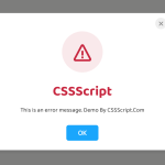
})3. Create an alert dialog with custom action buttons.
var alertDemo = new gModal({
    title: 'Modal Title Here',
    body: 'Modal Body Here. Also Supports <strong>html</strong> Content.',
    buttons: [
      {
        content: "OK",
        classes: "gmodal-button-blue", // or red, green, grey
        bindKey: 13, /* Enter */
        callback: function(modal){
          console.log("You just accepted the Alert Modal");
          modal.hide();
        }
      }
    ],
    close: {
      callback: function(modal){
        console.log("You just closed the Alert Modal");
        modal.hide();
      }
    }
})
4. Create a confirm dialog with Confirm and Cancel buttons.
var confirmDemo = new gModal({
    buttons: [
      {
        content: "Cancel",
        classes: "gmodal-button-red",
        bindKey: false, /* no key! */
        callback: function(modal){
          console.log("You have said NO!!!!");
          console.warn("Getting your ip...");
          console.warn("Blacklisting your ip...");
          console.error("Successfully blacklisted.");
          modal.hide();
        }
      },{
        content: "Confirm",
        classes: "gmodal-button-green",
        bindKey: false, /* no key! */
        callback: function(modal){
          console.log("We love you too <3!");
          modal.hide();
        }
      }
    ],
    close: {
      closable: false,
    }
})
5. Create a prompt dialog.
var confirmDemo = new gModal({
    title: "Let's know you better",
    body: "<center><p>What is your name?</p><input type='text' id='name'></center>",
    buttons: [{
      content: "Continue",
      classes: "gmodal-button-blue",
      bindKey: 13, /* Enter */
      callback: function(modal){
        var name = document.getElementById("name").value;
        name = name == "" ? "Mr. Unnamed" : name;
        console.log("Welcome home "+ name);
        modal.hide();
      }
    }],
    close: {
      closable: false,
    }
})
6. Show the modal when needed.
instance.show();
7. All default configuration options and callback functions.
title: 'Default gModal title',
body:
  'This is the default body. It can include <strong>html</strong>. ' +
  'You can also leave it empty so we will hide it :).',
buttons: [
  /* No buttons by default */
],
close: {
  closable: true,
  location: 'in',
  bindKey: 27,
  callback: function(modal) {
    modal.hide();
  }
},
// callbacks
onShow: function(modal) {},
onHide: function(modal) {
  modal.destroy();
},
onCreate: function(modal) {},
onDestroy: function(modal) {}
Changelog:
v2.2.0 (08/01/2020)
- Added support for Javascript DOM API both in body and title parameters.
See Also:
 Create Custom Stylish Dialogs with SnapDialog JavaScript Library
 Create iOS-Style Popups & Notifications With Popup JS Library
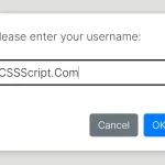 Async, Promise-based Alert/Confirm/Prompt Dialogs – Prompts.js
 Custom Alert/Confirm/Prompt Dialogs to Replace Native Popups – SWN.js
 JavaScript Wrapper For Bootstrap 5 Modals – Modbox
 Create & Manage Bootstrap 5 Modals Using use-bootstrap-dialog JS Library
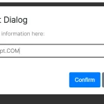 Beautiful & Functional Custom Dialogs In JavaScript – Dialog-JS
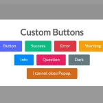 Build Interactive Customizable Popups And Alerts with AsPopup.js