


The SenangWebs Notices (SWN) JavaScript library transforms native alert, confirm, and prompt dialogs into modern, customizable popup boxes that match your website’s design.
Key Features:
- Flexible Positioning: Control dialog location on the screen.
- Backdrop Effects: Add blur and custom overlay colors.
- Templating: Style dialogs with your own HTML and CSS.
- Asynchronous Operations: Use promises for clean code handling.
- Accessibility: Built-in focus management.
- Direct Replacement: Option to completely override native alert, confirm, and prompt functions.
- No Dependencies: Lightweight and easy to implement.
How to use it:
1. Install & download via NPM.
# NPM
$ npm install senangwebs-notices
2. Add the SWN script to your web page:
<script src="/path/to/dist/swn.js"></script>
3. Initialize the SWN instance with your desired options:
const myDialog = new SWN({
  titleText: 'Notice',
  buttonText: 'OK',
  cancelText: 'Cancel',
  template: null, // Template selector
  position: 'center', // center, top, top left, top right, bottom, bottom left, bottom right, left, right
  bgColor: '#000000',
  bgOpacity: 0.5,
  bgBlur: 0, // blur in px
  zIndex: 9999,
  inputPlaceholder: 'Enter your response...',
  defaultValue: ''
});
4. Now, you can create alert, confirm, and prompt dialogs using async/await syntax:
// alert
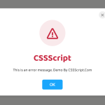
await myDialog.show('CSSScript.com!');
// confirm dialog
const confirmed = await myDialog.showConfirm('Are you sure?');
// prompt box
const email = await myDialog.showPrompt('Enter your email:');5. You can also directly replace the native alert(), confirm(), and prompt() methods with SWN like this:
// Replace native alert/confirm/prompt
myDialog.install();
// myDialog.uninstall();
// Use the native functions after installation
alert('CSSScript.com!');
const confirmed = await confirm('Are you sure?');
const email = await prompt('Enter your Email:', '[email protected]');
6. Use the following HTML data attributes to customize the dialog’s template with your CSS or 3rd-party frameworks like Bootstrap or Tailwind CSS.
- data-swn: Targets the main dialog container.
- data-swn-title: Targets the title container within the dialog.
- data-swn-body: Targets the message body container.
- data-swn-buttons: Targets the container holding the dialog buttons.
- data-swn-ok: Targets the “OK” button.
- data-swn-cancel: Targets the “Cancel” button (used in confirm and prompt dialogs).
- data-swn-input: Targets the input field (used in prompt dialogs).
<!-- Alert Template -->
<template id="alert-template">
  <div data-swn class="grid border-neutral-200 border-2 rounded-xl bg-white w-full min-w-[300px] max-w-[600px]">
    <div data-swn-title class="py-2 px-4 border-b border-neutral-200 flex justify-between items-center text-base lg:text-lg capitalize font-bold m-0"></div>
    <div data-swn-body class="py-2 px-4"></div>
    <div data-swn-buttons class="py-2 px-4 border-t border-neutral-200 flex justify-end gap-2">
      <button data-swn-ok class="bg-teal-600 text-white rounded-lg text-base font-semibold px-4 w-full lg:max-w-max h-10 flex items-center justify-center hover:opacity-80"></button>
    </div>
  </div>
</template>
<!-- Confirm Template -->
<template id="confirm-template">
<div data-swn class="grid border-neutral-200 border-2 rounded-xl bg-white w-full min-w-[300px] max-w-[600px]">
<div data-swn-title class="py-2 px-4 border-b border-neutral-200 flex justify-between items-center text-base lg:text-lg capitalize font-bold m-0"></div>
<div data-swn-body class="py-2 px-4"></div>
<div data-swn-buttons class="py-2 px-4 border-t border-neutral-200 flex justify-end gap-2">
<button data-swn-cancel class="border-teal-600 border-2 text-teal-600 rounded-lg text-base font-semibold px-4 w-full lg:max-w-max h-10 flex items-center justify-center hover:opacity-80"></button>
<button data-swn-ok class="bg-teal-600 text-white rounded-lg text-base font-semibold px-4 w-full lg:max-w-max h-10 flex items-center justify-center hover:opacity-80"></button>
</div>
</div>
</template><!-- Prompt Template -->
<template id="prompt-template">
<div data-swn class="grid border-neutral-200 border-2 rounded-xl bg-white w-full min-w-[300px] max-w-[600px]">
<div data-swn-title class="py-2 px-4 border-b border-neutral-200 flex justify-between items-center text-base lg:text-lg capitalize font-bold m-0"></div>
<div data-swn-body class="py-2 px-4">
</div>
<input type="text" data-swn-input class="h-10 px-3 border-neutral-200 border-2 rounded-lg text-base mx-4 mb-2">
<div data-swn-buttons class="py-2 px-4 border-t border-neutral-200 flex justify-end gap-2">
<button data-swn-cancel class="border-teal-600 border-2 text-teal-600 rounded-lg text-base font-semibold px-4 w-full lg:max-w-max h-10 flex items-center justify-center hover:opacity-80"></button>
<button data-swn-ok class="bg-teal-600 text-white rounded-lg text-base font-semibold px-4 w-full lg:max-w-max h-10 flex items-center justify-center hover:opacity-80"></button>
</div>
</div>
</template>const notices = new SWN({
template: '#alert-template', // 'confirm-template', 'prompt-template'
});See Also:
 Create Custom Stylish Dialogs with SnapDialog JavaScript Library
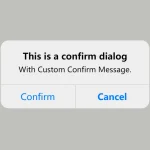 Create iOS-Style Popups & Notifications With Popup JS Library
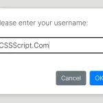 Async, Promise-based Alert/Confirm/Prompt Dialogs – Prompts.js
 JavaScript Wrapper For Bootstrap 5 Modals – Modbox
 Create & Manage Bootstrap 5 Modals Using use-bootstrap-dialog JS Library
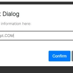 Beautiful & Functional Custom Dialogs In JavaScript – Dialog-JS
 Build Interactive Customizable Popups And Alerts with AsPopup.js
 Lightweight Customizable Modal and Alert Library – SilverBox.js