


Multi-Checkbox is a web component that takes a list of options and converts them into a multi-select dropdown.
Users can select single or multiple options from the dropdown by checking the checkboxes.
Built on top of Custom Element and easy to implement.
How to use it:
1. Import the multi-checkbox.js library as a module.
<script type="module" src="./multi-checkbox.js"></script>
2. Add the multi-checkbox component to the page. Available props:
- separator: Custom character to used between selected options
- value: Default value on page load
<multi-checkbox separator="," value="">
  ...
</multi-checkbox>
3. Add a list of options to the multi-checkbox component.
<multi-checkbox separator="," value="">
  <ul slot="check-values">
    <li>CSS</li>
    <li>Script</li>
    <li>Com</li>
  </ul>
</multi-checkbox>
4. Customize the multi-checkbox component by overriding the default CSS variables.
multi-checkbox {
  /* Element */
  --mc-border: 1px solid #000000;
  --mc-border-radius: 2px;
  --mc-display: inline-block;
  --mc-font: 400 0.9em Arial;
  --mc-vertical-align: middle;
  /* Dropdown */
  --mc-dropdown-background: #efefef;
  --mc-dropdown-box-shadow: 3px 3px 5px 1px rgba(0,0,0,0.35);
  --mc-dropdown-width: 209px;
  /* Input */
  --mc-target-background: #efefef;
  --mc-target-color: #000000;
  --mc-target-cursor: default;
  --mc-target-height: 28px;
  --mc-target-margin: 0;
  --mc-target-max-height: default;
  --mc-target-min-height: default;
  --mc-target-max-width: default;
  --mc-target-min-width: default;
  --mc-target-padding: 0px 0px 0px 3px;
  --mc-target-outline: none;
  --mc-target-width: 175px;
  /* Dropdown Line Items */
  --mc-dropdown-color: #000000;
  --mc-dropdown-line-height: 2em;
  --mc-ul-margin: 5px;
  --mc-ul-padding: 0;
  /* Toggle Button */
  --mc-toggle-button-background: #ffffff;
  --mc-toggle-button-color: #000000;
  --mc-toggle-button-cursor: pointer;
  --mc-toggle-button-height: 30px;
  --mc-toggle-button-outline: none;
  --mc-toggle-button-width: 30px;
  /* Close Button */
  --mc-close-button-background: #efefef;
  --mc-close-button-border: none;
  --mc-close-button-border-radius: default;
  --mc-close-button-color: #000000;
  --mc-close-button-cursor: pointer;
  --mc-close-button-display: block;
  --mc-close-button-height: 30px;
  --mc-close-button-margin: 5px auto;
  --mc-close-button-outline: none;
  --mc-close-button-width: 30px;
}
Changelog:
v0.1.11 (02/08/2023)
- Update
v0.1.10 (02/06/2023)
- Fixed text measuring bug.
See Also:
 Multi-select Dropdown Component For JavaScript – slim-select
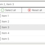 Feature-rich Custom Select JavaScript Library – SimpSelect
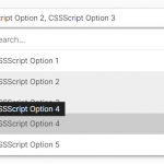 High Performance Select Box with Virtual Scroll (Vanilla JS) – Virtual Select
 Customizable Select Box & Input Field Enhancement Library – Choices.js
 Tagging & Searchable Dropdown with Multi-Select – Searchdown.js
 Multi-Select Box With Tree Structured Data Dropdown List – Treeselect
 Select Multiple Elements With Mouse Drag & Touch Gestures – Selectables
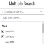 Powerful Single & Multiple Select Library – tail.select