


| Author: | markReo-code |
|---|---|
| Views Total: | 0 views |
| Official Page: | Go to website |
| Last Update: | April 8, 2025 |
| License: | MIT |
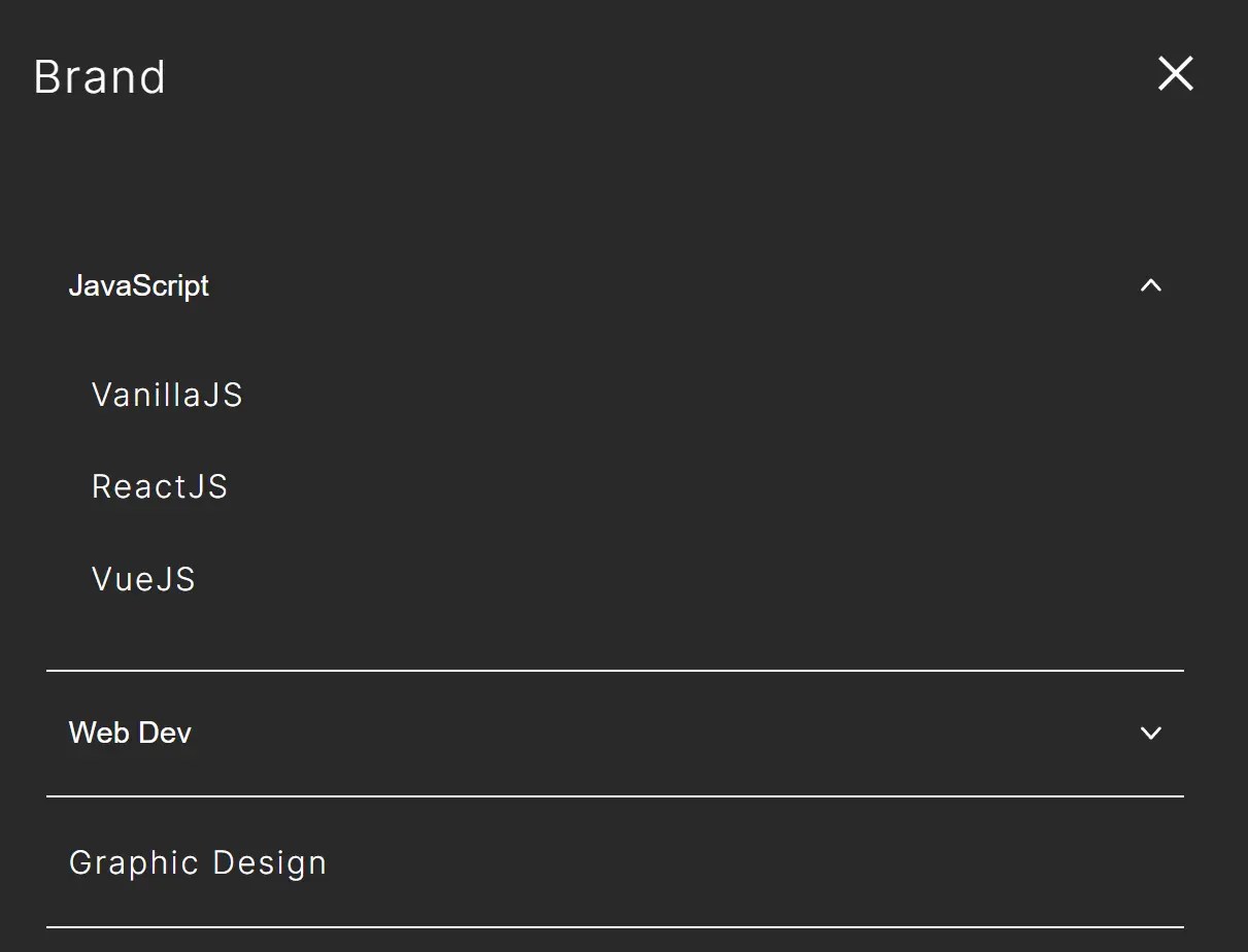
Preview:
Description:
dropdown-menu-accessible is a minimalist, responsive, accessible navigation system implemented in vanilla JavaScript.
It focuses on a navigation layout enhanced with dropdown menus that support accessibility through appropriate ARIA attributes and focus trapping.
You can use it as a template for websites that require accessible, mobile-friendly menu navigation.
Features:
- Responsive design with hamburger menu for mobile (under 768px)
- Dropdown navigation that works consistently across desktop and mobile
- Accessibility-focused with aria attributes (aria-expanded, aria-hidden, aria-label)
- Focus trapping with Tab/Shift+Tab
- ESC key support for closing navigation
- Built with pure vanilla JavaScript (no dependencies)
- Uses grid-template-rows for smooth open/close animations
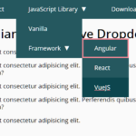
See It In Action:
How to use it:
1. Add the following HTML markup to your web project:
- A
<header>containing everything. - A main navigation container (
.gnav.js-gnav) which holds the list (.gnav__list). - List items (
.gnav__item). Items with dropdowns contain a<button class="gnav__btn js-nav-toggle">and a sibling<div class="gnav__panel js-gnav-panel">. The button needsaria-controlspointing to the panel’sid, andaria-expanded. The panel needsaria-hiddenand a matchingid. - Items without dropdowns are simple anchor links (
<a class="gnav__link">). - A hamburger button (
.hamburger.js-global-btn) outside the main.gnavcontainer, also usingaria-controls(pointing to the.gnavID) andaria-expanded.
<header class="header">
  <div class="header__inner">
    <div class="header__logo">
      <a href="/">Brand Logo</a>
    </div>
    <!-- Main Navigation Container -->
    <div class="gnav js-gnav" id="gnav">
      <nav class="gnav__wrapper">
        <ul class="gnav__list">
            <!-- Item with Dropdown -->
          <li class="gnav__item">
            <button class="gnav__btn js-nav-toggle" aria-controls="gnav-panel-1" aria-expanded="false" aria-label="Item 1" type="button">
              <!-- label & arrow svg -->
            </button>
            <div class="gnav__panel js-gnav-panel" aria-hidden="true" id="gnav-panel-1">
               <!-- sublist links -->
            </div>
          </li>
          <!-- Item without Dropdown -->
          <li class="gnav__item">
            <a href="" class="gnav__link">
              <span class="gnav__label">Item 2</span>
            </a>
          </li>
          <!-- other items -->
        </ul>
      </nav>
    </div>
    <!-- Hamburger Toggle Button -->
    <button class="hamburger js-global-btn" aria-controls="gnav" aria-label="Open Menu" aria-expanded="false" type="button">
      <!-- span lines for icon  -->
    </button>
  </div>
</header>
2. The necessary CSS rules:
- Uses a mobile-first approach (implicitly, via
max-widthmedia queries). - The core responsiveness is handled by
@media screen and (max-width: 768px). Below this, the.gnavbecomes aposition: fixedoverlay, and the.hamburgerbutton is displayed. - The
.is-openclass onbodytriggers the mobile menu visibility. - The
.is-activeclass on.gnav__paneltriggers the dropdown visibility. - The
grid-template-rows: 0fr;togrid-template-rows: 1fr;transition on.gnav__panel(when.is-activeis added) creates the animated dropdown effect.
* {
  margin: 0;
  padding: 0;
  box-sizing: border-box;
}
html {
  font-size: 62.5%;
}
body {
  font-family: "Inter", sans-serif;
  color: #333333;
  font-size: 14px;
  letter-spacing: 0.08em;
}
ul {
  list-style: none;
}
button {
  background: transparent;
  border: none;
  cursor: pointer;
}
a {
  text-decoration: none;
  background-color: transparent;
  color: #000000;
}
img {
  width: 100%;
  max-width: 100%;
  height: auto;
  vertical-align: middle;
}
/* =================================
               header
================================= */
.header {
  border-bottom: 1px solid #292929;
}
.header__inner {
  width: 100%;
  max-width: 1200px;
  margin: 0 auto;
  display: flex;
  align-items: center;
  justify-content: space-between;
  padding: 0 3.5vw;
}
@media screen and (max-width: 768px) {
  .header__inner {
    padding: 15px 24px;
  }
}
.header__logo {
  font-size: 20px;
  z-index: 60;
}
.is-open .header__logo a {
  color: #ffffff;
}
.header__logo a:focus-visible {
  outline-offset: 2px;
  outline: 2px solid #000;
}
.is-open .header__logo a:focus-visible {
  outline-offset: 2px;
  outline: 2px solid #ffffff;
}
@media screen and (max-width: 768px) {
  .gnav {
    position: fixed;
    top: 0;
    left: 0;
    width: 100%;
    height: 100vh;
    background-color: #292929;
    padding: 30px;
    display: flex;
    justify-content: center;
    z-index: 50;
    visibility: hidden;
    opacity: 0;
    transition: opacity 0.4s ease, visibility 0.4s;
    pointer-events: none;
  }
}
.is-open .gnav {
  visibility: visible;
  opacity: 1;
  pointer-events: auto;
}
@media screen and (max-width: 768px) {
  .gnav__wrapper {
    width: 100%;
    margin-top: 70px;
  }
}
.gnav__list {
  display: flex;
  align-items: center;
  column-gap: 24px;
}
@media screen and (max-width: 1024px) {
  .gnav__list {
    column-gap: 5px;
  }
}
@media screen and (max-width: 768px) {
  .gnav__list {
    flex-direction: column;
    column-gap: 0;
  }
}
.gnav__panel {
  width: max-content;
  display: grid;
  grid-template-rows: 0fr;
  transition: grid-template-rows 0.2s ease-out;
  position: absolute;
  top: 100%;
  left: 50%;
  transform: translateX(-50%);
  border: 1px solid #292929;
  border-top: none;
  visibility: hidden;
}
@media screen and (max-width: 768px) {
  .gnav__panel {
    width: 100%;
    border: none;
    position: static;
    transform: translateX(0);
  }
}
.is-active.gnav__panel {
  grid-template-rows: 1fr;
  visibility: visible;
}
.gnav__subList {
  padding: 10px;
}
@media screen and (max-width: 768px) {
  .gnav__subList {
    padding: 0 0 20px 0;
  }
}
.gnav__item {
  position: relative;
  font-size: 14px;
}
@media screen and (max-width: 768px) {
  .gnav__item {
    width: 100%;
    border-bottom: 1px solid #ffffff;
  }
}
.gnav__btn {
  padding: 20px;
  display: flex;
  align-items: center;
  gap: 12px;
}
@media screen and (max-width: 768px) {
  .gnav__btn {
    width: 100%;
    padding: 20px 10px;
    justify-content: space-between;
  }
}
.gnav__label {
  background: linear-gradient(#000000, #000000) 100% 100%/0 1px no-repeat;
  transition: background-size 0.3s ease;
}
@media screen and (max-width: 768px) {
  .gnav__label {
    color: #ffffff;
  }
}
.gnav__arrow {
  display: block;
  width: 10px;
  height: 6px;
}
@media screen and (max-width: 768px) {
  .gnav__arrow {
    color: #ffffff;
  }
}
.gnav__btn[aria-expanded=true] .gnav__arrow {
  transform: rotate(-180deg);
}
.gnav__link {
  display: block;
  font-size: 14px;
  padding: 20px;
}
@media screen and (max-width: 768px) {
  .gnav__link {
    width: 100%;
    padding: 20px 10px;
    display: block;
  }
}
.gnav__panel .gnav__link {
  padding: 14px 20px;
  text-align: left;
}
@media screen and (max-width: 768px) {
  .gnav__panel .gnav__link {
    color: #ffffff;
    text-align: left;
    padding: 12px 20px;
  }
}
.gnav__panelInner {
  overflow: hidden;
}
.hamburger {
  display: none;
}
@media screen and (max-width: 768px) {
  .hamburger {
    display: flex;
    align-items: center;
    justify-content: center;
    width: 40px;
    height: 40px;
    cursor: pointer;
    position: relative;
    right: -10px;
    z-index: 60;
  }
}
.hamburger__wrap {
  width: 20px;
  height: 5px;
  position: absolute;
}
.hamburger__line {
  display: block;
  width: 20px;
  height: 2px;
  background-color: #111111;
  position: absolute;
  transition: transform 0.15s cubic-bezier(0.215, 0.61, 0.355, 1);
}
.hamburger__line:nth-child(1) {
  top: -4px;
}
.hamburger__line:nth-child(2) {
  top: 4px;
}
.is-open .hamburger__line:nth-child(1) {
  top: 0;
  background-color: #ffffff;
  transform: rotate(-45deg);
}
.is-open .hamburger__line:nth-child(2) {
  top: 0;
  background-color: #ffffff;
  transform: rotate(45deg);
}
.site-content {
  width: 100%;
  height: 100vh;
}
@media (hover: hover) and (pointer: fine) {
  .gnav__label:hover {
    background-size: 100% 1px;
    background-position: 0 100%;
  }
}/*# sourceMappingURL=style.css.map */(pointer: fine) {
  .gnav__label:hover {
    background-size: 100% 1px;
    background-position: 0 100%;
  }
}
3. The main JavaScript that handles toggling menu states, managing focus, closing menus with Escape, and resetting dropdown states. Make sure it runs after the DOM is loaded.
const body = document.body;
const globalBtn = document.querySelector(".js-global-btn");
const globalMenu = document.querySelector(".js-gnav");
const dropdownToggles = document.querySelectorAll(".js-nav-toggle");
const dropdownPanels = document.querySelectorAll(".js-gnav-panel");
const resetDropdowns = () => {
  dropdownPanels.forEach((panel) => {
    panel.classList.remove("is-active");
    panel.setAttribute("aria-hidden", "true");
  });
  dropdownToggles.forEach((btn) => {
    btn.setAttribute("aria-expanded", "false");
  });
};
globalBtn.addEventListener("click", () => {
  const isOpen = body.classList.toggle("is-open");
  globalBtn.setAttribute("aria-label", isOpen ? "Close Menu" : "Open Menu");
  globalBtn.setAttribute("aria-expanded", isOpen ? "true" : "false")
  if (isOpen) {
    const firstItem = globalMenu.querySelector(".gnav__item")
    const firstFocusable = firstItem?.querySelector(
      'a[href], button:not([disabled]), [tabindex]:not([tabindex="-1"])'
    );
    firstFocusable?.focus();
  }
});
body.addEventListener("click", (e) => {
  const targetNavItem = e.target.closest(".gnav__item");
  if (!targetNavItem) {
    resetDropdowns();
  }
});
dropdownToggles.forEach((toggle) => {
  toggle.addEventListener("click", () => {
    const panel = toggle.nextElementSibling;
    const isActive = panel.classList.contains("is-active");
    resetDropdowns();
    if (!isActive) {
      panel.classList.add("is-active");
      panel.setAttribute("aria-hidden", "false");
      toggle.setAttribute("aria-expanded", "true");
    }
  });
});
document.addEventListener("keydown", (e) => {
  if (e.key === "Escape" && body.classList.contains("is-open")) {
    body.classList.remove("is-open");
    resetDropdowns();
  }
});
document.addEventListener("keydown", (e) => {
  if (!body.classList.contains("is-open")) return;
  if (e.key !== "Tab") return;
  const trapArea = document.querySelector(".header__inner");
  const focusableEls = trapArea.querySelectorAll(
    'a[href], button:not([disabled]), [tabindex]:not([tabindex="-1"])'
  );
  const firstEl = focusableEls[0];
  const lastEl = focusableEls[focusableEls.length - 1];
  if (e.shiftKey && document.activeElement === firstEl) {
    e.preventDefault()
    lastEl.focus();
  }
  if (!e.shiftKey && document.activeElement === lastEl) {
    e.preventDefault();
    firstEl.focus();
  }
});
FAQs
Q: Can I customize the breakpoint (768px)?
A: Yes. You’ll need to find and replace 768px in the provided CSS/SCSS media queries with your desired value.
Q: How do I change the appearance/styling?
A: Modify the CSS. Target the .header, .gnav, .hamburger, and related classes. Be mindful not to remove properties essential for functionality, like position: fixed for the mobile overlay or overflow: hidden on .gnav__panelInner if you want the grid animation.
Q: Can I add nested dropdowns (sub-sub-menus)?
A: Not out of the box. The current HTML structure and JS logic are designed for a single level of dropdowns. Adding nested levels would require significant changes to the HTML structure, CSS, and the JavaScript event handling and state management logic.
Q: What if my focusable elements inside the menu change dynamically?
A: The focus trap logic queries focusable elements at the moment the Tab key is pressed. If elements are added or removed while the menu is open, the trap should still work correctly on the next Tab press, as it re-queries the DOM each time. Just ensure any dynamically added interactive elements have appropriate href, disabled state, or tabindex.
See Also:
 WCAG Compliant Responsive Dropdown Navigation – accessible-menu
 Responsive Dropdown/Off-canvas Navigation In Vanilla JavaScript – Menue
 Accessible Dropdown Nav With Vanilla JavaScript – Clicky Menus
 Responsive Dropdown Mega Menu In JavaScript
 Responsive Multi-level Dropdown Menu With JavaScript And CSS – ozmenu.js
 Multi-level Accordion/Dropdown Menu In Vanilla JavaScript – metisMenu
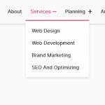 Responsive Single-level Dropdown Menu With JavaScript
 Responsive Header Dropdown Navigation Bar With JavaScript and CSS