


A responsive sticky navbar that coverts the nav items into a full-width off-canvas menu with a hamburger toggle button.
Clicking/tapping the hamburger will slide the off-canvas menu out from the left side of the screen.
Written in pure HTML and CSS/CSS3. Fully customizable by overriding the default variables in the main.scss.
How to use it:
1. Modify the CSS variables (colors, transitions, breakpoints) to fit your design.
// main.scss
$breakpoint_tablet: 680px;
$breakpoint_desktop: 1040px;
$max_header_width: 1200px;
$color_background: #FAFAFA;
$color_background_alt: #e0e5eb;
$color_text: #121212;
$color_text_alt: #36bae6;
$color_border: #e0e5eb;
$transition_link: .14s ease-in-out;
$transition_anim: .22s ease-in-out;
2. Compile the main.scss to main.css.
sass /path/to/main.scss /path/to/main.css
3. Load the main.css in the document.
<link rel="stylesheet" href="main.css" />
4. The HTML structure for the responsive sticky navbar.
<header>
  <div class="container">
    <div class="logo">
      CSSScript
    </div>
    <input class="hamburger-button" type="checkbox" id="hamburger-button" />
    <label for="hamburger-button">
      <div></div>
    </label>
    <div class="menu">
      <nav>
        <ul>
            <li><a href="#">Home</a></li>
            <li><a href="#">About</a></li>
            <li><a href="#">Work</a></li>
            <li><a href="#">Contact</a></li>
        </ul>
      </nav>
      <div class="buttons">
        <a href="#" class="button primary">Login</a>
        <a href="#" class="button">Settings</a>
      </div>
    </div>
  </div>
</header>
See Also:
 Responsive Dropdown/Off-canvas Navigation In Vanilla JavaScript – Menue
 Responsive Multi-level Dropdown Menu With JavaScript And CSS – ozmenu.js
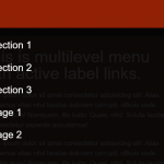 Mobile-friendly Hamburger Navigation With Submenus
 Convert Bootstrap 5 Navbar Into Offcanvas Menu
 Responsive Offcanvas Menu For Bootstrap 5
 Responsive Single-level Dropdown Menu With JavaScript
 Responsive Mobile Menu Using CSS Flexbox – ftwnav
 Responsive Multi-level Sidebar Menu With JavaScript/CSS