


Azar Datepicker is a dependency-free JavaScript library that attaches a full-featured Persian (Jalali) or Gregorian date and time picker to any HTML input element.
The date picker renders an inline dropdown on desktop screens and a modal style overlay on smaller screens. It also supports dark mode, RTL layout for Jalali dates, input and output format control, min and max dates, and calendar switching.
Features:
- Supports Jalali and Gregorian calendar selection.
- Handles date, time, and date time input.
- Adapts the picker layout for desktop and mobile screens.
- Detects dark color preferences.
- Formats input display and returned values.
- Switches calendar systems from the picker UI.
- Supports minimum and maximum selectable dates.
Use cases:
- Persian e‑commerce sites that collect delivery dates in Jalali format.
- International clinic systems where patients can switch between Jalali and Gregorian appointment calendars.
- Scheduling dashboards that need a time‑only picker with 12‑hour display.
- Government web applications requiring birth date entry with a fixed Jalali range.
How to use it:
1. Copy datepicker.css and datepicker.js into your project. Load the CSS file in the document head and load the JavaScript file before your initialization code.
<link rel="stylesheet" href="datepicker.min.css">
<script src="datepicker.min.js"></script>
2. Attach a minimal Jalali date picker to the input field you specify.
<input type="text" id="birthDate" placeholder="تاریخ تولد">
new AzarDatepicker({
  selector: '#birthDate',      // Target input by CSS selector
  mode: 'date',                // Date-only; no time controls are rendered
  calendar: 'jalali',          // Start in Jalali (Shamsi) calendar
  inputFormat: 'YYYY/MM/DD',   // Format displayed inside the input field
  outputFormat: 'YYYY-MM-DD',  // Format returned by getValue() and callbacks
  onSelect: function(data) {
    console.log(data.formatted);  // '1403-06-15' string using outputFormat
    console.log(data.nativeDate); // Standard JavaScript Date object
    console.log(data.iso);        // ISO 8601 timestamp string
  }
});
3. Create a date & time picker with Min/Max dates. Use this when you need to restrict the selectable range, such as a booking system that only accepts appointments within the current Persian year.
<input type="text" id="appointmentTime" placeholder="زمان ملاقات">
<span id="selectedPreview"></span>
new AzarDatepicker({
  selector: '#appointmentTime',
  mode: 'datetime',                         // Shows calendar and time controls together
  calendar: 'jalali',
  inputFormat: 'YYYY/MM/DD HH:mm',
  outputFormat: 'YYYY-MM-DD HH:mm',
  minDate: { year: 1403, month: 1,  day: 1  },   // Dates before this are disabled
  maxDate: { year: 1403, month: 12, day: 29 },   // Dates after this are disabled
  closeOnSelect: false,          // Keep picker open so the user can also set time
  onChange: function(data) {
    // Fires on every change: day click, hour/minute increment or decrement
    document.getElementById('selectedPreview').textContent = data.formatted;
  },
  onSelect: function(data) {
    // Fires only when a day cell is clicked; use for final confirmation logic
    console.log('Day selected:', data.year, data.month, data.day);
  }
});
4. Create a Gregorian date picker via Data Attributes:
data-azar-datepicker(attribute): Marks an input for automatic initialization.data-azar-mode(string): Setsdate,time, ordatetimemode.data-azar-calendar(string): Setsjalaliorgregorianas the starting calendar.data-azar-input-format(string): Sets the visible input format.data-azar-output-format(string): Sets the returned formatted value.data-azar-placeholder(string): Sets placeholder text.data-azar-dark(string): Setsauto,light, ordarktheme behavior.data-azar-close-on-select(string boolean): Sets close behavior from HTML.data-azar-auto-load(string boolean): Requests an initial value in declarative markup.
<!-- Initialized automatically on DOMContentLoaded, no script block needed -->
<input
  type="text"
  id="invoiceDate"
  data-azar-datepicker
  data-azar-calendar="gregorian"
  data-azar-mode="date"
  data-azar-input-format="MM/DD/YYYY"
  data-azar-dark="auto"
  placeholder="Invoice date (MM/DD/YYYY)"
>
5. Available configuration options:
selector(string | element): The target input element. Accepts a CSS selector string or a direct DOM element reference. Required.mode(string, default'date'): The picker mode. Accepts'date','time', or'datetime'.calendar(string, default'jalali'): The starting calendar system. Accepts'jalali'or'gregorian'.inputFormat(string, default auto): The format string displayed inside the input. Supported tokens:YYYY,YY,MMMM,MMM,MM,M,DD,D,HH,H,hh,h,mm,m,A,a. Defaults toYYYY/MM/DDfor Jalali andYYYY-MM-DDfor Gregorian.outputFormat(string, default same asinputFormat): The format string returned bygetValue()and all callbacks.autoLoad(boolean, defaultfalse): Pre-fills the input with today’s date when the picker initializes.placeholder(string, defaultnull): Sets theplaceholderattribute on the input element.darkMode(string, default'auto'): Dark mode behavior. Accepts'auto','light', or'dark'. In'auto'mode the picker checksdata-theme="dark",data-bs-theme="dark"ondocument.documentElement, then falls back to the OSprefers-color-scheme: darkmedia query.rtl(boolean, default auto): Forces RTL or LTR layout direction. Defaults totruewhencalendaris'jalali'andfalsewhencalendaris'gregorian'.closeOnSelect(boolean, defaulttrue): Closes the picker after a day cell is clicked in'date'mode. Has no effect in'time'or'datetime'mode.showCalendarToggle(boolean, defaulttrue): Shows the button that switches between Jalali and Gregorian.minDate(object, defaultnull): The earliest selectable date. Format:{ year, month, day }in the active calendar system. Month navigation stops at the month containingminDate.maxDate(object, defaultnull): The latest selectable date. Same format asminDate.onLoad(function, defaultnull): Called when the picker finishes initialization. Receives the picker instance as its argument. Use this to set a programmatic default date after init.onSelect(function, defaultnull): Called when the user clicks a day cell. Receives the selection data object.onChange(function, defaultnull): Called on every selection change, including time spinner increments and decrements. Receives the selection data object.onClear(function, defaultnull): Called when the user clicks the clear button (✕). Receives no arguments.jalaliMonths(array, defaultnull): Overrides the full Persian month name array (12 strings).jalaliMonthsShort(array, defaultnull): Overrides the abbreviated Persian month name array (12 strings).jalaliWeekDaysShort(array, defaultnull): Overrides the Persian weekday abbreviation array (7 strings, starting Saturday).- Selection data object structure (passed to
onSelect,onChange, and returned bygetValue()):
6. API methods:
const dp = new AzarDatepicker({ selector: '#myInput', mode: 'date' });
// Opens the picker dropdown (desktop) or modal (mobile)
dp.open();
// Closes the picker with a brief CSS closing animation
dp.close();
// Toggles between open and closed state
dp.toggle();
// Returns the current selection data object, or null if nothing is selected yet
dp.getValue();
// Sets the picker to a specific date object; pass null to clear the selection
dp.setValue({ year: 1403, month: 6, day: 15, hour: 9, minute: 0 });
// Parses and sets the date from a string
// Accepts 'YYYY/MM/DD', 'YYYY-MM-DD', or either with an optional ' HH:mm' suffix
dp.setValueFromString('1403/06/15 09:30');
// Switches the active calendar; pass 'jalali' or 'gregorian'
// Converts the current cursor and selected dates to the new system automatically
dp.setCalendar('gregorian');
// Returns the name of the active calendar as a string
dp.getCalendar(); // 'jalali' or 'gregorian'
// Re-detects dark mode preference and mobile viewport, then re-renders
dp.refresh();
// Removes all picker DOM nodes and restores the original input element
dp.destroy();
Alternatives:
- Flatpickr: A popular JavaScript date and time picker with a plugin architecture and a large locale collection.
- Air Datepicker: A lightweight JS date picker with multi-date selection, date ranges, and built-in localization files.
- Pikaday: A small, modular JS date picker with no dependencies and strong accessibility defaults.
- Persian Datepicker: A dedicated jQuery-based Jalali date picker for projects that already depend on jQuery.
FAQs:
Q: Does Azar Datepicker work with Bootstrap or Tailwind CSS form components?
A: Yes. Drop the input inside any Bootstrap or Tailwind form group as normal. The picker wraps the input in its own div.azar-datepicker-wrapper, so existing form styles apply to the input element as written. If you use data-bs-theme="dark" on your Bootstrap layout, the picker reads that attribute automatically.
Q: The picker opens but gets clipped by a modal dialog. How do I fix it?
A: The picker container appends to document.body, so overflow: hidden on a parent element does not clip it. If the picker still disappears under the modal, the issue is z-index. The picker uses z-index: 10550 by default. Set your modal to a lower z-index, or override .azar-datepicker-container in your own CSS to raise it above the modal layer.
Q: How do I pre-fill the picker with a date from an API response?
A: Use setValueFromString inside the onLoad callback for correct timing: onLoad: function(dp) { dp.setValueFromString(apiResponse.date); }. The method accepts YYYY/MM/DD and YYYY-MM-DD with an optional HH:mm time suffix. It logs a console warning and exits early on unrecognized input.
Q: Does the library support date range selection?
A: No. Azar Datepicker handles single date and time selection only. The minDate and maxDate options constrain the selectable range but do not create a two-input range picker. For range selection, Flatpickr and Air Datepicker both support that natively.
Q: How do I integrate this picker in a React or Vue component?
A: Initialize the picker inside a useEffect hook (React) or onMounted hook (Vue) and store the instance in a ref. Call destroy() in the cleanup function. Pass the actual DOM node to selector using a ref (inputRef.current) rather than a string selector, to avoid document-level query collisions across multiple picker instances on the same page.
Changelog:
v1.2.0 (06/05/2026)
- Update package
See Also:
 Accessible Customizable Date/Time/Date Picker for Modern Web App – FDatepicker
 Vanilla DateTime Picker: Zero-Dependency JS Date-Time Input
 Vanilla JS Date & Time Picker for Moderb Web Apps – Tuncxys DatePicker
 Versatile Datetime Picker For Bulma – bulma-calendar
 Powerful, Customizable JavaScript Date Picker – Datelite
 Easy Datetime & Date Range Pickers in Vanilla JavaScript
 Minimal Multilingual Datetime Picker Component – input-dt
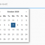 Minimal Date & Time Picker – dtsel