


Just another vanilla JavaScript library used to displays Android / Material inspired toast notifications of various types (success, info, warning) on your web applications.
Supports custom CSS3 animations and action buttons. With no dependencies.
By default, the toast messages will auto-dismiss after a certain timeout. You can also close them manually by click on the message body.
How to use it:
Include the Animate.css in the head section if you want more animations.
<link rel="stylesheet" href="animate.min.css">
Include the core JavaScript file on the webpage.
<script src="sheeptoasts.js"></script>
Initialize the library with default options and the SheepToasts is ready for use.
Create a success toast message:
SheepToasts.success('Success.');// mode: success, info, warning // animation: Name of animation for show toast // buttons: Buttons [object] SheepToasts.show(mode, message, animation, buttons)
Create a toast message with Yes/No buttons:
SheepToasts.warning('Are you sure?', null, {
  yes: {
    value: 'Yes',
    callback: function(){
      alert('You are sure!');
      SheepToasts.close(this.toastId);
    }
  },
  no: {
    value: 'No',
    callback: function(){
      SheepToasts.close(this.toastId);
    }
  }
});
Available options:
{
  /*
    animation: {
      in: 'fadeIn', //Default: none
      out: 'fadeOut', //Default: none
      duration: '1s' //Default: 0.5s
    }
  */
  animation: false,
  // margin in pixels
  toastMargin: 4,
  // auto dismiss after 5 seconds
  delayRemove: 5000,
  // where to place the toast messages
  sort: 'bottom'
  // main CSS styles
  cssMain: {
    display: 'inline-block',
    maxWidth: '320px',
    padding: '5px 8px',
    position: 'fixed',
    top: 'auto',
    right: '32px',
    bottom: '32px',
    left: 'auto',
    borderRadius: '3px',
    wordBreak: 'break-all',
    fontFamily: 'cursive, sans-serif',
    fontSize: '13px',
    cursor: 'pointer',
    transition: 'top 0.32s, bottom 0.32s',
    webKitAnimationDuration: '0.5s',
    mozAnimationDuration: '0.5s',
    oAnimationDuration: '0.5s',
    animationDuration: '0.5s'
  },
  // button styles
  cssButtons: {
    display: 'inline-block',
    height: '20px',
    margin: '-3px 0 0 3px',
    padding: '0 5px',
    verticalAlign: 'middle',
    whiteSpace: 'nowrap',
    border: 'none',
    borderRadius: '10px',
    fontFamily: 'inherit',
    fontSize: '11px',
    cursor: 'pointer'
  },
  // mode styles
  cssModes: {
    warning: {
      color: '#fafeff',
      background: '#c8354e',
      textShadow: '#e74c3c 1px 2px 1px',
      _buttons: {
        color: '#fafeff',
        textShadow: '#46231f 0px 0px 3px',
        background: '#e25353'
      }
    },
    info: {
      color: '#fafeff',
      background: '#2980b9',
      textShadow: '#3498db 1px 2px 1px',
      _buttons: {
        color: '#fafeff',
        textShadow: '#173646 0px 0px 3px',
        background: '#2c9fea'
      }
    },
    success: {
      color: '#fafeff',
      background: '#27ae60',
      textShadow: '#1e7744 1px 2px 1px',
      _buttons: {
        color: '#fafeff',
        textShadow: '#185833 0px 0px 3px',
        background: '#5ac17f'
      }
    }
  }
}
See Also:
 Framework-Agnostic Toast Notifications with TypeScript – NotifyX
 Advanced Toast/Tooltip/Popover/Confirm/Modal Notification Library – toast-anchor
 Developer-Friendly Toast Alerts in JavaScript – Toast-JS
 Modern Toast Popup JavaScript Library – EggyJS
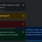 Advanced Alert Notification System For Bootstrap 5 – AvalynxAlert.js
 SVG Gooey Toast Notification Library – Physics Toast
 Modern JavaScript Toast Notification & Modal Popup Library – JSPT
 Lightweight Toast & Growl Notifications Inspired by macOS – Toastify