


A lightweight JavaScript popup menu library to easily add context menus or dropdowns that open on click or right click of a trigger element.
The popup isn’t just limited to menu items. You can insert any custom elements, making it adaptable to various use cases.
How to use it:
1. Import the Tiny Popup Menu’s JavaScript and Stylesheet.
<link rel="stylesheet" href="/dist/css/tiny-popup-menu.css" />
<script src="/dist/tiny-popup-menu.js"></script>
2. Initiate a new instance of TinyPopupMenu and define your menu items. These items should be structured as a JavaScript array of objects as follows:
const myMenu = new TinyPopupMenu({
      menuItems: [
        {
          content: 'Menu Item 1',
          callback: () => alert('You Clicked Item 1')
        },
        {
          content: 'Menu Item 2',
          callback: () => alert('You Clicked Item 2')
        },
        '-', // separator
        {
          content: 'Menu Item 3',
          callback: () => alert('You Clicked Item 3')
        },
        // ... more items here
      ]
});
3. Enable a button to toggle the popup menu.
myTogglerButton.onclick = function (event) {
  myMenu.open(event);
};
4. Or attach the popup menu to a toggle button programatically.
myMenu.addToggler(myTogglerButton, {
  // options
},
'click' // custom trigger event
);
5. All default options.
const myMenu = new TinyPopupMenu({
      // or 'top'
      position: "bottom",
      // additional CSS class
      className: '',
      // only one popup menu is activated at a time
      autoClose: true,
      // shows arrow indicator
      arrow: true,
      // custom margin
      margin: 5,
      // items align items in the menu
      alignContent: 'center';
      // custom x/y offsets
      offset: {
        x: 0,
        y: 0
      },
      // menu items here
      menuItems: [],
      // prevents the native click event
      stopClick: true

});
6. Events.
// triggered on open
myMenu.on('open', () => console.log('Open event'));
// triggered on close
myMenu.on('close', () => console.log('Close event'));
// triggered on update
myMenu.on('updateposition', () => console.log('Update position event'));
Changelog:
v1.0.14 (07/09/2025)
- Fix missing types in build
- Removed incremental from tsconfig
v1.0.14 (07/08/2025)
- Some minor css improvements to allow show HTML content as an popup info only
v1.0.13 (05/20/2025)
- Bugfix
v1.0.12 (05/17/2025)
- Added general and submenu alignContent option
- Improved some css classes
v1.0.11 (05/14/2025)
- Only apply style cursor: pointer if item has an existing callback function (created class popup-menu–item-clickleable)
- Added item option autoClose to allow an individual control
- Added an input checkbox in the example (with autoClose disabled)
v1.0.10 (08/03/2024)
- Added helper function addSeparator
- Improved position type
- Added min-width css
v1.0.9 (09/14/2023)
- Added visibility:hidden to submenu
v1.0.8 (09/14/2023)
- Added hoverable submenu option
- Improved postcss configuration
- Improved some scss variables
See Also:
 Navbar-Synced Context Menu for Bootstrap 5 – BRC JS
 Create Contextual Right-Click Menus with Vanilla JavaScript
 Multi-level Custom Context Menu Made Easy – ctxmenu.js
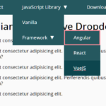 WCAG Compliant Responsive Dropdown Navigation – accessible-menu
 Accessible Dropdown Nav With Vanilla JavaScript – Clicky Menus
 Custom Context Menus for Touch & Desktop – ContextMenu
 Responsive Accessible Dropdown Menu Template with Vanilla JavaScript
 Modern Multi-level DropDown Menu – Droppy