


This is a smooth scrolling, CSS-only horizontal scroller that behaves like the traditional marquee element without all the extra markup, JavaScript, and images.
How to use it:
1. Add content to the scroller.
<!-- Right To Left -->
<div class="marquee">
  <div class="track">
    <span class="text">Item 1</span>
    <span class="text">Item 2</span>
    <span class="text">Item 3</span>
    ...
  </div>
</div>
<!-- Left To Right -->
<div class="marquee">
<div class="track">
<span class="text -r">Item 1</span>
<span class="text -r">Item 2</span>
<span class="text -r">Item 3</span>
...
</div>
</div>2. The required CSS/CSS3 rules for the ultimate marquee scroller.
/* variables */
:root {
  --step--2: clamp(3.13rem, 2.62rem + 2.51vw, 5.76rem);
  --step--1: clamp(3.75rem, 3.09rem + 3.29vw, 7.20rem);
  --step-0: clamp(4.50rem, 3.64rem + 4.29vw, 9.00rem);
}
/* animations */
@-webkit-keyframes marquee {
  from {
    transform: translateX(0);
  }
  to {
    transform: translateX(-100%);
  }
}
@keyframes marquee {
  from {
    transform: translateX(0);
  }
  to {
    transform: translateX(-100%);
  }
}
@-webkit-keyframes marquee-r {
  from {
    transform: translateX(-100%);
  }
  to {
    transform: translateX(0);
  }
}
@keyframes marquee-r {
  from {
    transform: translateX(-100%);
  }
  to {
    transform: translateX(0);
  }
}
/* scroller styles */
.marquee {
  border-bottom: 1px solid #efefef;
  color: #fefefe;
  font-size: var(--step-0);
  height: calc(170px + 4rem);
  overflow: hidden;
  position: relative;
  width: 100vw;
}
.track {
  height: 100%;
  overflow: hidden;
  padding: 2rem 0;
  position: absolute;
  transition: background-color 300ms ease, color 300ms ease;
  white-space: nowrap;
}
.track .text {
  -webkit-animation: marquee 50000ms linear infinite;
  animation: marquee 50000ms linear infinite;
  align-items: center;
  display: inline-flex;
  will-change: transform;
}
.track .text.-r {
  -webkit-animation-name: marquee-r;
  animation-name: marquee-r;
}
See Also:
 Overflow-Aware Marquee Scroller in Vanilla JS – fluid-marquee
 Smooth, Infinite Scrolling Marquees in Vanilla JavaScript – marquee6k
 Smooth, Infinite, Horizontal Scroller with Progress Tracking
 Pure CSS Responsive Infinite Logo Carousel with Fade Effects
 Create Infinite Scrolling Ribbons with ribbon-tile Web Component
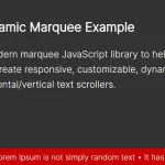 Dynamic Marquee-like Text Scroller In Vanilla JavaScript
 CSS-only Horizontal Image Scroller with Vertical Scroll Pause
 Create Customizable Omnidirectional Marquees – Manawave