Grid Overlays For Modern Web Layout Design – Graaf
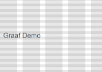
Graaf is a collection of pure CSS grid overlays that display grid and measurement overlays for grid system design.


Graaf is a collection of pure CSS grid overlays that display grid and measurement overlays for grid system design.

flexbin.css is a lightweight CSS library which lets you create responsive, neat, justified grid layout for showcasing your photos using CSS flexbox.

Boardz.css is a very lightweight CSS library which lets you generate a responsive, adaptive, Pinterest board-like grid layout from normal html lists.
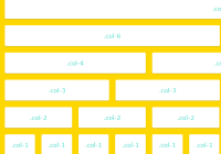
Just another 12-column Grid Framework used to create a responsive, fluid, adaptive grid system for your web project.

Fukol™ is a tiny (less than 1kb), extendable, fully responsive, Flexbox based, progressive enhancement CSS grid responsive for modern web design.
BrickCols.js is a really small JavaScript library that lets you create fully responsive cascading grid layout without any dependencies.

tiny-masonry.js is a minimalist JavaScript library that makes it easy to create Masonry-like responsive, neat, fluid grid layout for your web project.

Gridfolio is a simple and easy-to-use JavaScript library for generating a Flickr-style justified grid layout for portfolio webpages.
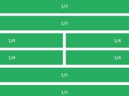
Lemonade.css is a super tiny CSS/LESS/SCSS library that helps you create a fully responsive & flexible grid layout with ease.

colm.js is a lightweight & standalone JavaScript library that dynamically arrange a collection of elements into a responsive grid layout similar to Pinterest or Masonry.