Dynamic Responsive Pinterest Style Columns Layout with Pure CSS

A pure CSS implementation of Pinterest style responsive grid layout that automatically adjusts the number of grid columns based on screen size.


A pure CSS implementation of Pinterest style responsive grid layout that automatically adjusts the number of grid columns based on screen size.
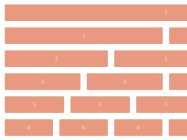
Siimple is a minimal 12 column .scss grid created with a focus on simplicity and usability.

Republic is a super tiny, cross-browser CSS framework which helps you create fully responsive 12-column based grid layout in a minute.

ungrid.css is a super tiny CSS library that helps you create responsive, smart, fluid grid system with ease.

A 3D hexagon(honeycomb) grid layout with cool hover effects, built on top of CSS3 transitions and transforms.
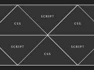
A creative and fully responsive triangle/diamond grid layout using CSS3 transitions, transforms and media queries

A standalone Javascript library helps you create a sortable grid view which allows you to move and re-sort boxes to your desired position through drag and drop.

Bijou is a lightweight and easy CSS framework for quickly and easily creating your own styles of grid layout, typography, tables, buttons and more.

A simple, dynamic, fluid and fully responsive Pinterest-style grid layout with sleek hover effects based on CSS and CSS3 transitions & transforms. Great for portfolio websites that work nicely both on desktop and mobile devices.

A flexible, fully responsive, mobile-friendly grid layout built on top of CSS and CSS3 media queries.