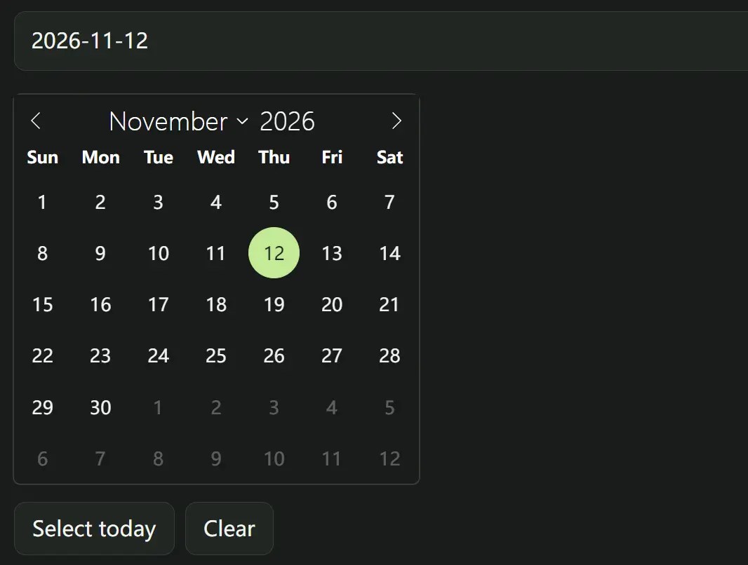
flatpickr-ce is the upgraded version of flatpickr for date and time inputs in vanilla JavaScript.
It preserves flatpickr’s API, themes, and plugins, and adds year-only selection alongside fixes for keyboard focus, mobile inputs, and localized dates.
Features
- Single-date, multiple-date, date-range, and time-only modes.
- Date limits and custom functions for enabling or disabling dates.
- Locale-aware calendar labels and customizable date formats.
- Inline calendars, week numbers, and multi-month views.
- Week, month, year, and paired-input range plugins.
- Dark, light, Airbnb, confetti, and Material themes.
How to Use flatpickr-ce
Load flatpickr-ce from a CDN
<!-- Core Stylesheet -->
<link rel="stylesheet" href="https://cdn.jsdelivr.net/npm/flatpickr-ce/dist/flatpickr.min.css">
<!-- OPTIONAL THEMES -->
<link rel="stylesheet" href="https://cdn.jsdelivr.net/npm/flatpickr-ce/dist/light.min.css">
<link rel="stylesheet" href="https://cdn.jsdelivr.net/npm/flatpickr-ce/dist/dark.min.css">
<link rel="stylesheet" href="https://cdn.jsdelivr.net/npm/flatpickr-ce/dist/airbnb.min.css">
<link rel="stylesheet" href="https://cdn.jsdelivr.net/npm/flatpickr-ce/dist/confetti.min.css">
<link rel="stylesheet" href="https://cdn.jsdelivr.net/npm/flatpickr-ce/dist/material_blue.min.css">
<link rel="stylesheet" href="https://cdn.jsdelivr.net/npm/flatpickr-ce/dist/material_green.min.css">
<link rel="stylesheet" href="https://cdn.jsdelivr.net/npm/flatpickr-ce/dist/material_red.min.css">
<link rel="stylesheet" href="https://cdn.jsdelivr.net/npm/flatpickr-ce/dist/material_orange.min.css">
<input id="event-date" name="event_date" type="text" placeholder="Choose a date">
<!-- Core JavaScript -->
<script src="https://cdn.jsdelivr.net/npm/flatpickr-ce/dist/flatpickr.min.js"></script>
<!-- OPTIONAL LOCALS -->
<script src="https://cdn.jsdelivr.net/npm/flatpickr-ce/dist/l10n/fr.js"></script>
....
<script>
  flatpickr("#event-date", {
    minDate: "today",
    dateFormat: "Y-m-d",
    altInput: true,
    altFormat: "F j, Y"
  });
</script>
Install with npm
npm install flatpickr-ce
import flatpickr from "flatpickr-ce";
import "flatpickr-ce/dist/flatpickr.css";
flatpickr("#event-date", {
  enableTime: true,
  dateFormat: "Y-m-d H:i"
});
Migrate from flatpickr
Keep existing flatpickr import paths with an npm alias:
npm install flatpickr@npm:flatpickr-ce
Select an appointment time
<input id="appointment" type="text" placeholder="Appointment date and time">
<script>
flatpickr("#appointment", {
  enableTime: true,
  time_24hr: true,
  dateFormat: "Y-m-d H:i",
  minDate: "today",
  disable: [date => date.getDay() === 0 || date.getDay() === 6],
  onChange(selectedDates, dateStr) {
    console.log(dateStr);
  }
});
</script>
Create a time-only input
<input id="office-hours" type="text" placeholder="Select time">
<script>
  flatpickr("#office-hours", {
    enableTime: true,
    noCalendar: true,
    dateFormat: "H:i",
    time_24hr: true,
    minuteIncrement: 15
  });
</script>
Use two inputs for a date range
Load rangePlugin.js after the core script.
<input id="start-date" type="text" placeholder="Start date">
<input id="end-date" type="text" placeholder="End date">
<script src="https://cdn.jsdelivr.net/npm/flatpickr-ce/dist/plugins/rangePlugin.js"></script>
<script>
  flatpickr("#start-date", {
    dateFormat: "Y-m-d",
    plugins: [new rangePlugin({ input: "#end-date" })]
  });
</script>
Add a year-only picker
<link rel="stylesheet" href="https://cdn.jsdelivr.net/npm/flatpickr-ce/dist/plugins/yearSelect/style.css">
<input id="graduation-year" type="text" placeholder="Select year">
<script src="https://cdn.jsdelivr.net/npm/flatpickr-ce/dist/plugins/yearSelect/index.js"></script>
<script>
  flatpickr("#graduation-year", {
    plugins: [new yearSelectPlugin({
      yearsPerPage: 12,
      columns: 3
    })]
  });
</script>
All Configuration Options
Date selection and display
| Option | Default and purpose |
|---|
allowInput | false. Permit manual typing into the date field. |
allowInvalidPreload | false. Retain a preloaded value even when it is invalid. |
altFormat | "F j, Y". Display format for the alternate input. |
altInput | false. Create an alternate, human-readable input while retaining the original field value. |
altInputClass | "form-control input". CSS classes for the alternate input; original input classes are also inherited. |
animate | Enabled by default in most browsers. Controls calendar transitions. |
appendTo | Unset. Append the calendar to a supplied HTMLElement (default: document body). |
ariaDateFormat | "F j, Y". Format of date labels exposed to assistive technology. |
autoFillDefaultTime | true. Populate time controls with the default time when appropriate. |
clickOpens | true. Open the calendar on input interaction. |
closeOnSelect | true. Close the calendar after a completed selection. |
conjunction | ", ". Join dates in multiple-selection mode. |
dateFormat | "Y-m-d". Format of the stored input value. |
defaultDate | Unset. Initial selection as a Date, string, timestamp, or array. |
disable | []. Exclude dates, date ranges, or dates matching callback functions. |
disableMobile | false. Force the custom picker on mobile when set to true. |
enable | Unset. Restrict selection to the supplied dates, ranges, or callback matches. |
inline | false. Render the calendar in the page. |
locale | "default". Locale identifier or locale configuration object. |
maxDate | Unset. Latest selectable date, inclusive. |
minDate | Unset. Earliest selectable date, inclusive. |
mode | "single". Accepts "single", "multiple", "range", or "time". |
monthSelectorType | "dropdown". Accepts "dropdown" or "static". |
now | Current date. Reference date for the calendar when no selection determines the view. |
shorthandCurrentMonth | false. Display abbreviated current-month names. |
showMonths | 1. Number of months visible at once. |
weekNumbers | false. Show week numbers alongside calendar rows. |
Time selection
| Option | Default and purpose |
|---|
defaultHour | 12. Initial hour when no date is selected. |
defaultMinute | 0. Initial minute when no date is selected. |
defaultSeconds | 0. Initial seconds value. |
enableTime | false. Display time controls. |
enableSeconds | false. Show a seconds input. |
hourIncrement | 1. Step size of the hour control. |
maxTime | Unset. Latest selectable time, subject to date constraints. |
minTime | Unset. Earliest selectable time, subject to date constraints. |
minuteIncrement | 5. Step size of the minute control. |
noCalendar | false. Hide day selection, usually for a time-only picker. |
secondIncrement | Defaults to minuteIncrement. Step size of the seconds control. |
time_24hr | false. Use 24-hour time controls. |
Layout and extension points
| Option | Default and purpose |
|---|
ignoredFocusElements | []. Elements whose focus should not dismiss the calendar. |
nextArrow | Built-in SVG. HTML content for the next-month arrow. |
position | "auto". Vertical/horizontal placement string or positioning callback. |
positionElement | Unset. Element used as the calendar positioning anchor. |
prevArrow | Built-in SVG. HTML content for the previous-month arrow. |
static | false. Place calendar in a wrapper beside its input. |
wrap | false. Initialize on a wrapper containing data-input and optional control buttons. |
Formatting and callbacks
| Option | Default and purpose |
|---|
errorHandler | Default logs warnings to the console. Custom callback receives an Error. |
formatDate | Unset. Custom formatDate(date, format, locale) callback. |
getWeek | Built-in week-number calculation. A custom getWeek(date) must return a number or trusted text because its result enters calendar HTML. |
parseDate | Unset. Custom parseDate(dateString, format) callback returning a Date. |
plugins | []. Initialize optional plugins. |
Wrapped Input Attributes
<div id="date-controls">
  <input type="text" data-input>
  <button type="button" data-toggle>Toggle calendar</button>
  <button type="button" data-clear>Clear date</button>
</div>
<script>
  flatpickr("#date-controls", { wrap: true });
</script>| Attribute | Purpose |
|---|
data-input | Marks the date input inside the wrapper. |
data-open | Opens the calendar when clicked. |
data-close | Closes the calendar when clicked. |
data-toggle | Toggles the calendar when clicked. |
data-clear | Clears the selected date when clicked. |
Date Formatting Tokens
Use these tokens in dateFormat, altFormat, and ariaDateFormat. Escape literal token characters with a backslash.
| Token | Meaning |
|---|
d / j / J | Day with leading zero / without leading zero / with ordinal suffix. |
D / l / w | Short weekday name / full weekday name / weekday number (0 is Sunday). |
W | Week number. |
F / M | Full / abbreviated month name. |
m / n | Month number with / without leading zero. |
y / Y | Two-digit / four-digit year. |
U / Z | Unix timestamp in seconds / ISO datetime. |
H / G / h | 24-hour hour / zero-padded 12-hour hour / 12-hour hour. |
i / S / s | Minutes with leading zero / seconds with leading zero / seconds without leading zero. |
K | Locale-aware AM/PM marker. |
Instance Methods and Properties
| Method | Purpose |
|---|
changeMonth(monthNum, isOffset = true) | Move by a month offset; set isOffset to false to use a zero-indexed month. |
clear() | Remove selected dates and clear the input. |
close() | Close the popup calendar. |
destroy() | Remove the picker, clean up listeners, and restore its input. |
formatDate(dateObj, formatStr) | Format a Date using flatpickr tokens. |
jumpToDate(date?, triggerChange?) | Move the current calendar view to a date; optionally fire month/year-change hooks. |
open() | Open the picker. |
parseDate(dateStr, dateFormat) | Parse a date string; returns a Date or undefined for an invalid value. |
redraw() | Rebuild the displayed calendar. |
set(option, value) | Update a configuration option, or pass an object of options. |
setDate(date, triggerChange?, dateStrFormat?) | Set one or more dates; optionally fire change hooks and specify the supplied string format. |
toggle() | Toggle the popup calendar. |
const picker = flatpickr("#event-date");
picker.setDate("2026-12-10", true);
picker.set("minDate", "2026-12-01");
console.log(picker.selectedDates);
picker.clear();
Instance Properties and Elements
| Property or element | Purpose |
|---|
selectedDates | Array of selected Date objects. |
currentYear / currentMonth | Year and zero-based month displayed by the calendar. |
config | Resolved configuration, including registered hooks. |
input | Underlying input element. |
calendarContainer | Root calendar element. |
prevMonthNav / nextMonthNav | Elements for month navigation. |
currentMonthElement / currentYearElement | Month label and year control elements. |
days | Container holding date cells. |
Static Utilities
| Method | Purpose |
|---|
flatpickr.parseDate(date, format) | Parse a date string using flatpickr tokens. |
flatpickr.formatDate(date, format) | Format a Date using flatpickr tokens. |
flatpickr.localize(locale) | Set the default locale for subsequent pickers. |
flatpickr.setDefaults(options) | Set default options for subsequent pickers. |
flatpickr.compareDates(a, b, timeless = true) | Return the millisecond difference between two dates; ignore times by default. |
Events and Hooks
Each hook accepts a function or an array of functions. Callbacks receive selectedDates, dateStr, and the instance.
| Hook | When it runs |
|---|
onChange | Selected date or time actually changes. |
onClose | Calendar closes. |
onDayCreate | A day cell is constructed; the fourth argument is the cell element. |
onDaysBuilt | Day cells have been rebuilt after calendar redraw or navigation. |
onDestroy | Instance is being destroyed. |
onKeyDown | Calendar receives relevant keyboard input; fourth argument contains the event. |
onMonthChange | Displayed month changes. |
onOpen | Calendar opens. |
onParseConfig | Configuration is parsed during initialization. |
onPreCalendarPosition | Calendar is about to be positioned. |
onReady | Instance finishes initialization. |
onValueUpdate | Input value is updated. |
onYearChange | Displayed year changes. |
Optional Plugins and Their Options
For browser use, load each plugin script after the core flatpickr-ce script. Pass plugin settings inside the plugins array.
| Plugin script | Purpose and options |
|---|
rangePlugin.js | rangePlugin({ input, position }): Two-input range selection; input is a selector/element for the end input, and position accepts "left". |
weekSelect/weekSelect.js | weekSelect(): Pick a week. No configuration parameters. |
monthSelect/index.js | monthSelectPlugin({ shorthand, dateFormat, altFormat, theme }): Month-only selection. Defaults: false, "F Y", "F Y", "light". Load monthSelect/style.css. |
yearSelect/index.js | yearSelectPlugin({ yearsPerPage, columns, dateFormat, altFormat, theme }): Year-only selection. Defaults: 12, 3, "Y", "Y", "light". Load yearSelect/style.css. |
confirmDate/confirmDate.js | confirmDatePlugin({ confirmIcon, confirmText, showAlways, theme }): Add a confirmation control. Defaults include "OK ", false, "light". Load confirmDate/confirmDate.css. |
minMaxTimePlugin.js | minMaxTimePlugin({ table, getTimeLimits, tableDateFormat }): Date-specific time limits from a lookup object or callback; default format "Y-m-d". |
scrollPlugin.js | scrollPlugin(): Enable wheel interactions on calendar controls. No configuration parameters. |
labelPlugin/labelPlugin.js | labelPlugin(): Keep an input label connected to the visible alternate or mobile input. No configuration parameters. |
momentPlugin.js | momentPlugin({ moment }): Integrate Moment.js into time stepping. Load Moment.js before the plugin; the core picker has no Moment.js dependency. |
Alternatives and Related Resources


 Elegant Accessible Date Range Picker In JavaScript – Hotel Datepicker
 Accessible Customizable Date/Time/Date Picker for Modern Web App – FDatepicker
 Cally Calendar Components for Date Pickers & Ranges
 Vanilla JS Date Picker with Range Selection – EssealDatePicker
 Lightweight Accessible Date Picker Component – WC Datepicker
 Versatile Datetime Picker For Bulma – bulma-calendar
 Powerful, Customizable JavaScript Date Picker – Datelite
 Easy Datetime & Date Range Pickers in Vanilla JavaScript