


An animated test tube style progress bar written in pure CSS.
See it in action:
How to use it:
1. Load the main stylesheet test-tube.css in the document.
<link rel=”stylesheet” href=”dist/test-tube.css” />
2. The required HTML structure for the test tube.
<div class="tube">
  <div class="shine"></div>
  <div class="body">
    <div class="liquid">
      <div class="percentage"></div>
    </div>
  </div>
  <div class="meter">
    <div>100</div>
    <div>80</div>
    <div>60</div>
    <div>40</div>
    <div>20</div>
  </div>
  <div class="bubbles">
    <div></div>
    <div></div>
    <div></div>
    <div></div>
    <div></div>
  </div>
</div>
3. Override the default percentage value in the CSS.
:root {
  --tube-percentage: 80%;
  --tube-title: "80%";
  --tube-color: #9198e5;
}
See Also:
 Pure CSS Progress Bar Library with Custom Themes – progress-bar.css
 Modern TypeScript Progress Bar Library – BProgress
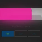 3D Liquid Progress Bar in Pure CSS/CSS3
 Easy Scroll Position Tracking – ScrollProgress.js
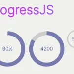 Visualize Progress Data With Animated, Circular Progress Bars – ProgressJS
 Radial Progress Indicator For Click-and-hold Actions – HoldCircleJS
 Simple Scroll Progress Indicator For Long Pages – PageBar.js
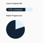 Generate Linear & Radial Progressbars Using CSS – Progress.css