


Yet another pure CSS solution to help you create text glitch and skew effects.
How to use it:
1. Add your text to the glitch container.
<div class="glitch-bloc">
  <p class="invisible-text">CSSScript</p>
  <p class="glitchedAnim">CSSScript</p>
  <p class="glitchedAnim">CSSScript</p>
  <p class="glitchedAnim">CSSScript</p>
</div>
2. The main CSS/CSS3 rules for the glitch & skew effects.
.glitchedAnim,
.invisible-text {
  font-size: 250px;
  font-weight: 400;
  line-height: 1.1;
  color: #fff;
}
.glitchedAnim {
  position: absolute;
  top: 0;
  opacity: 0.9;
}
.invisible-text {
  visibility: hidden;
}
.glitchedAnim:nth-child(2) {
  color: #f03e3e;
  animation: skewAnim 3s infinite;
}
.glitchedAnim:nth-child(3) {
  color: #3df0cf;
  animation: glitchAnim2 3s infinite;
}
.glitchedAnim:nth-child(4) {
  color: #f1f1f1;
  animation: glitchAnim1 3s infinite;
}
.txt-info {
  font-family: Open Sans, sans-serif;
  color: #f1f1f1;
  font-size: 20px;
}
@keyframes glitchAnim1 {
  7% {
    transform: none;
  }
  10% {
    transform: translate(6px, -2px);
  }
  13% {
    transform: none;
  }
  20% {
    transform: none;
  }
  23% {
    transform: translate(-12px, -7px);
  }
  26% {
    transform: none;
  }
  40% {
    transform: none;
  }
  43% {
    transform: translate(10px, -9px);
  }
  46% {
    transform: none;
  }
  65% {
    transform: none;
  }
  68% {
    transform: translate(7px, 5px);
  }
  71% {
    transform: none;
  }
  100% {
    transform: none;
  }
}
@keyframes glitchAnim2 {
  7% {
    transform: none;
  }
  10% {
    transform: translate(-6px, 2px);
  }
  13% {
    transform: none;
  }
  20% {
    transform: none;
  }
  23% {
    transform: translate(12px, 7px);
  }
  26% {
    transform: none;
  }
  40% {
    transform: none;
  }
  43% {
    transform: translate(-10px, 9px);
  }
  46% {
    transform: none;
  }
  65% {
    transform: none;
  }
  68% {
    transform: translate(-7px, 5px);
  }
  71% {
    transform: none;
  }
  100% {
    transform: none;
  }
}
@keyframes skewAnim {
  20% {
    transform: none;
  }
  23% {
    transform: skew(5deg, -5deg) translate(10px, 5px);
  }
  26% {
    transform: none;
  }
  40% {
    transform: none;
  }
  43% {
    transform: skew(5deg, -10deg) translate(-5px, 2px);
  }
  46% {
    transform: none;
  }
  100% {
    transform: none;
  }
}
See Also:
 Text Glitch Effect Using Only CSS
 Text Glitch (Distortion) Animation On Hover – Glitch.css
 Animated Text Glitch Effect In Pure CSS
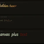 Font-Based Handwriting Text Animation for the Web – Tegaki
 Advanced Typewriter Animation Library – TypeFX.js
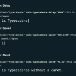 Natural Typing Animations In JavaScript – Typecadence
 Animate Text Using SVG Font – svg-text-animate.js
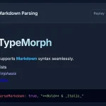 Text Typing Animations with Real-time Markdown/HTML Rendering – TypeMorph