


| Author: | pandeyAmit4 |
|---|---|
| Views Total: | 185 views |
| Official Page: | Go to website |
| Last Update: | February 22, 2025 |
| License: | MIT |
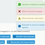
Preview:

Description:
ToastfierJS is a lightweight JavaScript library that adds non-intrusive toast notifications to web applications with full control over positioning, themes, and accessibility. It runs without external dependencies and integrates smoothly with any JavaScript project.
The generated Toast notifications appear based on your configuration settings. Each toast supports automatic stacking, progress bars, hover pausing, and animated transitions. You set the display duration, choose from built-in themes or create custom styles, and control positioning around the viewport edges.
The library prioritizes accessibility through WCAG 2.1 compliance, proper ARIA attributes, keyboard controls, and screen reader support. It also respects user preferences, such as reduced motion settings.
How to use it:
1. Install ToastfierJS using npm:
# NPM
$ npm install js-toast-notifier
2. Import the necessary modules into your JavaScript file:
import ToastNotifier from 'js-toast-notifier';
import "js-toast-notifier/dist/toast.css"
3. If you prefer not to include files directly in your project, you can load these links in your HTML file:
<link rel="stylesheet" href="/dist/toast.css">
<script src="/dist/index.umd.js"></script>
4. Create a new toast intance.
const toast = new ToastNotifier();
5. Then you can create various types of toast notifications with the following methods:
toast.show('Basic Toast');
toast.success('Success Toast');
toast.error('Error Toast');
toast.info('Info Toast');
toast.warning('Warning Toast');
6. Customize the default behavior of all toasts by passing an options object when initializing ToastNotifier:
- position: Sets the initial position of the toast notifications. Available options are ‘top’, ‘bottom’, ‘left’, ‘right’, ‘top-left’, ‘top-right’, ‘bottom-left’, ‘bottom-right’. The default is ‘top-right’.
- timeout: Specifies how long a toast remains visible in milliseconds. Setting this to 0 prevents the toast from automatically closing. The default is 5000.
- theme: Determines the visual theme of the toasts. You can choose between the built-in ‘light’ or ‘dark’ themes, or provide a custom theme object. The default is ‘light’.
- showCloseButton: A boolean value that controls whether a close button is displayed on each toast. The default is true.
- pauseOnHover: When set to true, the toast’s timeout timer will pause when the user hovers their mouse over the notification. The default is true.
- showProgress: A boolean value to show or hide a progress bar at the top of the toast, indicating the remaining time before it closes. The default is true.
- progressHeight: Sets the height of the progress bar. The default is ‘4px’.
- progressColor: Sets the color of the progress bar.
- progressBackground: Sets the background color of the progress bar.
- customContainerClass: Adds custom CSS classes to the main toast container element.
const toast = new ToastNotifier({
  position: 'top-right',
  timeout: 5000,
  theme: 'light',
  showCloseButton: true,
  pauseOnHover: true,
  showProgress: true,
  progressHeight: '4px',
  progressColor: '#fff',
  progressBackground: 'rgba(255, 255, 255, 0.2)'
  customContainerClass: 'class1 class2'
});
7. You can further customize individual toasts by passing an options object to the show, success, error, info, and warning methods:
toast.show('Custom Toast', {
  anchor: document.getElementById('myElement'),
  customClass: 'myClass',
  // more options here
});
8. Dimiss all activated toasts:
toast.destroy();
9. You can further customize the appearance of your toasts by writing your own CSS rules. For example, target the .toast class for general toast styling and .toast-progress for styling the progress bar.
.toast {
  /* Your custom styles */
}
/* Custom progress bar */
.toast-progress {
  --progress-height: 6px;
  --progress-color: #00ff00;
  --progress-background: rgba(0, 0, 0, 0.2);
}
/* Custom animation on hover */
.toast:hover {
  transform: scale(1.05);
}
Changelog:
v1.0.14 (02/22/2025)
- add custom container class and optimize animation handling
v1.0.12 (01/11/2025)
- Bugfixes
See Also:
 Customizable JS Toast Notification System with Themes – ChangeAlert
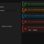 Beautiful Toast Notifications with 40+ Themes – ButterPop.js
 Customizable Growl/Toast Alerts with LocalNotification.js
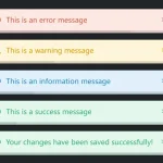 Pure JS Notification System Inspired by Bootstrap 5 – ZephyrToast
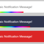 Auto-dismissable Notification Popup With Progress Bar – Notification.js
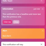 Create Bootstrap 5 Toasts Dynamically – bootstrap-show-toast
 Developer-Friendly Toast Alerts in JavaScript – Toast-JS
 Simple Interactive Snackbar & Toast Notification In Vanilla JavaScript – notifyjs