


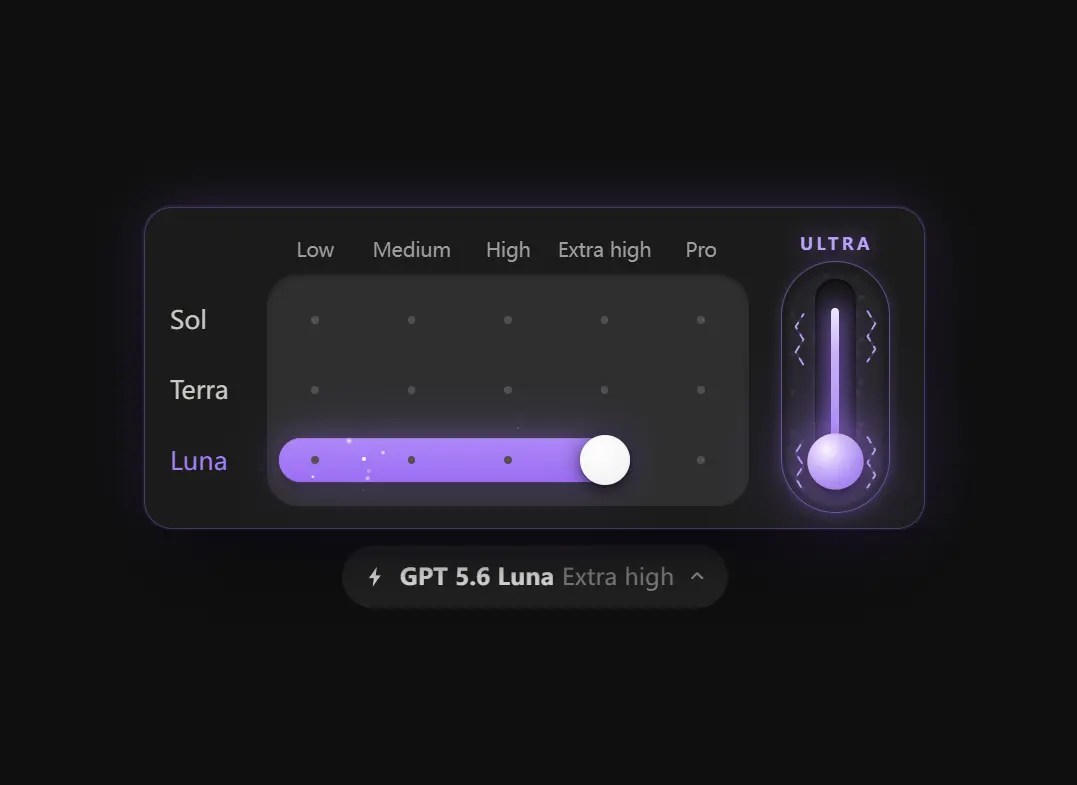
Model Picker is a Web Component that adds an animated AI model and reasoning effort selector to your webpage. The picker popover combines three model rows, five effort tiers, and a separate Ultra lever inside one compact control.
The matrix responds to clicks, horizontal scrubbing, vertical drag handoff, touch input, and arrow-key navigation. Its trigger label updates after each committed selection, while the `change` event exposes the selected model, tier, and Ultra state.
The component supplies UI state only. Connect that state to your own API, form, or application store. The built-in GPT 5.6, Sol, Terra, and Luna labels require source edits when they do not match your product.
See it in Action:
Features:
- Three model rows with five reasoning-effort levels per row.
- Horizontal pointer scrubbing across effort levels.
- Vertical drag handoff between model rows.
- Separate click-and-drag Ultra mode lever.
- Reflected HTML attributes for model, tier, Ultra, and panel state.
- Mouse, touch, and keyboard interaction.
- Open Shadow DOM with encapsulated layout and visual effects.
- Automatic reduced-motion behavior.
Keyboard Interactions:
ArrowLeftandArrowRightmove between effort tiers.ArrowUpandArrowDownmove between model rows.SpaceandEntertoggle Ultra mode while the lever has focus.Escapecloses the panel.- Clicking or tapping outside the component also closes the panel.
How to use it:
1. Download and load the web component as a module in your document.
<script type="module" src="./model-picker.js"></script>
2. Add the custom element to the page:
<model-picker id="reasoning-picker"></model-picker>
3. The component registers the <model-picker> element when the module loads. No initialization function is required. A committed selection produces an event payload in this format:
{
  model: 'sol',
  tierIndex: 2,
  tier: 'High',
  ultra: false,
  label: 'GPT 5.6 Sol High'
}
4. Define the starting model, effort tier, Ultra state, and panel state through HTML attributes:
model(String): Selectssol,terra, orluna. The default value issol. An unsupported value resets the component tosol.tier(Number-like attribute): Selects an effort level from0through4. The default value is2, which represents High. The component rounds numeric values and clamps them to the supported range.ultra(Boolean attribute): Activates the Ultra lever and its visual state when present.open(Boolean attribute): Opens the selection panel when present.value(Object, read-only property): Returns the currentmodel,tierIndex,tier, andultrastate.
<model-picker
  model="terra"
  tier="4"
  ultra
  open>
</model-picker>
5. Read the current selection from JavaScript:
const picker = document.querySelector('#reasoning-picker');
console.log(picker.value);
// {
//   model: 'sol',
//   tierIndex: 2,
//   tier: 'High',
//   ultra: false
// }
6. The component reflects its state through attributes. Change those attributes to update the interface:
const picker = document.querySelector('#reasoning-picker');
// Select Luna.
picker.setAttribute('model', 'luna');
// Select Extra high.
picker.setAttribute('tier', '3');
// Activate Ultra mode.
picker.toggleAttribute('ultra', true);
console.log(picker.value);
7. Open and Close the picker:
const picker = document.querySelector('#reasoning-picker');
// Open the panel and move focus to the selected grid cell.
picker.open();
// Close the panel and restore focus when appropriate.
picker.close();
8. The component dispatches change after a user selects a model or tier, completes a drag interaction, or toggles Ultra mode.
const picker = document.querySelector('#reasoning-picker');
picker.addEventListener('change', function (event) {
  const selection = event.detail;
  console.log(selection.model);
  console.log(selection.tierIndex);
  console.log(selection.tier);
  console.log(selection.ultra);
  console.log(selection.label);
});
9. Model Picker does not submit a native form value. Store its state in a hidden input when the selection belongs to a standard form:
<form id="ai-request-form">
  <model-picker id="request-model"></model-picker>
  <input
    type="hidden"
    id="reasoning-config"
    name="reasoningConfig"
  >
  <button type="submit">Run Request</button>
</form>
const picker = document.querySelector('#request-model');
const hiddenInput = document.querySelector('#reasoning-config');
function syncReasoningConfig() {
hiddenInput.value = JSON.stringify(picker.value);
}
syncReasoningConfig();
picker.addEventListener('change', syncReasoningConfig);Alternatives:
- AI Model Effort Selector with Magnetic Step Slider – ChatGPT Model Selector
- Claude-Style Effort Slider Web Component – Claude Model Selector
- Accessible Range Slider Custom Element
- Touch-enabled Custom Range Slider Web Component – ToolCool Range Slider
- Build Custom Circular Range Sliders with CircularRange Web Component
FAQs:
Q: Does Model Picker require jQuery or another framework?
A: No. It registers as a native custom element and has no runtime dependency on jQuery, React, Vue, or another UI framework.
Q: Why does the component fail when I open the HTML file directly?
A: The browser blocks the ES module under a file:// URL. Start a local HTTP server and confirm that the path to model-picker.js is correct.
Q: Can I replace Sol, Terra, Luna, and GPT 5.6 with real model names?
A: Yes. Edit the MODELS and FAMILY constants, or keep the visible labels and map their IDs inside your application code.
Q: Will Model Picker submit its value with an HTML form?
A: No. The custom element is not form-associated. Copy picker.value into a hidden input before submission.
See Also:
 Tiny Touch Carousel Web Component for Modern Apps – Pure Swipe Slider
 Custom Media Player Controls Using Web Components – media-chrome
 Embed Mastodon Posts with mastodon-post Web Component
 Animate Falling Font Awesome Icons Web Component – icon-fall
 loadersz: 160 Canvas Loading Animations for the Web
 Cally Calendar Components for Date Pickers & Ranges
 liquid-glass.js: iOS Liquid Glass Web Component with SVG & WebGL
 Loopem: Drag & Snap Picker/Carousel Library for Vanilla JS