


An animated rating bar with support for half star rating, built using radio buttons and CSS/CSS3.
How to use it:
1. The rating uses Font Awesome for star symbols.
<link rel="stylesheet" href="/path/to/cdn/font-awesome.min.css" />
2. Add radio buttons to the rating container. For example, you can create 10 radio buttons for a 5-star rating system.
<div class="rating">
  <input type="radio" name="html">
  <input type="radio" name="html">
  <input type="radio" name="html">
  <input type="radio" name="html">
  <input type="radio" name="html">
  <input type="radio" name="html">
  <input type="radio" name="html">
  <input type="radio" name="html">
  <input type="radio" name="html">
  <input type="radio" name="html">
</div>
3. The CSS to transform the radio buttons into rating stars.
.rating{
  position: relative;
  display: flex;
  margin: 10px 0;
  flex-direction: row-reverse ;
}
.rating input{
  position: relative;
  width: 20px;
  height: 40px;
  display: flex;
  justify-content: center;
  align-items: center;
  -webkit-appearance: none;
  appearance: none;
  overflow: hidden;
}
.rating input::before{
  content: '\f005';
  position: absolute;
  font-family: fontAwesome;
  font-size: 34px;
  position: absolute;
  left: 4px;
  color: #030b0f;
  transition: 0.5s;
}
.rating input:nth-child(2n + 1)::before{
  right: 4px;
  left: initial;
}
.rating input:hover ~ input::before,
.rating input:hover::before,
.rating input:checked ~ input::before,
.rating input:checked::before{
  color: #1f9cff;
}
See Also:
 Five-Star Rating Web Component in JavaScript
 Select Box Based Star Rating JavaScript Library – star-rating.js
 Customizable 5-Star Rating System In Pure CSS/SCSS
 Tiny Star Rating System In Vanilla JavaScript
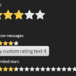 Interactive Star Rating Component With Pure JavaScript – rater-js
 Accessible Star Rating Control Using Radio Buttons
 Simple HTML5 Star Rating System – SimpleStarRating.js
 Pure JavaScript Star Rating Library – JavaScript-Rating