


star-rating.js is a small JavaScript library to generate a customizable, progressively enhancement star rating control from a regular select box with numeric values.
How to use it:
1. Create a select box for your star rating system.
<select class="star-rating">
    <option value="">Select a rating</option>
    <option value="5">Excellent</option>
    <option value="4">Very Good</option>
    <option value="3">Average</option>
    <option value="2">Poor</option>
    <option value="1">Terrible</option>
</select>
2. Install & download the star-rating.js.
# Yarn
$ yarn add star-rating.js
# NPM
$ npm install star-rating.js --save
3. Load necessary JavaScript and CSS files in the document.
<link href="dist/star-rating.css" rel="stylesheet" />
<script src="dist/star-rating.min.js"></script>
4. Initialize the library on the select box and done.
var starRatingControl = new StarRating( '.star-rating' );
5. Set the maximum number of stars allowed to select. Default: 10.
var starRatingControl = new StarRating('.star-rating',{
    maxStars: 5
});
6. Determine whether or not to show the label next to the star rating control. String or boolean.
var starRatingControl = new StarRating('.star-rating',{
    tooltip: 'Select a Rating',
});
7. Determine whether or not to clear the rating by clicking on the selected stars. Default: true.
var starRatingControl = new StarRating('.star-rating',{
    clearable: false
});
8. Add an SVG image to each star value instead of using the background images in the CSS.
var starRatingControl = new StarRating('.star-rating',{
    stars: function (el, item, index) {
      el.innerHTML = '<svg xmlns="http://www.w3.org/2000/svg" viewBox="0 0 24 24"><rect class="gl-star-full" width="19" height="19" x="2.5" y="2.5"/><polygon fill="#FFF" points="12 5.375 13.646 10.417 19 10.417 14.665 13.556 16.313 18.625 11.995 15.476 7.688 18.583 9.333 13.542 5 10.417 10.354 10.417"/></svg>';
    },
});
9. Determine whether to enable the rebuild mode. If set to true, only the event listeners will be added and no DOM manipulation will take place. You will need to ensure that the DOM looks something like this:
var starRatingControl = new StarRating('.star-rating',{
    prebuilt: true
});
<span class="gl-star-rating">
<select>
<option value="">Select a rating</option>
<option value="5">5 Stars</option>
<option value="4">4 Stars</option>
<option value="3">3 Stars</option>
<option value="2">2 Stars</option>
<option value="1">1 Star</option>
</select>
<span class="gl-star-rating--stars">
<span data-value="1"></span>
<span data-value="2"></span>
<span data-value="3"></span>
<span data-value="4"></span>
<span data-value="5"></span>
</span>
</span>10. Default CSS classes.
var starRatingControl = new StarRating('.star-rating',{
    classNames: {
      active: 'gl-active',
      base: 'gl-star-rating',
      selected: 'gl-selected',
    },
});
11. You can also pass the options object to the data-options in your select element.
<select class="star-rating" data-options='{"clearable":false}'>
  ...
</select>
12. Destroy & re-init the star rating control.
starRatingControl.destroy();
starRatingControl.rebuild();
13. Override the default CSS styles.
:root {
  --gl-star-color: #fdd835;
  --gl-star-color-inactive: #dcdce6;
  --gl-star-empty: url(../img/star-empty.svg);
  --gl-star-full: url(../img/star-full.svg);
  --gl-star-size: 24px;
  --gl-tooltip-border-radius: 4px;
  --gl-tooltip-font-size: 0.875rem;
  --gl-tooltip-font-weight: 400;
  --gl-tooltip-line-height: 1;
  --gl-tooltip-margin: 12px;
  --gl-tooltip-padding: .5em 1em;
  --gl-tooltip-size: 6px;
}
Changelog:
v4.3.0 (08/07/2022)
- Fixed left/right keydown events
- Optimised CSS
v4.2.5 (07/31/2022)
- Fixed active index when stars have gaps between them
v4.1.3 – 4.2.3 (06/04/2022)
- Disabled pointer-events on tooltip
- Fixed focus state with pointer events
- Fixed selected index on reset
- Added a data-rating attribute on the widget which holds the transient/selected rating
- Perform a complete teardown on destroy allowing a rebuild from the selector in a new DOM
- Fixed rebuild function
v4.1.2 (02/24/2021)
- Fixed error when initialising more than once
v4.1.1 (02/15/2021)
- Removed v3 compatibility mode when using the
prebuiltoption
v4.1.0 (02/14/2021)
- Added the prebuilt option
v4.0.6 (02/06/2021)
- Remove the focus from being triggered entirely as it caused to many problems on ios
v4.0.5 (02/03/2021)
- Fixed an invalid change event from being triggered by the reset event
v4.0.4 (02/03/2021)
- Export a babel-transpiled commonjs module
v4.0.3 (01/30/2021)
- Fixed rollup config to support optional-chaining in babel
v4.0.2 (01/24/2021)
- Fixed compatibility mode (when
'function' !== typeof options.stars) - Removed trigger of change event after init as this could trigger unwanted validation
v4.0.1 (01/23/2021)
- Fixed the change event for disabled SELECT elements
See Also:
 Five-Star Rating Web Component in JavaScript
 Customizable 5-Star Rating System In Pure CSS/SCSS
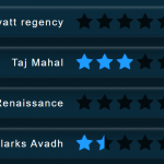 CSS Only Animated Rating Bar
 Tiny Star Rating System In Vanilla JavaScript
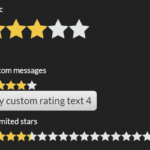 Interactive Star Rating Component With Pure JavaScript – rater-js
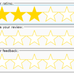 Accessible Star Rating Control Using Radio Buttons
 Simple HTML5 Star Rating System – SimpleStarRating.js
 Pure JavaScript Star Rating Library – JavaScript-Rating