


This is a pure CSS solution to create an easy accessible star rating control using radio buttons and SVG star symbols.
You can adjust the rating value with mouse hover & move and/or left & right arrow keys.
See also:
How to use it:
Create 5 radio buttons for the star rating control.
<fieldset class="star-rating">
  <legend class="star-rating__title">Your rating:</legend>
  <div class="star-rating__stars">
    <input class="star-rating__input" type="radio" name="rating" value="1" id="rating-1" />
    <label class="star-rating__label" for="rating-1" aria-label="One"></label>
    <input class="star-rating__input" type="radio" name="rating" value="2" id="rating-2" />
    <label class="star-rating__label" for="rating-2" aria-label="Two"></label>
    <input class="star-rating__input" type="radio" name="rating" value="3" id="rating-3" />
    <label class="star-rating__label" for="rating-3" aria-label="Three"></label>
    <input class="star-rating__input" type="radio" name="rating" value="4" id="rating-4" />
    <label class="star-rating__label" for="rating-4" aria-label="Four"></label>
    <input class="star-rating__input" type="radio" name="rating" value="5" id="rating-5" />
    <label class="star-rating__label" for="rating-5" aria-label="Five"></label>
    <div class="star-rating__focus"></div>
  </div>
</fieldset>
The necessary CSS/CSS3 styles for the star rating control.
.star-rating__stars {
  position: relative;
  height: 5rem;
  width: 25rem;
  background: url(off.svg);
  background-size: 5rem 5rem;
}
.star-rating__label {
  position: absolute;
  height: 100%;
  background-size: 5rem 5rem;
}
.star-rating__input {
  margin: 0;
  position: absolute;
  height: 1px; width: 1px;
  overflow: hidden;
  clip: rect(1px, 1px, 1px, 1px);
}
.star-rating__stars .star-rating__label:nth-of-type(1) {
  z-index: 5;
  width: 20%;
}
.star-rating__stars .star-rating__label:nth-of-type(2) {
  z-index: 4;
  width: 40%;
}
.star-rating__stars .star-rating__label:nth-of-type(3) {
  z-index: 3;
  width: 60%;
}
.star-rating__stars .star-rating__label:nth-of-type(4) {
  z-index: 2;
  width: 80%;
}
.star-rating__stars .star-rating__label:nth-of-type(5) {
  z-index: 1;
  width: 100%;
}
.star-rating__input:checked + .star-rating__label,
.star-rating__input:focus + .star-rating__label,
.star-rating__label:hover {
  background-image: url(on.svg);
}
.star-rating__label:hover ~ .star-rating__label {
  background-image: url(off.svg);
}
.star-rating__input:focus ~ .star-rating__focus {
  position: absolute;
  top: -.25em;
  right: -.25em;
  bottom: -.25em;
  left: -.25em;
  outline: 0.25rem solid lightblue;
}
See Also:
 Five-Star Rating Web Component in JavaScript
 Select Box Based Star Rating JavaScript Library – star-rating.js
 Customizable 5-Star Rating System In Pure CSS/SCSS
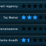 CSS Only Animated Rating Bar
 Tiny Star Rating System In Vanilla JavaScript
 Interactive Star Rating Component With Pure JavaScript – rater-js
 Simple HTML5 Star Rating System – SimpleStarRating.js
 Pure JavaScript Star Rating Library – JavaScript-Rating