


A responsive tabs & accordion JavaScript plugin that works perfectly on desktop, tablet, and mobile.
The tabs transform to an accordion when it reaches a CSS breakpoint (840px by default).
How to use it:
1. Add the stylesheet vanilla-tabs.min.css and JavaScript vanilla-tabs.min.js to the page.
<link rel="stylesheet" href="dist/vanilla-tabs.min.css" />
<script src="dist/vanilla-tabs.min.js"></script>
2. Create a tabs component from an HTML unordered list.
<ul id="example" class="tabs">
  <li data-title="First tab">
    <h2>Heading 1</h2>
  </li>
  <li data-title="Second tab">
    <h2>Heading 2</h2>
  </li>
  <li data-title="Third tab">
    <h2>Heading 3</h2>
  </li>
</ul>
3. Create a horizontal tabs component.
new VanillaTabs({
    'selector': '#example',
    'type': 'horizontal',
});
4. Create a vertical tabs component.
new VanillaTabs({
    'selector': '#example',
    'type': 'vertical',
});
5. Create an accordion instead.
new VanillaTabs({
    'selector': '#example',
    'type': 'accordion',
});
6. Override the default breakpoint in px.
new VanillaTabs({
    'selector': '#example',
    'type': 'horizontal',
    'responsiveBreak': 468,
});
7. Set the initial tab on init. Default: 0.
new VanillaTabs({
    'selector': '#example',
    'type': 'horizontal',
    'activeIndex': 1, // tab 2
});
See Also:
 Animated Tabs Component In Pure CSS – Tabsy CSS
 Responsive Vertical Tabs For Bootstrap 5/4
 Accessible Tabs & Accordion Component In JavaScript – a11y-accordion-tabs
 Responsive CSS Only Accordion & Tabs Component
 Create A Responsive Tabs Component Using CSS and Radio Input
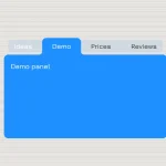 CSS-Only Inverted Corner Tabs With Anchor Positioning
 Convert Sectioned Contents Into Tabs – tinytabs
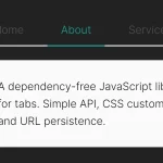 Lightweight Pure JavaScript Tabs With URL Persistence – Tabzy.js