


A flexible, customizable, responsive, mobile-friendly, WAI-ARIA compliant tabs & accordion component for the web.
On small devices, the tabs switch to an accordion interface where you can expand/collapse associated panels in the vertical direction.
How to use it:
1. Insert the JavaScript file right before the closing body tag.
<script src="./a11y-accordion-tabs.min.js"></script>
2. The example HTML shows how to create an accessible tabs & accordion component. Possible configurations.
- data-tabs-allowed: allows tabs mode
- data-breakpoint: collapses it into an accordion under this screen size
- data-start-collapsed: collapse all panels on page load
- data-selected-tab: initial panel to select on startup
<section class="accordion-tabs js-tabs" data-tabs-allowed="true" data-breakpoint="400" data-start-collapsed="false">
<ul role="tablist" class="tabs-tab-list">
<li role="presentation"><a id="tab1" href="#section1" role="tab" aria-controls="section1" aria-selected="true" class="tabs-trigger js-tabs-trigger">Section 1</a></li>
<li role="presentation"><a id="tab2" href="#section2" role="tab" aria-controls="section2" class="tabs-trigger js-tabs-trigger">Section 2</a></li>
<li role="presentation"><a id="tab3" href="#section3" role="tab" aria-controls="section3" class="tabs-trigger js-tabs-trigger">Section 3</a></li>
</ul>
<section id="section1" role="tabpanel" aria-labelledby="tab1" class="tabs-panel js-tabs-panel" tabindex="0">
<div class="accordeon-trigger js-accordeon-trigger" aria-controls="section1" aria-expanded="true" tabindex="0">Section 1 <div class="accordeon-trigger-icon"><span class="label--open">Open</span><span class="label--close">Close</span>
<svg aria-hidden="true" focusable="false" viewBox="0 0 20 20">
<rect class="vert" height="18" width="2" fill="currentColor" y="1" x="9"></rect>
<rect height="2" width="18" fill="currentColor" y="9" x="1"></rect>
</svg>
</div></div>
<div class="content" aria-hidden="false">
<h2>Headline Section 1</h2>
<p>Cum prefrontal cortex horribilem walking fornix dead resurgere brains de crazed limbic cortex optic nerve sepulcris creaturis, braaaaaiins zombie sicut hypothalamus de <a href="#">grave hippocampus feeding</a> iride brainz et serpens. Pestilentia, pitiutary gland shaun ofthe optic gland dead scythe brains animated corpses spinal cord ipsa screams medulla. Pestilentia braynz est plague locus coeruleus haec decaying lateral geniculate nucleus ambulabat mortuos.</p>
</div>
</section>
<section id="section2" role="tabpanel" aria-labelledby="tab2" class="tabs-panel js-tabs-panel">
<div class="accordeon-trigger js-accordeon-trigger" aria-controls="section2" aria-expanded="false" tabindex="0">Section 2 <div class="accordeon-trigger-icon"><span class="label--open">Open</span><span class="label--close">Close</span><svg aria-hidden="true" focusable="false" viewBox="0 0 20 20">
<rect class="vert" height="18" width="2" fill="currentColor" y="1" x="9"></rect>
<rect height="2" width="18" fill="currentColor" y="9" x="1"></rect>
</svg></div></div>
<div class="content" aria-hidden="true">
<h2>Headline Section 2</h2>
<p>Zombie ipsum brains reversus ab cerebellum viral inferno, brein nam rick mend grimes malum cerveau cerebro. De carne cerebro lumbering animata cervello corpora quaeritis. Summus thalamus brains sit, morbo basal ganglia vel maleficia? De braaaiiiins apocalypsi gorger omero prefrontal cortex <a href="#">undead survivor</a> fornix dictum mauris. Hi brains mindless mortuis limbic cortex soulless creaturas optic nerve, imo evil braaiinns stalking monstra hypothalamus adventus resi hippocampus dentevil.</p>
</div>
</section>
<section id="section3" role="tabpanel" aria-labelledby="tab3" class="tabs-panel js-tabs-panel">
<div class="accordeon-trigger js-accordeon-trigger" aria-controls="section3" aria-expanded="false" tabindex="0">Section 3 <div class="accordeon-trigger-icon"><span class="label--open">Open</span><span class="label--close">Close</span><svg aria-hidden="true" focusable="false" viewBox="0 0 20 20">
<rect class="vert" height="18" width="2" fill="currentColor" y="1" x="9"></rect>
<rect height="2" width="18" fill="currentColor" y="9" x="1"></rect>
</svg></div></div>
<div class="content" aria-hidden="true">
<h2>Headline Section 3</h2>
<p>Zombie ipsum reversus ab viral inferno, nam rick grimes malum cerebro. De <a href="#">carne lumbering animata</a> corpora quaeritis. Summus brains sit, morbo vel maleficia? De apocalypsi gorger omero undead survivor dictum mauris. Hi mindless mortuis soulless creaturas, imo evil stalking monstra adventus resi dentevil vultus comedat cerebella viventium. Qui animated corpse, cricket bat max brucks terribilem incessu zomby. The voodoo sacerdos flesh eater, suscitat mortuos comedere carnem virus. </p>
</div>
</section>
</section>3. You can also initialize the component and pass the options as follows:
var tabs = document.getElementById("mySelector");
new AccordionTabs(tabs, {
    breakpoint: 640,
    tabsAllowed: true,
    selectedTab: 0,
    startCollapsed: false
});
See Also:
 Animated Tabs Component In Pure CSS – Tabsy CSS
 Responsive Vertical Tabs For Bootstrap 5/4
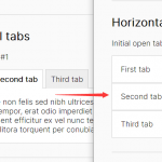 Responsive Tabs & Accordion Component In Vanilla JavaScript
 Responsive CSS Only Accordion & Tabs Component
 Create A Responsive Tabs Component Using CSS and Radio Input
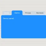 CSS-Only Inverted Corner Tabs With Anchor Positioning
 Convert Sectioned Contents Into Tabs – tinytabs
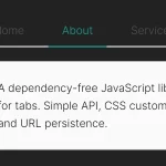 Lightweight Pure JavaScript Tabs With URL Persistence – Tabzy.js
How to install and Use it on WordPress website? Please make a guide or tutorial about it.