


Yet another pure CSS tabs that will be automatically converted into a vertical accordion interface on mobile devices. Based on CSS flexbox and radio/label hacks.
How to use it:
Create tabs and tab panes as follows. In this case, we’re going to use radio inputs to switch between tabs and their content.
<div class="tabs">
  <input type="radio" name="tabs" id="tabone" checked="checked">
  <label for="tabone">Tab One</label>
  <div class="tab">
    <h1>Tab One</h1>
  </div>

  <input type="radio" name="tabs" id="tabtwo">
  <label for="tabtwo">Tab Two</label>
  <div class="tab">
    <h1>Tab Two</h1>
  </div>

  <input type="radio" name="tabs" id="tabthree">
  <label for="tabthree">Tab Three</label>
  <div class="tab">
    <h1>Tab Three</h1>
  </div>

</div>
Style the tabs in the CSS.
.tabs {
  display: -webkit-box;
  display: -webkit-flex;
  display: -ms-flexbox;
  display: flex;
  -webkit-flex-wrap: wrap;
  -ms-flex-wrap: wrap;
  flex-wrap: wrap;
}
.tabs label {
  -webkit-box-ordinal-group: 2;
  -webkit-order: 1;
  -ms-flex-order: 1;
  order: 1;
  display: block;
  padding: 1rem 2rem;
  margin-right: 0.2rem;
  cursor: pointer;
  background: #90CAF9;
  font-weight: bold;
  -webkit-transition: background ease 0.2s;
  transition: background ease 0.2s;
}
.tabs .tab {
  -webkit-box-ordinal-group: 100;
  -webkit-order: 99;
  -ms-flex-order: 99;
  order: 99;
  -webkit-box-flex: 1;
  -webkit-flex-grow: 1;
  -ms-flex-positive: 1;
  flex-grow: 1;
  width: 100%;
  display: none;
  padding: 1rem;
  background: #fafafa;
}
.tabs input[type="radio"] {
  position: absolute;
  opacity: 0;
}
.tabs input[type="radio"]:checked + label { background: #fafafa; }
.tabs input[type="radio"]:checked + label + .tab { display: block; }
Convert the tabs into an accordion when the screen size is less than a specific breakpoint.
@media (max-width: 45em) {
.tabs .tab,  .tabs label {
  -webkit-box-ordinal-group: NaN;
  -webkit-order: initial;
  -ms-flex-order: initial;
  order: initial;
}
.tabs label {
  width: 100%;
  margin-right: 0;
  margin-top: 0.2rem;
}
}
See Also:
 Animated Tabs Component In Pure CSS – Tabsy CSS
 Responsive Vertical Tabs For Bootstrap 5/4
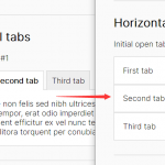 Responsive Tabs & Accordion Component In Vanilla JavaScript
 Accessible Tabs & Accordion Component In JavaScript – a11y-accordion-tabs
 Create A Responsive Tabs Component Using CSS and Radio Input
 CSS-Only Inverted Corner Tabs With Anchor Positioning
 Convert Sectioned Contents Into Tabs – tinytabs
 Lightweight Pure JavaScript Tabs With URL Persistence – Tabzy.js