


@adminuiux/masonry is a vanilla JavaScript library for responsive masonry grids with a fullscreen photo viewer.
It arranges image tiles and cards into staggered columns, including featured items that span multiple columns.
Features
- Aspect-ratio hints for predictable image heights.
- Adjustable gaps and viewport-based column counts.
- Layout updates after images load or the container resizes.
- Dynamic card insertion and column switching.
- Custom lightbox markup and accent colors.
- Recalculation when Bootstrap tabs show auto-initialized galleries.
How to Use It
Installation
Load the browser bundle with Bootstrap 5 CSS and Bootstrap Icons when using the built-in lightbox controls.
<link rel="stylesheet" href="https://cdn.jsdelivr.net/npm/bootstrap/dist/css/bootstrap.min.css">
<link rel="stylesheet" href="https://cdn.jsdelivr.net/npm/bootstrap-icons/font/bootstrap-icons.min.css">
<script defer src="https://cdn.jsdelivr.net/npm/@adminuiux/masonry/dist/masonry.min.js"></script>
For npm projects, install the package and import the ES module build.
npm install @adminuiux/masonry
Basic Usage
The browser build initializes .masonry-container elements on DOM ready. Add .masonry-item to each card and set data-preview="true" to activate the lightbox.
<div class="masonry-container"
     data-columns="3"
     data-gap="16"
     data-preview="true"
     data-thumb-preview="true">
  <div class="masonry-item" data-span="2" data-aspect-ratio="16/9"
       data-caption="Mountain lake" data-category="Landscape">
    <img src="images/lake.jpg" alt="Mountain lake at sunrise">
  </div>
  <div class="masonry-item" data-aspect-ratio="3/4"
       data-caption="City architecture">
    <img src="images/city.jpg" alt="High-rise buildings">
  </div>
  <div class="masonry-item" data-aspect-ratio="1/1"
       data-caption="Desert dunes">
    <img src="images/desert.jpg" alt="Desert sand dunes">
  </div>
</div>
Set Responsive Column Counts
Use data-cols-xs through data-cols-xl for viewport-specific column counts.
<div class="masonry-container"
     data-columns="4"
     data-cols-xs="1"
     data-cols-sm="2"
     data-cols-md="2"
     data-cols-lg="3"
     data-cols-xl="4">
  <div class="masonry-item" data-aspect-ratio="4/3">
    <img src="images/photo-a.jpg" alt="Coastal view">
  </div>
  <div class="masonry-item" data-aspect-ratio="3/4">
    <img src="images/photo-b.jpg" alt="Forest trail">
  </div>
  <div class="masonry-item" data-aspect-ratio="1/1">
    <img src="images/photo-c.jpg" alt="Rock formations">
  </div>
  <div class="masonry-item" data-aspect-ratio="4/3">
    <img src="images/photo-d.jpg" alt="Snowy mountain">
  </div>
</div>
Create a Standalone Lightbox Group
Group standalone image triggers with the same data-gallery-lightbox value.
<div data-gallery-lightbox="product-photos"
     data-caption="Front view" data-thumb-preview="true">
  <img src="images/product-front.jpg" alt="Product front view">
</div>
<div data-gallery-lightbox="product-photos"
     data-caption="Detail view" data-description="Close-up of the finish">
  <img src="images/product-detail.jpg" alt="Product detail view">
</div>
Initialize and Update a Gallery with JavaScript
For manual initialization, use an unmarked container and run the constructor after DOM ready.
<div id="portfolio-gallery">
  <div class="masonry-item" data-aspect-ratio="4/3">
    <img src="images/portfolio-a.jpg" alt="Portfolio photograph">
  </div>
</div>
import { AdminUIUXMasonry } from '@adminuiux/masonry';
function createGallery() {
  const gallery = new AdminUIUXMasonry('#portfolio-gallery', {
    columns: 4,
    gap: 20,
    preview: true,
    thumbPreview: false,
    responsive: { 576: 1, 992: 2, 1200: 3 }
  });
  const card = document.createElement('div');
  card.className = 'masonry-item';
  card.dataset.aspectRatio = '3/4';
  card.dataset.caption = 'New photograph';
  card.innerHTML = '<img src="images/new-photo.jpg" alt="New photograph">';
  gallery.addItem(card);
}
if (document.readyState === 'loading') {
  document.addEventListener('DOMContentLoaded', createGallery, { once: true });
} else {
  createGallery();
}
Open the Lightbox Programmatically
Use AdminUIUXMasonry.openLightbox() with an array of slide objects. Each slide needs a src. Add thumb, title, category, or description as needed.
AdminUIUXMasonry.openLightbox([
  {
    src: 'images/full-1.jpg',
    thumb: 'images/thumb-1.jpg',
    title: 'Cliffside',
    category: 'Travel',
    description: 'A view across the coast.'
  },
  {
    src: 'images/full-2.jpg',
    thumb: 'images/thumb-2.jpg',
    title: 'Harbor',
    category: 'Travel'
  }
], 0, { thumbPreview: true });
All Configuration Options
| Option | Description |
|---|---|
columns | Number of columns. Default: 3. |
gap | Spacing between cards in pixels. Default: 16. |
preview | Enables click-to-open lightbox viewing. Default: false. |
thumbPreview | Shows the lightbox thumbnail strip. Default: true. |
itemSelector | Selector for masonry cards. Default: .adminuiux-masonry-item, .masonry-item. |
responsive | Map of upper-width thresholds to column counts. For example, { 576: 1, 992: 2, 1200: 3 } uses columns from 1200px upward. Default: null. Overrides colsXs through colsXl. |
colsXs | Columns below 576px. Default: 1. |
colsSm | Columns from 576px to 767px. Default: the lesser of 2 and columns. |
colsMd | Columns from 768px to 991px. Default: the lesser of 2 and columns. |
colsLg | Columns from 992px to 1199px. Default: columns. |
colsXl | Columns at 1200px and above. Default: columns. |
HTML Data Attributes
The automatic initializer detects .adminuiux-masonry, .masonry-container, [data-adminuiux-masonry], and [data-masonry].
| Attribute | Description |
|---|---|
data-columns | Main column count. Aliases: data-column, data-cols, data-col. Default: 3. |
data-gap | Item gap in pixels. Default: 16. |
data-responsive | JSON breakpoint map, such as '{"576":1,"992":2,"1200":3}'. |
data-preview | Set to true to activate the grid lightbox. Default: false. |
data-thumb-preview | Set to false to hide thumbnails. Works on containers and individual items. |
data-item-selector | Grid item selector. The positioning CSS targets .adminuiux-masonry-item and .masonry-item. |
data-cols-xs | Column count below 576px. Default: 1. |
data-cols-sm | Column count from 576px to 767px. Default: 2, capped by the base count. |
data-cols-md | Column count from 768px to 991px. Default: 2, capped by the base count. |
data-cols-lg | Column count from 992px to 1199px. Default: 3 when the base count is 3. |
data-cols-xl | Column count from 1200px upward. Default: the base count. |
data-aspect-ratio | Item ratio such as 16/9, 4/3, 1/1, or 3/4. |
data-span | Number of columns occupied by an item. Default: 1. |
data-caption | Lightbox title. Falls back to the image alt text. |
data-category | Lightbox category label. |
data-description | Lightbox description. |
data-src | Full-size lightbox image URL. Falls back to the item’s image source. |
data-gallery-lightbox | Group identifier for standalone lightbox triggers. |
data-lightbox-target | CSS selector for an existing custom lightbox element. Set on a gallery item or standalone trigger. |
Public Methods and Static API
| Method | Description |
|---|---|
gallery.init() | Initializes layout and attaches listeners. The constructor already invokes it; repeated calls add listeners. |
gallery.layout() | Recomputes column positions and container height. |
gallery.refresh() | Calls layout() after changes to existing content. |
gallery.setColumns(cols) | Changes the base count, clears responsive overrides, and recalculates the grid. |
gallery.addItem(elementOrHtml) | Appends an element or HTML string, recalculates layout, and returns the inserted element or null. Use trusted content for HTML strings. |
gallery.destroy() | Disconnects ResizeObserver and removes the window resize listener. Existing markup and lightbox click handlers are retained. |
initMasonry(root) | Scans a document or parent element for marked galleries and standalone triggers. Returns the gallery instances; the default root is document. |
AdminUIUXMasonry.openLightbox(items, index, options) | Opens an array of slide objects from a zero-based index (default 0). options.thumbPreview controls the thumbnail strip. |
AdminUIUXMasonry.closeLightbox() | Closes the active lightbox. |
AdminUIUXMasonry.defaults | Static settings object: { columns: 3, gap: 16, preview: true, thumbPreview: true, itemSelector: '.masonry-item', colsXs: 1, colsSm: 2, colsMd: 2, colsLg: 3, colsXl: 3 }. The constructor calculates its own settings. |
Customize the Lightbox Markup
To customize the lightbox, place #adminuiuxLightboxModal on the page before the first preview opens. The library attaches its controls to the IDs below.
For a different modal ID, set data-lightbox-target="#yourModalId" on the opening grid item or standalone trigger.
<div class="adminuiux-lightbox-modal" id="adminuiuxLightboxModal">
  <div class="backdrop"></div>
  <div class="adminuiux-lightbox-topbar">
    <div class="d-flex align-items-center gap-2">
      <span id="adminuiuxLbCounter" class="adminuiux-lightbox-badge-primary badge">1 / 1</span>
      <span id="adminuiuxLbCategory">Gallery</span>
    </div>
    <div class="d-flex align-items-center gap-2">
      <button type="button" class="adminuiux-lightbox-btn" id="adminuiuxLbZoom" aria-label="Zoom">
        <i class="bi bi-zoom-in"></i>
      </button>
      <a href="#" class="adminuiux-lightbox-btn" id="adminuiuxLbDownload" download aria-label="Download">
        <i class="bi bi-download"></i>
      </a>
      <button type="button" class="adminuiux-lightbox-btn" id="adminuiuxLbFullscreen" aria-label="Fullscreen">
        <i class="bi bi-fullscreen"></i>
      </button>
      <button type="button" class="adminuiux-lightbox-btn" id="adminuiuxLbClose" aria-label="Close">
        <i class="bi bi-x-lg"></i>
      </button>
    </div>
  </div>
  <div class="adminuiux-lightbox-stage" id="adminuiuxLbStage">
    <button type="button" class="adminuiux-lightbox-btn adminuiux-lightbox-nav prev"
            id="adminuiuxLbPrev" aria-label="Previous image">
      <i class="bi bi-chevron-left"></i>
    </button>
    <img class="adminuiux-lightbox-img" id="adminuiuxLbImage" src="" alt="">
    <button type="button" class="adminuiux-lightbox-btn adminuiux-lightbox-nav next"
            id="adminuiuxLbNext" aria-label="Next image">
      <i class="bi bi-chevron-right"></i>
    </button>
  </div>
  <div class="adminuiux-lightbox-bottom">
    <h6 id="adminuiuxLbTitle">Image Preview</h6>
    <p id="adminuiuxLbDesc"></p>
    <div class="adminuiux-lightbox-thumbs" id="adminuiuxLbThumbs"></div>
  </div>
</div>
CSS Customization
Use --adminuiux-primary for lightbox accent colors and --bs-border-radius for image corners.
-root {
  --adminuiux-primary: #df5b27;
  --bs-border-radius: 0.9rem;
}
Alternatives and Related Resources
- Full-featured Vanilla JS Lightbox & Image Gallery – Neiki’s Gallery
- Responsive Masonry Layout Library for Vanilla JS & React – MasonryGrid
- Easy Masonry Layout Web Component – masonry-layout
- Versatile Mobile-friendly Photo Gallery – Natural Gallery JS
See Also:
 Full-featured Vanilla JS Lightbox & Image Gallery – Neiki’s Gallery
 Video/Iframe/Gallery/Inline Content Lightbox Library – Tobii
 Responsive Lightbox Gallery With Pure JavaScript And CSS3 – lightGallery v3
 Accessible Mobile-friendly Image Viewer – SmartPhoto
 Lightbox3: Image Gallery Lightbox with Touch & Zoom Support
 fslightbox: Modern Fullscreen Lightbox For Images & Videos
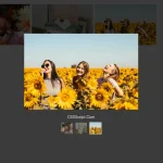 Lightweight Image Gallery With Lightbox Popup – havLightbox
 Modern JavaScript Lightbox with Zoom & Gallery – Zoomora