


Masonry Grid is a lightweight JavaScript library that helps you create fast and responsive masonry-style grid layouts for Vanilla JS & React apps.
The library handles the layout logic through direct DOM manipulation and intelligent reflow calculations. It automatically monitors container size changes using ResizeObserver, recalculates your layout when needed, and positions items using optimized transform properties that won’t trigger expensive repaints.
Features:
- Lightweight at 1.4KB (minified) with zero external dependencies.
- Direct DOM manipulation with optimized reflow algorithms that minimize unnecessary recalculations.
- Responsive behavior that adapts automatically to container size changes via ResizeObserver.
- TypeScript-first implementation with full type support and proper definitions.
- Two layout modes available: standard masonry with gap-filling and balanced masonry with item reordering.
- Works in both vanilla JavaScript and React with matching APIs.
- No CSS framework requirements
Installation:
Choose either the vanilla JavaScript version or the React component version depending on your project setup.
For vanilla JavaScript projects:
npm install @masonry-grid/vanilla
# or
pnpm add @masonry-grid/vanilla
# or
yarn add @masonry-grid/vanilla
For React projects:
npm install @masonry-grid/react
# or
pnpm add @masonry-grid/react
# or
yarn add @masonry-grid/react
Usage (Vanilla JS):
1. Set up your HTML structure with the necessary CSS. The container must be a CSS Grid, and each item needs --width and --height CSS variables to define its aspect ratio.
<div class="masonry" id="grid">
  <div class="frame" style="--width: 1; --height: 1; --color: hsl(15, 70%, 80%)">1</div>
  <div class="frame" style="--width: 2; --height: 3; --color: hsl(45, 70%, 80%)">2</div>
  <div class="frame" style="--width: 3; --height: 2; --color: hsl(75, 70%, 80%)">3</div>
  <div class="frame" style="--width: 4; --height: 3; --color: hsl(105, 70%, 80%)">4</div>
  <div class="frame" style="--width: 3; --height: 4; --color: hsl(135, 70%, 80%)">5</div>
  <div class="frame" style="--width: 1; --height: 1; --color: hsl(165, 70%, 80%)">6</div>
  ...
</div>
2. Import either MasonryGrid for standard gap-filling behavior or BalancedMasonryGrid for intelligently reordered layouts, then pass your container element to the constructor. That’s it.
import { MasonryGrid } from '@masonry-grid/vanilla'
const grid = new MasonryGrid(container)
// OR
import { BalancedMasonryGrid } from '@masonry-grid/vanilla'
const grid = new BalancedMasonryGrid(container)
// Destroy the instance
masonry.destroy()
Usage (React):
1. Import the components and build your layout declaratively:
import { MasonryGrid, Frame } from '@masonry-grid/react'
<MasonryGrid
  frameWidth={200}
  gap={10}
>
  <Frame width={4} height={3}>
    <img src="..." />
  </Frame>
  {/* more frames... */}
</MasonryGrid>
// OR
import { BalancedMasonryGrid, Frame } from '@masonry-grid/react'
<BalancedMasonryGrid
  frameWidth={200}
  gap={10}
>
  <Frame width={4} height={3}>
    <img src="..." />
  </Frame>
  {/* more frames... */}
</BalancedMasonryGrid>
2. Available MasonryGrid props:
frameWidth(number | string): Minimum width of each frame; used to calculate grid-template-columns. Can be a pixel value or CSS string.gap(number | string): Space between grid items; accepts pixel values or CSS units.disabled(boolean): When true, disables all layout transforms and reordering.as(ElementType): Render the container as a different HTML element; defaults to ‘div’.
3. Available Frame props:
width(number): Proportional width for aspect ratio calculation.height(number): Proportional height for aspect ratio calculation.as(ElementType): Render the frame as a different element; defaults to ‘div’.
FAQs:
Q: Does Masonry Grid work with dynamic content that gets added or removed?
A: Yes, completely. MutationObserver tracks DOM changes to your grid, and the library automatically recalculates the layout whenever items are added or removed. You can build infinite scroll galleries or dynamically loaded content without additional setup.
Q: What’s the difference between MasonryGrid and BalancedMasonryGrid?
A: Standard MasonryGrid fills gaps by pulling items up while preserving their original order in the DOM. BalancedMasonryGrid goes further by reordering items within rows using CSS order properties to minimize total grid height. Use BalancedMasonryGrid when you want the most compact visual result; use standard MasonryGrid if DOM order must be preserved visually or when you care more about consistent item positioning.
Q: Does this library support CSS aspect-ratio browser support issues?
A: The library requires CSS aspect-ratio to work correctly, which is supported in all modern browsers. If you need to support older browsers like IE11, you’d need a polyfill, but that’s outside the library’s scope.
Q: How does Masonry Grid handle container width changes on mobile?
A: ResizeObserver handles this automatically. When your container resizes (like viewport rotation or window resize), the library detects the change and recalculates the layout if necessary. If only the width changes but column count stays the same, the percentage-based translations scale proportionally without a full recalculation.
Q: Can I customize the gap between items or grid columns?
A: Yes. In vanilla JavaScript, modify the CSS directly on your .masonry container. In React, pass gap and frameWidth props to control spacing. The frameWidth determines the minimum size for each column via CSS Grid’s minmax function, and gap controls the space between items.
See Also:
 Full-featured Vanilla JS Lightbox & Image Gallery – Neiki’s Gallery
 Responsive Masonry Layouts with CSS Grid and Mason-it.js
 Responsive CSS Masonry Grid Layout – Grid Overflow
 Adaptive Image Gallery With Masonry Grid Layout
 Easy Masonry Layout Web Component – masonry-layout
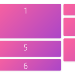 Minimal Masonry Web Layout In Pure JavaScript – MiniMasonry.js
 Responsive Masonry Image Grid In JavaScript
 Easy Responsive Masonry Grid Library – Stackgrid