


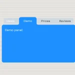
A cool Scifi-style tabs widget which allows to swap between content sections by clicking on the radio button based tabs. Created by aaronchuo.
How to use it:
Create a tabs interface using Html lists and radio buttons as shown below.
<ul class="tabs-demo">
  <li>
    <input type="radio" name="tab" id="tab1" checked>
    <label for="tab1">Tab1</label>
    <div class="section"> Section1 </div>
  </li>
  <li>
    <input type="radio" name="tab" id="tab2">
    <label for="tab2">Tab2</label>
    <div class="section"> Section2 </div>
  </li>
  <li>
    <input type="radio" name="tab" id="tab3">
    <label for="tab3">Tab3</label>
    <div class="section"> Section3 </div>
  </li>
  <li>
    <input type="radio" name="tab" id="tab4">
    <label for="tab4">Tab4</label>
    <div class="section"> Section4 </div>
  </li>
</ul>
The required CSS/CSS3 rules to style the tabs interface and to give the tabs a subtle transition effect on clicked.
.tabs-demo {
 list-style: none;
 position: relative;
 width: 600px;
 margin: 50px auto;
 padding: 0;
 font-size: 18px;
 color: #00bebe;
}
.tabs-demo * {
 -webkit-transition: all 200ms ease-in-out;
 transition: all 200ms ease-in-out;
 outline: none;
}
.tabs-demo :before,
.tabs-demo :after { content: ''; }
.tabs-demo li { display: inline-block; }
.tabs-demo li input[type=radio] {
 filter: progid:DXImageTransform.Microsoft.Alpha(Opacity=0);
 opacity: 0;
 position: absolute;
}
.tabs-demo li input[type=radio]:checked ~ label {
 box-shadow: 0 0 10px #00dcdc;
 background: #00bebe;
 color: #212121;
 height: 50px;
 font-size: 1.2em;
 cursor: default;
}
.tabs-demo li input[type=radio]:checked ~ .section {
 filter: progid:DXImageTransform.Microsoft.Alpha(enabled=false);
 opacity: 1;
 display: block;
 width: 500px;
 padding: 50px;
 border: 1px solid #00bebe;
 color: #00dcdc;
 letter-spacing: .1em;
 text-indent: 1em;
 z-index: 99;
}
.tabs-demo li label {
 border-radius: 5px 5px 0 0;
 display: block;
 width: 120px;
 height: 40px;
 border: 1px solid rgba(0, 190, 190, 0.7);
 border-bottom: 0;
 color: rgba(0, 190, 190, 0.7);
 line-height: 50px;
 text-align: center;
 cursor: pointer;
}
.tabs-demo li label:hover {
 height: 50px;
 border-color: #00bebe;
 color: #00bebe;
}
.tabs-demo li .section {
 filter: progid:DXImageTransform.Microsoft.Alpha(Opacity=0);
 opacity: 0;
 position: absolute;
 top: 51px;
 left: 0;
 width: 1000px;
 padding: 50px;
 border: 1px solid #00bebe;
 background: rgba(0, 190, 190, 0.1);
 color: white;
 letter-spacing: -1em;
 text-indent: 1em;
 z-index: 1;
}
See Also:
 CSS-Only Inverted Corner Tabs With Anchor Positioning
 Animated Tabs Component In Pure CSS – Tabsy CSS
 Convert Sectioned Contents Into Tabs – tinytabs
 Lightweight Pure JavaScript Tabs With URL Persistence – Tabzy.js
 Dynamic External Content Tabs with Quicktabs.js
 Create Accessible Tabs with Pure CSS and Semantic HTML
 Accessible Tabs Component – tab-container
 Simple Fast Vanilla JavaScript Tabs