Morphing Fullscreen Hamburger Menu With Pure HTML/CSS
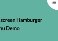
A pure HTML/CSS side navigation that morphs the hamburger toggle button into a fullscreen nav menu using CSS3 transitions and transforms.


A pure HTML/CSS side navigation that morphs the hamburger toggle button into a fullscreen nav menu using CSS3 transitions and transforms.
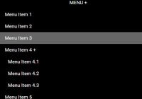
A fully responsive, CSS only multi-level navigation that automatically collapses the regular horizontal menu into a togglable dropdown menu on small screens.

A sidebar navigation that allows to show and hide a fullscreen menu using pure CSS/CSS3.
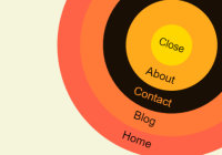
A ring navigation concept built with JavaScript and CSS that all the menu items are absolutely positioned in the circles when toggled.

Luxbar is a CSS library used for creating a responsive, mobile-friendly header navigation that is fully customizable via CSS classes.

A pretty cool app/site navigation which has the ability to morph the hamburger button into a top navigation panel when clicked/taped.
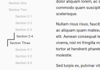
This is a pretty cool side TOC & navigation system which allows to highlight the current nav item with an animated progress line when you scroll through the webpage.

Just another CSS solution to create a sidebar off-canvas navigation using plain HTML and CSS transitions and transforms.
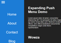
An expanding hamburger menu system that morphs the toggle icon into a sidebar navigation while push the main content to the right.
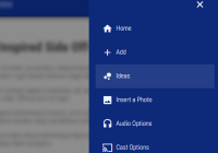
A Material design inspired nav written in ES 6 that enables the user to toggle an off-canvas menu from the edge, while blurring the main content.