


A ring navigation concept built with JavaScript and CSS that all the menu items are absolutely positioned in the circles when toggled.
How to use it:
Code the ring navigation as this:
<nav class="top-right">
  <a class="disc l1">
    <div>Menu 1</div>
  </a>
  <a class="disc l2">
    <div>Menu 2</div>
  </a>
  <a class="disc l3">
    <div>Menu 3</div>
  </a>
  <a class="disc l4">
    <div>Menu 4</div>
  </a>
  <a class="disc l5 toggle">
    Toggle Link
  </a>
</nav>
The primary CSS styles for the ring navigation.
nav {
  display: block;
  position: fixed;
  width: 500px;
  height: 500px;
  -webkit-user-select: none;
  -moz-user-select: none;
  -ms-user-select: none;
  user-select: none;
  -webkit-transform: translate3d(25px, -25px, 0);
  transform: translate3d(25px, -25px, 0);
  -webkit-transition: -webkit-transform 0.5s cubic-bezier(0.3, 1.4, 0.5, 0.9);
  transition: -webkit-transform 0.5s cubic-bezier(0.3, 1.4, 0.5, 0.9);
  transition: transform 0.5s cubic-bezier(0.3, 1.4, 0.5, 0.9);
  transition: transform 0.5s cubic-bezier(0.3, 1.4, 0.5, 0.9), -webkit-transform 0.5s cubic-bezier(0.3, 1.4, 0.5, 0.9);
}
nav.open {
  -webkit-transform: translate3d(0, 0, 0);
  transform: translate3d(0, 0, 0);
}
nav.top-right {
  top: -140px;
  right: -140px;
}
.disc {
  position: absolute;
  display: inline-block;
  text-align: center;
  cursor: pointer;
  font: 25px Alegreya Sans, sans-serif;
  line-height: 40px;
  padding-top: 10px;
  border-radius: 250px;
  -webkit-transform: scale3d(0.5, 0.5, 0.5) rotate3d(0, 0, 1, 200deg);
  transform: scale3d(0.5, 0.5, 0.5) rotate3d(0, 0, 1, 200deg);
  pointer-events: none;
  opacity: 0;
  cursor: pointer;
  -webkit-transition: opacity 0.5s, -webkit-transform 0.5s cubic-bezier(0.3, 1.4, 0.5, 0.9);
  transition: opacity 0.5s, -webkit-transform 0.5s cubic-bezier(0.3, 1.4, 0.5, 0.9);
  transition: transform 0.5s cubic-bezier(0.3, 1.4, 0.5, 0.9), opacity 0.5s;
  transition: transform 0.5s cubic-bezier(0.3, 1.4, 0.5, 0.9), opacity 0.5s, -webkit-transform 0.5s cubic-bezier(0.3, 1.4, 0.5, 0.9);
}
.disc div {
  -webkit-transform: rotate(180deg);
  transform: rotate(180deg);
}
.open .disc {
  pointer-events: auto;
  opacity: 1;
}
.l1 {
  top: 0px;
  left: 0px;
  right: 0px;
  bottom: 0px;
  background: tomato;
  -webkit-transition-delay: 0s;
  transition-delay: 0s;
}
Style the menu items.
.open .l1 {
  -webkit-transition-delay: 0s;
  transition-delay: 0s;
  -webkit-transform: scale3d(1, 1, 1) rotate3d(0, 0, 1, 200deg);
  transform: scale3d(1, 1, 1) rotate3d(0, 0, 1, 200deg);
  opacity: 1;
}
.open .l1:hover {
  background: #1a0a07;
  color: tomato;
  -webkit-transition-delay: 0s;
  transition-delay: 0s;
}
.open .l1:active {
  background: #803224;
  color: tomato;
}
.open .l1.toggle {
  -webkit-transform: scale3d(0.9, 0.9, 0.9) rotate3d(0, 0, 1, 20deg);
  transform: scale3d(0.9, 0.9, 0.9) rotate3d(0, 0, 1, 20deg);
}
.l2 {
  top: 50px;
  left: 50px;
  right: 50px;
  bottom: 50px;
  background: #ff7a39;
  -webkit-transition-delay: 0.1s;
  transition-delay: 0.1s;
}
.open .l2 {
  -webkit-transition-delay: 0.1s;
  transition-delay: 0.1s;
  -webkit-transform: scale3d(1, 1, 1) rotate3d(0, 0, 1, 200deg);
  transform: scale3d(1, 1, 1) rotate3d(0, 0, 1, 200deg);
  opacity: 1;
}
.open .l2:hover {
  background: #1a0c06;
  color: #ff7a39;
  -webkit-transition-delay: 0s;
  transition-delay: 0s;
}
.open .l2:active {
  background: #803d1d;
  color: #ff7a39;
}
.open .l2.toggle {
  -webkit-transform: scale3d(0.9, 0.9, 0.9) rotate3d(0, 0, 1, 20deg);
  transform: scale3d(0.9, 0.9, 0.9) rotate3d(0, 0, 1, 20deg);
}
.l3 {
  top: 100px;
  left: 100px;
  right: 100px;
  bottom: 100px;
  background: #ff912b;
  -webkit-transition-delay: 0.2s;
  transition-delay: 0.2s;
}
.open .l3 {
  -webkit-transition-delay: 0.2s;
  transition-delay: 0.2s;
  -webkit-transform: scale3d(1, 1, 1) rotate3d(0, 0, 1, 200deg);
  transform: scale3d(1, 1, 1) rotate3d(0, 0, 1, 200deg);
  opacity: 1;
}
.open .l3:hover {
  background: #1a0f04;
  color: #ff912b;
  -webkit-transition-delay: 0s;
  transition-delay: 0s;
}
.open .l3:active {
  background: #804916;
  color: #ff912b;
}
.open .l3.toggle {
  -webkit-transform: scale3d(0.9, 0.9, 0.9) rotate3d(0, 0, 1, 20deg);
  transform: scale3d(0.9, 0.9, 0.9) rotate3d(0, 0, 1, 20deg);
}
.l4 {
  top: 150px;
  left: 150px;
  right: 150px;
  bottom: 150px;
  background: #ffa91c;
  -webkit-transition-delay: 0.3s;
  transition-delay: 0.3s;
}
.open .l4 {
  -webkit-transition-delay: 0.3s;
  transition-delay: 0.3s;
  -webkit-transform: scale3d(1, 1, 1) rotate3d(0, 0, 1, 200deg);
  transform: scale3d(1, 1, 1) rotate3d(0, 0, 1, 200deg);
  opacity: 1;
}
.open .l4:hover {
  background: #1a1103;
  color: #ffa91c;
  -webkit-transition-delay: 0s;
  transition-delay: 0s;
}
.open .l4:active {
  background: #80550e;
  color: #ffa91c;
}
.open .l4.toggle {
  -webkit-transform: scale3d(0.9, 0.9, 0.9) rotate3d(0, 0, 1, 20deg);
  transform: scale3d(0.9, 0.9, 0.9) rotate3d(0, 0, 1, 20deg);
}
Style menu toggle button.
.l5 {
  top: 200px;
  left: 200px;
  right: 200px;
  bottom: 200px;
  background: #ffc00e;
  -webkit-transition-delay: 0.4s;
  transition-delay: 0.4s;
}
.open .l5 {
  -webkit-transition-delay: 0.4s;
  transition-delay: 0.4s;
  -webkit-transform: scale3d(1, 1, 1) rotate3d(0, 0, 1, 200deg);
  transform: scale3d(1, 1, 1) rotate3d(0, 0, 1, 200deg);
  opacity: 1;
}
.open .l5:hover {
  background: #1a1301;
  color: #ffc00e;
  -webkit-transition-delay: 0s;
  transition-delay: 0s;
}
.open .l5:active {
  background: #806007;
  color: #ffc00e;
}
.open .l5.toggle {
  -webkit-transform: scale3d(0.9, 0.9, 0.9) rotate3d(0, 0, 1, 20deg);
  transform: scale3d(0.9, 0.9, 0.9) rotate3d(0, 0, 1, 20deg);
}
.toggle {
  line-height: 100px;
  padding: 0;
  width: 100px;
  background: gold;
  opacity: 1;
  -webkit-transform: none;
  transform: none;
  pointer-events: auto;
  -webkit-transition-delay: 0s;
  transition-delay: 0s;
}
.open .toggle {
  -webkit-transform: rotate3d(0, 0, 1, 0deg);
  transform: rotate3d(0, 0, 1, 0deg);
}
.toggle:hover {
  background: #1a1600;
  color: gold;
}
.toggle:active {
  background: #806c00;
  color: rgba(255, 215, 0, 0.5);
  -webkit-transform: scale(0.9);
  transform: scale(0.9);
  -webkit-transition-duration: 0s;
  transition-duration: 0s;
}
Active the ring navigation by toggling the CSS classes with a little bit of JavaScript:
toggle = document.querySelectorAll(".toggle")[0];
nav = document.querySelectorAll("nav")[0];
toggle_open_text = 'Menu';
toggle_close_text = 'Close';
toggle.addEventListener('click', function() {
	nav.classList.toggle('open');

  if (nav.classList.contains('open')) {
    toggle.innerHTML = toggle_close_text;
  } else {
    toggle.innerHTML = toggle_open_text;
  }
}, false);
See Also:
 Pure CSS Radial Menu with Native Select Element
 Expanding Spiral Menu With JavaScript And CSS3
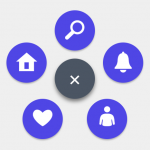 Rotating Circle Menu With JavaScript And CSS – Pentagon Menu
 Beautiful Radial Popup Menu With JavaScript And CSS
 Radial Toggle Menu With JavaScript And CSS3
 Path-style Animated Radial Menu – BloomingMenu.js
 Lightweight JavaScript Round Menu Library – radial.js
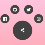 Radial Popup Menu In Pure CSS – Circle Menu