


A pretty cool app/site navigation which has the ability to morph the hamburger button into a top navigation panel when clicked/taped. Built using pure CSS and CSS3 animations.
How to use it:
Create the navigation menu:
<nav class="nav">
  <a class="nav-item" href="#">Home</a>
  <a class="nav-item" href="#">Blog</a>
  <a class="nav-item" href="#">About</a>
  <a class="nav-item" href="#">Contact</a>
</nav>
Create the hamburger style menu toggle button using checkbox and label elements as this:
<!-- This checkbox will give us the toggle behavior, it will be hidden, but functional -->
<input id="toggle" type="checkbox">
<!-- IMPORTANT: Any element that we want to modify when the checkbox state changes go here, being "sibling" of the checkbox element -->
<!-- This label is tied to the checkbox, and it will contain the toggle "buttons" -->
<label class="toggle-container" for="toggle">
  <!-- If menu is open, it will be the "X" icon, otherwise just a clickable area behind the hamburger menu icon -->
  <span class="button button-toggle"></span>
</label>
The main CSS styles for the navigation menu.
.nav {
  display: inline-block;
  margin: 25px 25px 20px;
  pointer-events: none;
  -webkit-transition: 0.5s;
  transition: 0.5s;
}
.nav-item {
  position: relative;
  display: inline-block;
  float: left;
  clear: both;
  color: transparent;
  font-size: 14px;
  letter-spacing: -6.2px;
  height: 7px;
  line-height: 7px;
  text-transform: uppercase;
  white-space: nowrap;
  -webkit-transform: scaleY(0.2);
      -ms-transform: scaleY(0.2);
          transform: scaleY(0.2);
  -webkit-transition: 0.5s, opacity 1s;
  transition: 0.5s, opacity 1s;
}
.nav-item:nth-child(1) {
  -webkit-transition-delay: 0s;
          transition-delay: 0s;
}
.nav-item:nth-child(1):before {
  -webkit-transition-delay: 0s;
          transition-delay: 0s;
}
.nav-item:nth-child(2) {
  -webkit-transition-delay: 0.05s;
          transition-delay: 0.05s;
}
.nav-item:nth-child(2):before {
  -webkit-transition-delay: 0.05s;
          transition-delay: 0.05s;
}
.nav-item:nth-child(3) {
  -webkit-transition-delay: 0.1s;
          transition-delay: 0.1s;
}
.nav-item:nth-child(3):before {
  -webkit-transition-delay: 0.1s;
          transition-delay: 0.1s;
}
.nav-item:nth-child(4) {
  -webkit-transition-delay: 0.15s;
          transition-delay: 0.15s;
}
.nav-item:nth-child(4):before {
  -webkit-transition-delay: 0.15s;
          transition-delay: 0.15s;
}
.nav-item:nth-child(1) {
  letter-spacing: -8px;
}
.nav-item:nth-child(2) {
  letter-spacing: -7px;
}
.nav-item:nth-child(n + 4) {
  letter-spacing: -8px;
  margin-top: -7px;
  opacity: 0;
}
.nav-item:before {
  position: absolute;
  content: '';
  top: 50%;
  left: 0;
  width: 100%;
  height: 2px;
  background-color: #EC7263;
  -webkit-transform: translateY(-50%) scaleY(5);
      -ms-transform: translateY(-50%) scaleY(5);
          transform: translateY(-50%) scaleY(5);
  -webkit-transition: 0.5s;
  transition: 0.5s;
}
Style the hamburger menu toggle button.
.button-toggle {
  position: absolute;
  display: inline-block;
  width: 20px;
  height: 20px;
  margin: 25px;
  background-color: transparent;
  border: none;
  cursor: pointer;
  border-radius: 100%;
  -webkit-transition: 0.6s;
  transition: 0.6s;
}
.button-toggle:hover {
  box-shadow: 0 0 0 8px rgba(0, 0, 0, 0.1), inset 0 0 0 20px rgba(0, 0, 0, 0.1);
}
.button-toggle:before, .button-toggle:after {
  position: absolute;
  content: '';
  top: 50%;
  left: 0;
  width: 100%;
  height: 2px;
  background-color: #EC7263;
  border-radius: 5px;
  -webkit-transition: 0.5s;
  transition: 0.5s;
}
.button-toggle:before {
  -webkit-transform: translateY(-50%) rotate(45deg) scale(0);
      -ms-transform: translateY(-50%) rotate(45deg) scale(0);
          transform: translateY(-50%) rotate(45deg) scale(0);
}
.button-toggle:after {
  -webkit-transform: translateY(-50%) rotate(-45deg) scale(0);
      -ms-transform: translateY(-50%) rotate(-45deg) scale(0);
          transform: translateY(-50%) rotate(-45deg) scale(0);
}
The toggle functionality.
#toggle {
  display: none;
}
#toggle:checked ~ .toggle-container .button-toggle {
  box-shadow: 0 0 0 550px rgba(0, 0, 0, 0.1), inset 0 0 0 20px rgba(0, 0, 0, 0.1);
}
#toggle:checked ~ .toggle-container .button-toggle:before {
  -webkit-transform: translateY(-50%) rotate(45deg) scale(1);
      -ms-transform: translateY(-50%) rotate(45deg) scale(1);
          transform: translateY(-50%) rotate(45deg) scale(1);
}
#toggle:checked ~ .toggle-container .button-toggle:after {
  -webkit-transform: translateY(-50%) rotate(-45deg) scale(1);
      -ms-transform: translateY(-50%) rotate(-45deg) scale(1);
          transform: translateY(-50%) rotate(-45deg) scale(1);
}
#toggle:checked ~ .nav {
  margin-bottom: 100px;
  pointer-events: auto;
  -webkit-transform: translate(50px, 50px);
      -ms-transform: translate(50px, 50px);
          transform: translate(50px, 50px);
}
#toggle:checked ~ .nav .nav-item {
  color: #EC7263;
  letter-spacing: 0;
  height: 40px;
  line-height: 40px;
  margin-top: 0;
  opacity: 1;
  -webkit-transform: scaleY(1);
      -ms-transform: scaleY(1);
          transform: scaleY(1);
  -webkit-transition: 0.5s, opacity 0.1s;
  transition: 0.5s, opacity 0.1s;
}
#toggle:checked ~ .nav .nav-item:nth-child(1) {
  -webkit-transition-delay: 0.15s;
          transition-delay: 0.15s;
}
#toggle:checked ~ .nav .nav-item:nth-child(1):before {
  -webkit-transition-delay: 0.15s;
          transition-delay: 0.15s;
}
#toggle:checked ~ .nav .nav-item:nth-child(2) {
  -webkit-transition-delay: 0.1s;
          transition-delay: 0.1s;
}
#toggle:checked ~ .nav .nav-item:nth-child(2):before {
  -webkit-transition-delay: 0.1s;
          transition-delay: 0.1s;
}
#toggle:checked ~ .nav .nav-item:nth-child(3) {
  -webkit-transition-delay: 0.05s;
          transition-delay: 0.05s;
}
#toggle:checked ~ .nav .nav-item:nth-child(3):before {
  -webkit-transition-delay: 0.05s;
          transition-delay: 0.05s;
}
#toggle:checked ~ .nav .nav-item:nth-child(4) {
  -webkit-transition-delay: 0s;
          transition-delay: 0s;
}
#toggle:checked ~ .nav .nav-item:nth-child(4):before {
  -webkit-transition-delay: 0s;
          transition-delay: 0s;
}
#toggle:checked ~ .nav .nav-item:before {
  opacity: 0;
}
#toggle:checked ~ .dummy-content {
  padding-top: 30px;
}
#toggle:checked ~ .dummy-content:before {
  background-color: rgba(0, 0, 0, 0.3);
}
See Also:
 Morphing Fullscreen Hamburger Menu With Pure HTML/CSS
 Responsive Sliding Hamburge Menu System
 Simple Sidebar Hamburger Menu In CSS
 Responsive Sidebar Navigation With Hamburger Toggle Button
 Expanding Dropdown Menu In JavaScript
 Hamburger Site Navigation With Menu Rotation
 3D Perspective Hamburger Menu With JavaScript And CSS3
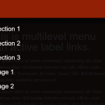 Mobile-friendly Hamburger Navigation With Submenus