


Luxbar is a CSS library used for creating a responsive, mobile-friendly header navigation that is fully customizable via CSS classes.
Installation:
bower install luxbar
How to use it:
Import the Luxbar.css library into your web project.
<link rel="stylesheet" href="hluxbar.css">
The primary HTML structure for the header navigation.
<div class="luxbar LUXBAR-STYLE-NAME">
  <input type="checkbox" id="luxbar-checkbox">
  <div class="luxbar-menu LUXBAR-MENU-COLORSCHEME">
    <ul class="luxbar-navigation">
      <li class="luxbar-header">
          <a class="luxbar-brand" href="#">Logo</a>
          <label class="luxbar-hamburger LUXBAR-ANIMATION-STYLE" for="luxbar-checkbox">
            <span></span>
          </label>
      </li>
      <li class="luxbar-item active"><a href="#">Home</a></li>
      <li class="luxbar-item"><a href="#">About</a></li>
      <li class="luxbar-item"><a href="#">Contact</a></li>
      <li class="luxbar-item"><a href="#">Blog</a></li>
    </ul>
  </div>
</div>
Set the styles of the header navigation using these CSS classes:
- luxbar-default: default style
- luxbar-static: fit the whole window width
- luxbar-fixed: always visible on page scroll
Change the default color scheme:
- luxbar-menu-light
- luxbar-menu-dark
- luxbar-menu-transparent
- luxbar-menu-material-red
- luxbar-menu-material-indigo
- luxbar-menu-material-cyan
- luxbar-menu-material-green
- luxbar-menu-material-amber
- luxbar-menu-material-brown
- luxbar-menu-material-bluegrey
Set the animation type for the hamburger menu toggle on mobile devices.
- luxbar-hamburger-spin
- luxbar-hamburger-doublespin
See Also:
 Responsive Dropdown/Off-canvas Navigation In Vanilla JavaScript – Menue
 Responsive Mobile Menu Using CSS Flexbox – ftwnav
 Flexible Mobile Hamburger Navigation With 4 Styles – Kin Menu
 Pure CSS Sliding Navigation For Mobile
 Multi-level Toggle Responsive Navigation Menu using Pure CSS
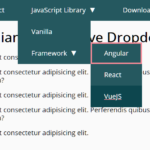 WCAG Compliant Responsive Dropdown Navigation – accessible-menu
 Accessible Dropdown Nav With Vanilla JavaScript – Clicky Menus
 Responsive Accessible Dropdown Menu Template with Vanilla JavaScript