


toggler.js is a multifunctional JavaScript content toggle plugin used to show and hide specific block elements with slide or fade animations.
Features:
- Easy to implement using
dataattributes and CSS classes. - Allows to toggle multiple elements at a time. Ideal for accordions.
- Allows to show a specific element on init.
Basic usage:
Import the toggler.css and toggler.js into your html file.
<link rel="stylesheet" href="css/toggler.css">
<script src="js/toggler.js"></script>
Initialize the toggler plugin and we’re ready to go.
Toggler.Init({
    // options here
});
Enable a toggle button to show/hide your element on click.
<a id="test-button">Test</a>
<div id="test-content">
  content here
</div>
var content = document.getElementById('test-content');
var button = document.getElementById('test-button');
var toggler = new Toggler(content);
toggler.show();
button.addEventListener('click', function (_) {
  return toggler.toggle();
});
You can also implement the toggler plugin via data attributes:
<a data-toggler="toggle" href="#demo">Toggle</a>
<a data-toggler="show" href="#demo">Show</a>
<a data-toggler="hide" href="#demo">Hide</a>
<div class="js-toggler" id="demo">
  content here
</div>
Enable a toggle element to show/hide multiple elements.
<a data-toggler="toggle" data-toggler-target="#1, #demo2" href="#">Toggle</a>
<div class="js-toggler" id="1">
  content here
</div>
<div class="js-toggler" id="2">
  content here
</div>
Create an accordion with this plugin.
<a href="#" data-toggler="toggle" data-toggler-target="#1" data-toggler-collection="#accordion">Accordion 1</a>
<div class="js-toggler is-visible" id="1">
  content here
</div>
<a href="#" data-toggler="toggle" data-toggler-target="#2" data-toggler-collection="#accordion">Accordion 2</a>
<div class="js-toggler" id="2">
  content here
</div>
...
Create a tabs interface with this plugin.
<a href="#1" data-toggler="tabs" data-toggler-collection="#tabs">Tab 1</a>
<a href="#2" data-toggler="tabs" data-toggler-collection="#tabs">Tab 2</a>
<div class="js-toggler is-visible" id="1">
  content here
</div>
<div class="js-toggler" id="2">
  content here
</div>
All default options.
Toggler.Init({
  CLASS_BASE: 'js-toggler',
  CLASS_VISIBLE: 'is-visible',
  CLASS_TARGET_VISIBLE: 'is-target-visible',
  CLASS_TRANSITIONING: 'is-transitioning',
  CLASS_FADE: 'is-fade',
  CLASS_SLIDEFADE: 'is-slidefade',
  DELEGATE_CLICK: false
});
See Also:
 Conditional Content Visibility with show-when Web Component
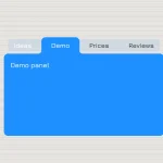 CSS-Only Inverted Corner Tabs With Anchor Positioning
 Conditional Form Fields Web Component – form-show-if
 Animated Tabs Component In Pure CSS – Tabsy CSS
 Convert Sectioned Contents Into Tabs – tinytabs
 Lightweight Pure JavaScript Tabs With URL Persistence – Tabzy.js
 Dynamic External Content Tabs with Quicktabs.js
 Create Accessible Tabs with Pure CSS and Semantic HTML