


Applies an interactive copy to clipboard functionality to any selected text content within the document.
How to use it:
Add the CSS class ‘copy-click’ to any string you want to copy.
<a href="" class="copy-click">Text Here</a>
Define the copy & copied text displayed in the tooltip when hovering over the string.
<a href="" class="copy-click"
   data-tooltip-text="Click To Copy"
   data-tooltip-text-copied="✔ Copied">
   Text Here
</a>
The core JavaScript to activate the copy to clipboard functionality.
const links = document.querySelectorAll('.copy-click');
const cls = {
  copied: 'is-copied',
  hover: 'is-hovered' };

const copyToClipboard = str => {
  const el = document.createElement('input');
  str.dataset.copyString ? el.value = str.dataset.copyString : el.value = str.text;
  el.setAttribute('readonly', '');
  el.style.position = 'absolute';
  el.style.opacity = 0;
  document.body.appendChild(el);
  el.select();
  document.execCommand('copy');
  document.body.removeChild(el);
};
const clickInteraction = e => {
  e.preventDefault();
  copyToClipboard(e.target);
  e.target.classList.add(cls.copied);
  setTimeout(() => e.target.classList.remove(cls.copied), 1000);
  setTimeout(() => e.target.classList.remove(cls.hover), 700);
};
Array.from(links).forEach(link => {
  link.addEventListener('click', e => clickInteraction(e));
  link.addEventListener('keypress', e => {
    if (e.keyCode === 13) clickInteraction(e);
  });
  link.addEventListener('mouseover', e => e.target.classList.add(cls.hover));
  link.addEventListener('mouseleave', e => {
    if (!e.target.classList.contains(cls.copied)) {
      e.target.classList.remove(cls.hover);
    }
  });
});
The example CSS for the tooltip.
.copy-click {
  position: relative;
  padding-bottom: 2px;
  text-decoration: none;
  cursor: copy;
  color: #484848;
  border-bottom: 1px dashed #767676;
  transition: background-color calc(var(--duration) * 2) var(--ease);
}
.copy-click:after {
  content: attr(data-tooltip-text);
  position: absolute;
  bottom: calc(100% + 6px);
  left: 50%;
  padding: 8px 16px;
  white-space: nowrap;
  background-color: white;
  border-radius: 4px;
  box-shadow: 0 0 0 -12px rgba(0, 0, 0, 0);
  pointer-events: none;
  -webkit-backface-visibility: hidden;
          backface-visibility: hidden;
  opacity: 0;
  -webkit-transform: translate(-50%, 12px);
          transform: translate(-50%, 12px);
  transition: box-shadow calc(var(--duration) / 1.5) var(--bounce), opacity calc(var(--duration) / 1.5) var(--bounce), -webkit-transform calc(var(--duration) / 1.5) var(--bounce);
  transition: box-shadow calc(var(--duration) / 1.5) var(--bounce), opacity calc(var(--duration) / 1.5) var(--bounce), transform calc(var(--duration) / 1.5) var(--bounce);
  transition: box-shadow calc(var(--duration) / 1.5) var(--bounce), opacity calc(var(--duration) / 1.5) var(--bounce), transform calc(var(--duration) / 1.5) var(--bounce), -webkit-transform calc(var(--duration) / 1.5) var(--bounce);
}
.copy-click.is-hovered:after {
  box-shadow: 0 4px 8px rgba(0, 0, 0, 0.1);
  opacity: 1;
  -webkit-transform: translate(-50%, 0);
          transform: translate(-50%, 0);
  transition-timing-function: var(--ease);
}
.copy-click.is-copied {
  background-color: yellow;
}
.copy-click.is-copied:after {
  content: attr(data-tooltip-text-copied);
}
See Also:
 Advanced Clipboard Management in JavaScript Clipify.js
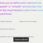 Advanced Clipboard (Copy/Paste/Cut) Management Library – ClipX.js
 Copy to Clipboard Button For Textarea – textToClipboard.js
 Add Extra Information To Copied Content – Copy Text Script
 Copy Image To Clipboard Using JavaScript
 Copy Text Or HTML To Clipboard – CopyJS
 Fast Copy To Clipboard Library – ClipLab
 Simplest Copy To Clipboard Library – simpleCopy