


A pure CSS/CSS3 powered tooltip component which allows you to append popup bubbles to any DOM elements when mouse hover.
Supports multi-line tooltip text and four directions. Written in LESS.
How to use it:
Include the tooltip.css in the document.
<link href="tooltip.css" rel="stylesheet">
Add the CSS class ‘tooltip’ to DOM element where you wish to display a tooltip when mouse hover. You can use data-tooltip attribute to specify the text displayed in the tooltip.
<a href="" class="tooltip top" data-tooltip="Tooltip content">Hover me</a>
To change the direction of the tooltip, just add the appropriate CSS class as follow.
<a href="" class="tooltip top" data-tooltip="Tooltip content">Top</a>
<a href="" class="tooltip bottom" data-tooltip="Tooltip content">Bottom</a>
<a href="" class="tooltip left" data-tooltip="Tooltip content">Left</a>
<a href="" class="tooltip right" data-tooltip="Tooltip content">Right</a>
See Also:
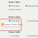 Precise Checkbox Validation With Required Checkboxes Web Component
 Make Youtube/Vimeo Videos Fluid and Responsive With The fit-vids Web Component
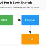 Add Interactive Zoom and Pan to Any SVG – svg-toolbelt
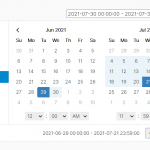 User-friendly Datetime Range Picker With Predefined Date Ranges
 Dynamic Responsive Image Slider with JavaScript and CSS3 – Karrot Slider
 Mobile-first Bootstrap 4 UI Kit – Shards
 Reveal Text With Scrambling Effect – shuffle-letters.js
 Feature-rich JavaScript Tooltip Library – SimpleTooltip.js