


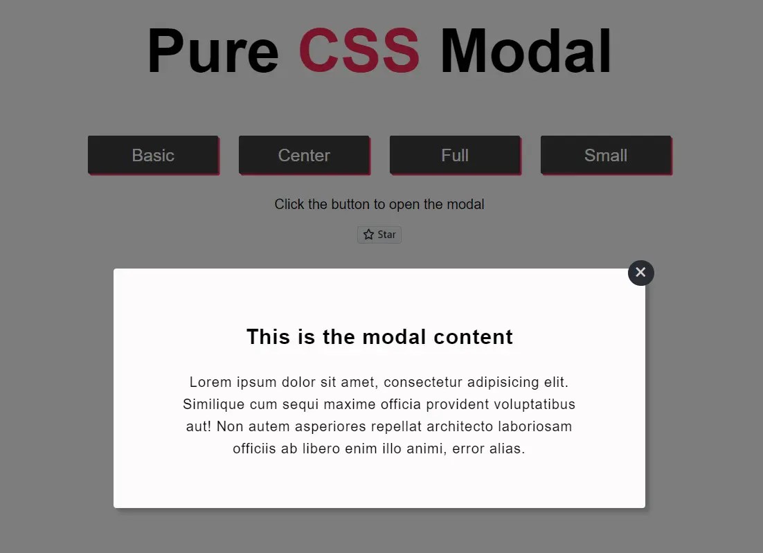
modal.css is a lightweight library for creating responsive modal windows with fade-in animations using checkboxes, CSS flexbox, and CSS3 transitions.
Modal windows are used to show additional information that requires the user’s attention or to ask a question. Many javascript libraries already provide this functionality, and they offer tons of features. This project is meant to help you build these windows using the CSS language itself, without needing any external plugins.
How to use it:
1. Download and load the modal.css stylesheet.
<link rel="stylesheet" href="css/modal.css" />
2. Create the HTML for the modal content. Note that each modal window must have a unique checkbox as follows:
<div class="pure-modal">
<input id="modal-trigger" class="checkbox" type="checkbox">
<div class="pure-modal-overlay">
<label for="modal-trigger" class="o-close"></label>
<div class="pure-modal-wrap">
<label for="modal-trigger" class="close">✖</label>
<h2>Modal Title</h2>
<p>
Modal Content
</p>
</div>
</div>
</div>3. Create a label element to toggle the modal window.
<label for="modal-trigger" class="open-modal">
  Launch
</label>
4. Make the modal window always centered using the a-center class.
<div class="pure-modal">
<input id="modal-trigger" class="checkbox" type="checkbox">
<div class="pure-modal-overlay">
<label for="modal-trigger" class="o-close"></label>
<div class="pure-modal-wrap a-center">
<label for="modal-trigger" class="close">✖</label>
<h2>Modal Title</h2>
<p>
Modal Content
</p>
</div>
</div>
</div>5. Create a fullscreen modal window using the full class.
<div class="pure-modal">
<input id="modal-trigger" class="checkbox" type="checkbox">
<div class="pure-modal-overlay">
<label for="modal-trigger" class="o-close"></label>
<div class="pure-modal-wrap a-center full">
<label for="modal-trigger" class="close">✖</label>
<h2>Modal Title</h2>
<p>
Modal Content
</p>
</div>
</div>
</div>6. Create a small modal window using the small class.
<div class="pure-modal">
<input id="modal-trigger" class="checkbox" type="checkbox">
<div class="pure-modal-overlay">
<label for="modal-trigger" class="o-close"></label>
<div class="pure-modal-wrap a-center small">
<label for="modal-trigger" class="close">✖</label>
<h2>Modal Title</h2>
<p>
Modal Content
</p>
</div>
</div>
</div>See Also:
 Detect Finger Swipe Events With JavaScript – swiped-events
 Responsive Infinite Image Scroller – Carousel.js
 Glassmorphic Style Calendar Component With JavaScript
 Terms And Conditions Scroll Box In JavaScript – scroll-to-accept.js
 Fast, Lightweight YouTube Video Embed Web Component – lite-youtube
 Powerful Interactive Data Visualization Library – Plotteus
 Customizable Growl/Toast Alerts with LocalNotification.js
 Minimal Back To Top Button – scrollToTop.js