


Dialog.js is a pure JavaScript plugin for creating modern, easy-to-style dialog boxes using HTML <dialog> element.
How to use it:
Include the core JavaScript and Stylesheet on the page.
<link rel="stylesheet" href="css/dialog.css">
<script type="text/javascript" src="js/dialog.js"></script>
Include the dialog polyfill for Edge and Firefox.
<script type="text/javascript" src="js/dialog-polyfill.js"></script>
Create an alert dialog.
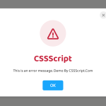
Dialog.alert('Hello Dialog!');With a custom title.
Dialog.alert('Hello Caption', 'Caption');Create a confirmation dialog.
Dialog.confirm('Are you sure to leave', 'Question', (dlg) => {
  alert('Bye!');
  dlg.close();
}, (dlg) => {
  alert('Thank you!');
  dlg.close();
});
Create a dialog with the custom template. Ideal for prompt dialog.
let dlg = Dialog.template(document.getElementById('tpl'), 'Use template');
dlg.beforeClosing(() => {
    let name = dlg.content.querySelector('.name').value;
    const require = 'nemo';
    if (name != require) {
        alert('You must input nemo');
        return false;
    } else {
        return true;
    }
}).closed(() => { alert('Close'); })
.cancelable = false;
Create an iframe dialog.
Dialog.iframe('example.html', 'Dialog Title', '360px', '440px');Customize the dialog with the following options.
let dlg = new Dialog({
  caption: 'User define dialog',
  message: 'You can click [Abort] to exit.',
  showClose: false,
  buttons: Dialog.buttons.ABORT_RETRY_IGNORE,
  cancelable: false,

  abortHandler: (dlg) => { dlg.close(); },
  retryHandler: () => { alert('retry...'); },
  ignoreHandler: () => { alert('ignore'); },
});
Customize the styles of the dialog.
.dlg-dialog {
  border: none;
  box-shadow: 10px 10px 20px gray;
}
.dlg-header {
  background-color: #555;
  color: white;
}
.dlg-caption {
  height: 1.17em;
  text-shadow: 1px 1px 1px black;
}
.dlg-close-button::before,
.dlg-close-button::after {
  background-color: white;
}
All default customization options.
let dlg = new Dialog({
    caption: '',
    message: '',
    content: undefined,
    buttons: Dialog.buttons.NONE,
    resize: 'none',
    cancelable: true,
    showHeader: true,
    showClose: true,
    showFooter: false,
});
Event handlers available.
let dlg = new Dialog({
    abortHandler: undefined,
    cancelHandler: () => { this.close(); },
    ignoreHandler: undefined,
    noHandler: undefined,
    okHandler: () => { this.close(); },
    retryHandler: undefined,
    yesHandler: undefined,
    // events
    beforeClosing: () => { return true; }, // set to false to prevent close
    closed: undefined,
});
Changelog:
05/24/2021
- Remove legacy Edge support
See Also:
 Create Custom Stylish Dialogs with SnapDialog JavaScript Library
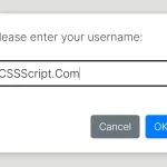 Async, Promise-based Alert/Confirm/Prompt Dialogs – Prompts.js
 Create & Manage Bootstrap 5 Modals Using use-bootstrap-dialog JS Library
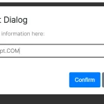 Beautiful & Functional Custom Dialogs In JavaScript – Dialog-JS
 Lightweight Customizable Modal and Alert Library – SilverBox.js
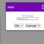 Minimal Customizable Modal Dialog Boxes In JavaScript – msg.js
 Custom Alert/Confirm/Prompt Popup Box JavaScript Library – attention.js
 Elegant Popup Box (Alert, Confirm, Prompt) In JavaScript – QuantumAlert