


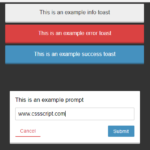
SilverBox.js is a tiny JavaScript library for creating highly customizable popups, notifications, prompts, confirm dialogs and modal windows without sacrificing performance or quality.
How to use it:
1. Download the package and include the SilverBox’s files on the page.
<link rel="stylesheet" href="/dist/silverBox.min.css" />
<script src="/dist/silverBox.min.js"></script>
2. Create a basic alert popup using the silverBox method:
const myModal = silverBox({
  text: "This Is A Basic Alert Popup."
})
3. Customize the SilverBox using the following options.
const myModal = silverBox({
  // success, error, warning, info, question
  alertIcon: "",
  // config animations
  animation: {
    delay: 0,
    direction: 'normal',
    duration: .3,
    fillMode: 'none',
    iterationCount: 1,
    name: 'popUp',
    timingFunction: 1, // Animation timing function.
  }
  // direction of buttons
  buttonsDirection: "",
  // config the Cancel button
  cancelButton: {
    bgColor: "",
    borderColor: "",
    className: "",
    closeOnClick: false,
    dataAttribute: : "",
    disabled: false,
    iconEnd: "",
    iconStart: "",
    id: "",
    loadingAnimation: true,
    onClick: null,
    showButton: true,
    text: "Cancel",
    textColor: "",
  }
  // config the Confirm button
  confirmButton: {
    bgColor: "",
    borderColor: "",
    className: "",
    closeOnClick: false,
    dataAttribute: : "",
    disabled: false,
    iconEnd: "",
    iconStart: "",
    id: "",
    loadingAnimation: true,
    onClick: null,
    showButton: true,
    text: "Cancel",
    textColor: "",
  },
  // center your content or not
  centerContent: false,
  // determine if closing on the overlay should close the silverBox modal
  closeOnOverlayClick: true,
  // custom buttons
  customButton: {
    bgColor: "",
    borderColor: "",
    className: "",
    closeOnClick: false,
    dataAttribute: : "",
    disabled: false,
    iconEnd: "",
    iconStart: "",
    id: "",
    loadingAnimation: true,
    onClick: null,
    showButton: true,
    text: "Custom",
    textColor: "",
  }
  // custom icon here
  customIcon: "",
  customIconClassName: "",
  customIconId: "",
  customSvgIcon: "",
  customSvgIconClassName: "",
  customSvgIconId: "",
  // config the Deny button
  denyButton: {
    bgColor: "",
    borderColor: "",
    className: "",
    closeOnClick: false,
    dataAttribute: : "",
    disabled: false,
    iconEnd: "",
    iconStart: "",
    id: "",
    loadingAnimation: true,
    onClick: null,
    showButton: true,
    text: "Cancel",
    textColor: "",
  },
  // HTML direction
  direction: "",
  // run after silverBox is rendered.
  didOpen: () => { // Do something here },
  // footer content
  footer: "",
  // html content
  html: "",
  // config the input in prompt dialog
  input: {
    className: "",
    fontSize: "",
    height: "100%",
    hint: "",
    id: "",
    label: "",
    maxLength: "",
    multiplyBy: 1,
    name: "",
    numberOnly: false,
    placeHolder: "",
    placeHolderFontSize: "",
    readOnly: false,
    textAlign: "",
    type: "text", // text, number, textarea, etc
    value: "",
    width: "100%",
  },
  // onClose function
  onClose: null,
  position: "", // top-right, top-center, top-left, bottom-right, bottom-center, bottom-left.
  preOpen: () => { // Do something here },
  removeLoading: "", // remove button loading animations. It can take first, last, all, number of the SilverBox (like '1').
  removeSilverBox: "", // first, last, all, number of the SilverBox (like '1').
  showCloseButton: false,
  silverBoxClassName: "",
  silverBoxId: "",
  text: "",
  theme: "light", // or "dark"
  timer: {
    duration: 0,
    pauseOnHover: true,
    showBar: true,
  }
  // customize the title
  title: {
    alertIcon: "",
    customIcon: "",
    customIconClassName: "",
    customIconId: "",
    customSvgIcon: "",
    customSvgIconClassName: "",
    customSvgIconId: "",
    text: "",
  }
})
4. API methods.
// Remove silverBox
myModal.remove();
// Remove button(s) loading animation
myModal.removeLoading();
Changelog:
v1.3.1 (10/09/2023)
- Fix timer object config not working as expected. The duration was not being applied.
v1.3.0 (10/06/2023)
- Add closeOnOverlayClick option to determine if closing on the overlay should close the silverBox modal.
- Timers now accept both number and string. If a number is provided, the time unit will be ms. If you need to determine the unit as well, you can pass an string like 300ms or 0.3s.
- Bugfix
v1.2.0 (09/13/2023)
- Add option to run a function before silverBox is rendered
- Add option to run a function after silverBox is rendered
- Add option for html property to also accept node element
- Add option for timer and animation properties to receive the time values as strings too. This way the unit can be specified.
- Return .remove() and .removeLoading() functions to be used to remove silverBox or button(s) loading animation.
- Bugfix
v1.1.0 (08/02/2023)
- Add option to run a function after clicking a button (button: { onClick: () => {} })
- Add option to run a function after silverBox closes (onClose: () => {})
- Add slide animation for silverBox modals with position property
- Add custom animation option so users can apply their own animation (animation)
- Add the option to title to only accept text (title: “Title” instead of title: { text: “Title” })
- Add timer bar option which is enabled by default when using timer
- Add a custom button option
- Bugfixes
See Also:
 Pretty Non-blocking Dialog Popup JavaScript Plugin – Prompt-Boxes
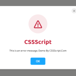 Create Custom Stylish Dialogs with SnapDialog JavaScript Library
 Create iOS-Style Popups & Notifications With Popup JS Library
 Async, Promise-based Alert/Confirm/Prompt Dialogs – Prompts.js
 Create & Manage Bootstrap 5 Modals Using use-bootstrap-dialog JS Library
 Beautiful & Functional Custom Dialogs In JavaScript – Dialog-JS
 Build Interactive Customizable Popups And Alerts with AsPopup.js
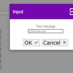 Minimal Customizable Modal Dialog Boxes In JavaScript – msg.js