


UX Select is a lightweight custom select JavaScript plugin designed for customizing and improving the native select dropdowns.
Features:
- Style dropdowns with custom CSS
- Live search/filtering
- Support single or multi-select
- Group related options
- Animate open/close transitions
- Work with existing select markup
Installation:
# NPM
$ npm i ux-select
How to use it:
1. Download the plugin and add the following files to the HTML.
<link rel="stylesheet" href="ux-select.min.css" />
<script src="ux-select.min.iife.js"></script>
// Or as an ES module
import { uxSelect } from "./dist/ux-select.min.umd.cjs";
2. Initialize the UxSelect on your existing select element and done.
<select name="courses" id="demo">
  <option value="java">Java</option>
  <option value="python">Python</option>
  <option value="javascript">JavaScript</option>
  <option value="html">HTML</option>
  <option value="css">CSS</option>
  <option value="javascript">JavaScript</option>
  <option value="python">Python</option>
  <option value="R">R</option>
  <option value="SQL">SQL</option>
</select>
const element = document.getElementById('demo')
const myUxSelect = new UxSelect(element, {
      // options here
});
3. Group your options using the data-ux-select-group attribute:
<select name="courses" id="demo" multiple>
  <option value="java" data-ux-select-group="programming">Java</option>
  <option value="python" data-ux-select-group="programming">Python</option>
  <option value="javascript" data-ux-select-group="programming">JavaScript</option>
  <option value="html" data-ux-select-group="web">HTML</option>
  <option value="css" data-ux-select-group="web">CSS</option>
  <option value="javascript" data-ux-select-group="web">JavaScript</option>
  <option value="python" data-ux-select-group="Data Science">Python</option>
  <option value="R" data-ux-select-group="Data Science">R</option>
  <option value="SQL" data-ux-select-group="Data Science">SQL</option>
</optgroup>
</select>
const myUxSelect = new UxSelect(element, {
      isGroupOptions: true,
});
4. Enable users to filter through the options via a search box:
const myUxSelect = new UxSelect(element, {
      isSearchable: true,
      isSearchFocus: false, // remove focus on search input
});
5. Set the option style: “default”, “checkbox”, “radio”, or “image”).
<option data-image-src="/path/to/image.png"></option>
<option data-image-srcset="/path/to/[email protected]"></option>
<option data-image-alt="Image description"></option>
<option data-image-width="32"></option>
<option data-image-height="32"></option>
const myUxSelect = new UxSelect(element, {
      optionStyle: "image",
});
6. More configuration options.
const myUxSelect = new UxSelect(element, {
placeholder: "Select an option",
searchText: "Search",
clearText: "Clear option(s)",
selectedText: "Selected:",
closeButton: true,
hideOnClear: true,
hideOnSelect: false,
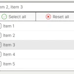
selectAllOption: true,
selectAllText: "Select All",
});7. API methods.
myUxSelect.enable()
myUxSelect.disable()
myUxSelect.clear()
myUxSelect.update(isTriggerChange)
myUxSelect.getSelectedValues()
8. Override the default CSS variables to create your owne styles:
:root {
  --uxs-padding-x: 0.75rem;
  --uxs-padding-y: 0.375rem;
  --uxs-border-width: 1px;
  --uxs-border-style: solid;
  --uxs-border-color: rgb(233, 233, 233);
  --uxs-border-radius: 0.375rem;
  --uxs-border-hover-color: rgb(189, 193, 198);
  --uxs-font-size: 1rem;
  --uxs-font-weight: 400;
  --uxs-line-height: 1.5;
  --uxs-background-color: rgb(255, 255, 255);
  --uxs-text-color: rgb(34, 34, 34);
  --uxs-dropdown-image: url("data:image/svg+xml,%3C%3Fxml version='1.0' encoding='utf-8'%3F%3E%3Csvg version='1.1' id='Layer_1' xmlns='http://www.w3.org/2000/svg' xmlns:xlink='http://www.w3.org/1999/xlink' x='0px' y='0px' viewBox='0 0 24 24' style='enable-background:new 0 0 24 24;' xml:space='preserve'%3E%3Cg%3E%3Cpath d='M12,16c-0.3,0-0.5-0.1-0.7-0.3l-6-6c-0.4-0.4-0.4-1,0-1.4s1-0.4,1.4,0l5.3,5.3l5.3-5.3c0.4-0.4,1-0.4,1.4,0s0.4,1,0,1.4 l-6,6C12.5,15.9,12.3,16,12,16z'/%3E%3C/g%3E%3C/svg%3E%0A");
  --uxs-dropdown-disabled-image: url("data:image/svg+xml,%3C%3Fxml version='1.0' encoding='utf-8'%3F%3E%3Csvg version='1.1' id='Layer_1' xmlns='http://www.w3.org/2000/svg' xmlns:xlink='http://www.w3.org/1999/xlink' x='0px' y='0px' viewBox='0 0 24 24' style='enable-background:new 0 0 24 24;' xml:space='preserve'%3E%3Cg%3E%3Cpath fill='rgb(130 130 130)' d='M12,16c-0.3,0-0.5-0.1-0.7-0.3l-6-6c-0.4-0.4-0.4-1,0-1.4s1-0.4,1.4,0l5.3,5.3l5.3-5.3c0.4-0.4,1-0.4,1.4,0s0.4,1,0,1.4 l-6,6C12.5,15.9,12.3,16,12,16z'/%3E%3C/g%3E%3C/svg%3E%0A");
  --uxs-clear-image: url("data:image/svg+xml,%3C%3Fxml version='1.0' encoding='utf-8'%3F%3E%3Csvg version='1.1' id='Layer_1' xmlns='http://www.w3.org/2000/svg' xmlns:xlink='http://www.w3.org/1999/xlink' x='0px' y='0px' viewBox='0 0 24 24' style='enable-background:new 0 0 24 24;' xml:space='preserve'%3E%3Cg%3E%3Cpath d='M6,19c-0.3,0-0.5-0.1-0.7-0.3c-0.4-0.4-0.4-1,0-1.4l12-12c0.4-0.4,1-0.4,1.4,0s0.4,1,0,1.4l-12,12C6.5,18.9,6.3,19,6,19z' /%3E%3Cpath d='M18,19c-0.3,0-0.5-0.1-0.7-0.3l-12-12c-0.4-0.4-0.4-1,0-1.4s1-0.4,1.4,0l12,12c0.4,0.4,0.4,1,0,1.4 C18.5,18.9,18.3,19,18,19z'/%3E%3C/g%3E%3C/svg%3E%0A");
  --uxs-clear-disabled-image: url("data:image/svg+xml,%3C%3Fxml version='1.0' encoding='utf-8'%3F%3E%3Csvg version='1.1' id='Layer_1' xmlns='http://www.w3.org/2000/svg' xmlns:xlink='http://www.w3.org/1999/xlink' x='0px' y='0px' viewBox='0 0 24 24' style='enable-background:new 0 0 24 24;' xml:space='preserve'%3E%3Cg%3E%3Cpath fill='rgb(130 130 130)' d='M6,19c-0.3,0-0.5-0.1-0.7-0.3c-0.4-0.4-0.4-1,0-1.4l12-12c0.4-0.4,1-0.4,1.4,0s0.4,1,0,1.4l-12,12C6.5,18.9,6.3,19,6,19z' /%3E%3Cpath fill='rgb(130 130 130)' d='M18,19c-0.3,0-0.5-0.1-0.7-0.3l-12-12c-0.4-0.4-0.4-1,0-1.4s1-0.4,1.4,0l12,12c0.4,0.4,0.4,1,0,1.4 C18.5,18.9,18.3,19,18,19z'/%3E%3C/g%3E%3C/svg%3E%0A");
  --uxs-option-hovered-bg-color: rgb(244, 244, 244);
  --uxs-option-selected-bg-color: rgb(244, 244, 244);
  --uxs-option-disabled-color: rgb(244, 244, 244);
  --uxs-option-styled-outline-width: 1px;
  --uxs-option-styled-checkbox-outline-radius: 0.25rem;
  --uxs-option-styled-border-width: 0.1875rem;
  --uxs-option-styled-background-color: rgb(0, 224, 255);
  --uxs-search-background-color: rgb(255, 255, 255);
  --uxs-search-text-color: rgb(34, 34, 34);
  --uxs-search-placeholder-color: rgb(169, 169, 169);
  --uxs-transition-duration: 0.2s;
  --uxs-transition-easing: ease-in-out;
  --uxs-scrollbar-track-color: rgb(189, 189, 189);
  --uxs-scrollbar-thumb-color: rgb(117, 117, 117);
  --uxs-scrollbar-thumb-hover-color: rgb(97, 97, 97);
}
Changelog:
v2.8.0 (11/29/2024)
- Added: overlay for empty search
- Added: getSelectedValues method
v2.7.0 (11/29/2024)
- feat: data-selected-display-text attr for option support
v2.6.0 (08/20/2024)
- feat: html name attr for search input
- feat: display selected items in multiple select though ‘,’ separator
v2.5.0 (08/08/2024)
- Bugfixes
v2.4.0 (07/23/2024)
- Add Support for selectAll option
v2.3.0 (05/31/2024)
- Add. SVG sprite support for styled option.
v2.2.0 (05/07/2024)
- Add. Data attributes support for params.
v2.1.1 (04/09/2024)
- Fix. Display body on update method.
v2.1.0 (03/20/2024)
- Added hideOnClear & hideOnSelect options.
- Added Images in option support.
v2.0.0 (02/21/2024)
- Update
v1.6.4 (08/15/2023)
- Fix. Initialization when options is undefined.
v1.6.1 (08/07/2023)
- Added isSearchFocus.
- Removed Input search focus by default.
v1.5.2 (08/07/2023)
- Fix. Input search color.
v1.5.0 (08/05/2023)
- Added: Scrollbar to dropdown.
- Added: Customizing for search input.
v1.3.0 (08/04/2023)
- Added optionStyle parameter
- Bugfix
v1.2.7 (07/31/2023)
- Bugfixes
v1.2.5 (07/30/2023)
- Fix, Types & build for module.
See Also:
 Feature-rich Custom Select JavaScript Library – SimpSelect
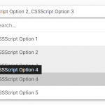 High Performance Select Box with Virtual Scroll (Vanilla JS) – Virtual Select
 Tagging & Searchable Dropdown with Multi-Select – Searchdown.js
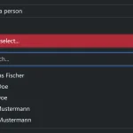 Bootstrap 5 Select Dropdown Enhancer – AvalynxSelect
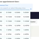 Fast Touch-Friendly Picker Library for JavaScript & React – Quickpick UI
 Advanced Draggable & Selectable Library – DragSelect
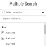 Powerful Single & Multiple Select Library – tail.select
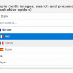 Enhanced Dropdown Select In Pure JavaScript – LC-select