


CanvasSlider is a dependency-free JavaScript library to render a modern, customizable, feature-rich range slider using HTML5 canvas.
Key Features:
- Number formatting.
- Supports multiple drag handles.
- Custom handle shapes.
- Optional ticks, labels, tooltips, and value boxes.
- No CSS required.
How to use it:
1. Download the package and place the JavaScript canvasslider.js at the bottom of the page.
<script src="canvasslider.js"></script>
2. Create an HTML5 canvas element on which you want to render a range slider.
<canvas id="mySlider" title="My Slider"></canvas>
3. Initialize the range slider and done.
var mySlider = new CanvasSlider({
     canvas: "mySlider",
     range: {min: 0, max: 80.4, count: 5},
     start: [40.6],
     snapToTicks: true,
     showLabels: true,
     showMajorTicks: true,
     showMinorTicks: false,
     showToolTip: true,
     showValueBox: false,
     format: {decimals: 0, prefix: "€ ", suffix: ""},
     handle: {shape: "ellipse", w: 20, h: 20, hue: 240},
     baseColor: {h: 207, s: 60, v: 100}
});
4. All possible configs:
- Configuration properties are used if a new instance of the slider is initiated. The canvas option is required, all other options are optional.
- Set the width and height of the slider in the html code of the canvas if you do not want a default.
- The slider is automatically scaled in the width and adjusts to the width of the canvas.
- Depending on the options you choose, the preferred height of the canvas varies between 45px and 80px.
| canvas | Reference to a canvas element or id of a canvas element. Required. |
| range | An array of values (floats) e.g. [1, 3, 9, 15, 18] or an object e.g. {min: 1, max: 100}. If the object has a property count then an evenly spaced range of floats is generated between min and max. If the object has a property step then a range of floats with spacing step is generated between min and max. Default: [0,100]. |
| start | An array of floats for the initial values of the slider. The number of values determines the number of handles Default: [0,0]. |
| snapToTicks | Boolean (true or false) to either snap to tick values or to be positioned at any point along the slider Default: false. |
| showLabels | Boolean (true or false) to show or hide number labels along the slider Default: true. |
| showMajorTicks | Boolean (true or false) to show or hide major tick marks along the slider Default: true. |
| showMinorTicks | Boolean (true or false) to show or hide minor tick marks along the slider Default: true. Only valid if showMajorTicks is true. |
| showToolTip | Boolean (true or false) to show or hide tooltip(s) above the handle(s) Default: true. |
| showValueBox | Boolean (true or false) to show or hide a valuebox for handle 0 and 1, left and right of the track. Default: false. |
| disabled | Boolean (true or false) to disable/enable the slider Default: false. |
| format | An object to set the format of numbers. Default: {decimals: 0, prefix: “”, suffix: “”}. |
| handle | An object with optional properties. Default: {shape: “rectangle”, w: 20, h: 20, hue: auto} . The property shape can have values “rectangle” and “ellipse”. The properties w and h define the width and height of the handle (px). The property hue is the hue-component of the color of the handle. Values in the range [0,360]. |
| baseColor | An object to define the base color of the slider, e.g. {h: 207, s: 60, v: 100}. The base color has the format of a HSV color with valid ranges h: [0,360], s: [0,100], v: [0,100]. This color is used to define the colors of the slider. |
| onChange | Callback function when one of the values of the slider is changed. When user starts dragging a handle, values change very often. An alternative is to use the onDragStart or onDragEnd events. Parameters passed: (index, value). Default: null. |
| onDragStart | Callback function when a user starts dragging a handle. Parameters passed: (index, value). Default: null. |
| onDragEnd | Callback function when the handle ends dragging after onDragStart. Parameters passed: (index, value). Default: null. |
| onMouseDown | Callback function when the user has pressed the mouse button while on slider track or handle. No parameters. Default: null. |
| onMouseUp | Callback function when the user has released the mouse button after onMouseDown. No parameters. Default: null. |
5. Possible API methods. Methods can be used after a new instance is initiated. E.g. var a = slider.getValue(2);
| getValue(idx) | Returns the current slider value of the handle with given index. |
| setValue(idx, value) | Sets the slider value for the handle with given index. More sets at once possible. E.g. slider.setValue(0,23)(1,44); Set value 23 for handle 0 and 44 for handle 1. |
| disabled = [true,false] | Makes the slider disabled/enabled. E.g. slider.enabled = true; |
| onChange = [callback] | Define callback function of the onChange event. Parameters passed: (index, value). |
| onDragStart = [callback] | Define callback function of the onDragStart event. Parameters passed: (index, value). |
| onDragEnd = [callback] | Define callback function of the onDragEnd event. Parameters passed: (index, value). |
| onMouseDown = [callback] | Define callback function of the onMouseDown event. No parameters passed. |
| onMouseUp = [callback] | Define callback function of the onMouseUp event. No parameters passed. |
| snapToTicks = [true,false] | Handle either snap to tick values or to be positioned at any point along the slider. |
| showLabels = [true,false] | Either show or hide number labels along the slider. E.g. slider.showLabels = true; |
| showMajorTicks = [true,false] | Either show or hide major tick marks along the slider. |
| showMinorTicks = [true,false] | Either show or hide minor tick marks along the slider. Only valid if showMajorTicks is true. |
| showToolTip = [true,false] | Show or hide tooltip(s) above the handle(s). |
| showValueBox = [true,false] | Show or hide valuebox for handle 0 and 1, left and right of the track. |
Changelog:
09/25/2020
- Update canvasslider.js
08/11/2020
- JS Update
See Also:
 Responsive & Touch-enabled Range Slider In Vanilla JavaScript – rangeSlider
 Accesible Range Slider Custom Element
 Build Custom Circular Range Sliders with CircularRange Web Component
 Accessible Dual-Handle Range Slider Library – range-slider.js
 Accessible Dual-Thumb Range Slider for Web & Mobile – DoubleRange
 Modern Range Sliders Based On Native Range Inputs – dual-range-input
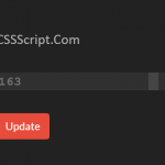 Highly Customizable Range Slider In JavaScript – Slider89.js
 Interactive Range Slider with Tooltip Using Pure CSS