


The upgraded version of the legacy jQuery Lightbox2 plugin.
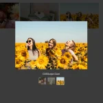
Lightbox3 is a vanilla JS lightbox library that helps you create a modern gallery lightbox with thumbnail links, full-size images, captions, swipe navigation, zoom gestures, and spring-based open and close animations.
The library keeps the familiar data-lightbox markup pattern from Lightbox2, but it removes the jQuery dependency. You can install it through npm for modern build tools or load the ESM build and stylesheet from a CDN.
Features:
- Spring-physics open and close animations with configurable stiffness and damping.
- Pinch-to-zoom, swipe navigation, and swipe-to-dismiss on touch devices.
- Gallery grouping through the
data-lightboxattribute. - Programmatic API for open, close, next, prev, and destroy.
- CSS custom properties for backdrop, border radius, caption bar, and z-index.
- Backward-compatible with Lightbox2
data-lightboxanddata-titlemarkup.
Use Cases:
- Display a product image gallery on an e-commerce site.
- Showcase a photography portfolio with captions and keyboard navigation.
- Add an in-context lightbox to blog posts for full-size image viewing.
How To Use It:
Installation
Install Lightbox3 with NPM.
npm install lightbox3
Import the JavaScript module and the stylesheet in your app entry file.
import { Lightbox } from 'lightbox3';
import 'lightbox3/dist/lightbox3.css';
// Initialize once after your gallery markup exists in the DOM.
const productGalleryLightbox = Lightbox.init();
For a direct browser setup, load the stylesheet and import the ESM build from a CDN.
<link rel="stylesheet" href="https://cdn.jsdelivr.net/npm/[email protected]/dist/lightbox3.css">
<script type="module">
  import { Lightbox } from 'https://cdn.jsdelivr.net/npm/[email protected]/dist/lightbox3.esm.js';
  // Initialize after the module loads.
  Lightbox.init();
</script>
Create a basic image lightbox
Add data-lightbox to an anchor element. The anchor href should point to the full-size image, and the nested image can use a smaller thumbnail source.
<a href="/images/case-study-large.jpg" data-lightbox data-caption="Dashboard analytics preview">
  <img src="/images/case-study-thumb.jpg" alt="Dashboard analytics preview">
</a>
<script type="module">
  import { Lightbox } from 'https://cdn.jsdelivr.net/npm/[email protected]/dist/lightbox3.esm.js';
  // Attach Lightbox3 to every element that matches the default selector.
  Lightbox.init();
</script>
Create a gallery lightbox
<a href="/gallery/office-large.jpg" data-lightbox="studio-tour" data-caption="Office workspace">
  <img src="/gallery/office-thumb.jpg" alt="Office workspace">
</a>
<a href="/gallery/lounge-large.jpg" data-lightbox="studio-tour" data-caption="Team lounge">
  <img src="/gallery/lounge-thumb.jpg" alt="Team lounge">
</a>
<a href="/gallery/desk-large.jpg" data-lightbox="studio-tour" data-caption="Developer desk setup">
  <img src="/gallery/desk-thumb.jpg" alt="Developer desk setup">
</a>
A legacy Lightbox2 page may already use data-title for captions. Lightbox3 reads that attribute, so old caption markup can stay in place during migration.
<a href="/archive/event-stage-large.jpg" data-lightbox="event-2026" data-title="Main stage photo">
  <img src="/archive/event-stage-thumb.jpg" alt="Main stage photo">
</a>
Override the default CSS styles
--lb-backdrop-color: Sets the overlay backdrop color. The default value isrgba(0, 0, 0, 0.95).--lb-image-border-radius: Sets the border radius of the opened image. The default value is24px.--lb-image-padding: Sets the space between the image and viewport edges. The default value is40px.--lb-chrome-bg: Sets the caption bar background color. The default value isrgba(24, 24, 24, 0.8).--lb-chrome-text: Sets the caption bar text color. The default value isrgba(255, 255, 255, 0.9).--lb-chrome-font-size: Sets the caption bar font size. The default value is15px.--lb-chrome-padding: Sets padding around the caption bar and navigation arrows. The default value is16px.--lb-chrome-border-radius: Sets the caption bar border radius. The default value is48px.--lb-z-index: Sets the overlay stacking level. The default value is999999.
-root {
  --lb-backdrop-color: rgba(8, 10, 18, 0.96);
  --lb-image-border-radius: 16px;
  --lb-chrome-bg: rgba(12, 12, 12, 0.82);
  --lb-chrome-text: rgba(255, 255, 255, 0.92);
  --lb-chrome-font-size: 14px;
  --lb-z-index: 10000;
}
Custom trigger button
import { Lightbox } from 'lightbox3';
const mediaLightbox = Lightbox.init();
const openPreviewButton = document.querySelector('#open-floorplan-preview');
openPreviewButton.addEventListener('click', function () {
  // Open an image from a custom control.
  mediaLightbox.open('/media/floorplan-large.jpg', openPreviewButton);
});
All configuration options
selector(string): Sets the CSS selector for lightbox trigger elements. The default value is'[data-lightbox]'.springOpen(SpringConfig): Controls the spring animation used during open and zoom-in transitions. The default value is{ stiffness: 260, damping: 26 }.springClose(SpringConfig): Controls the spring animation used during close and zoom-out transitions. The default value is{ stiffness: 500, damping: 38 }.padding(number): Sets the viewport padding around the opened image in pixels. The default value is40.upscale(boolean | number): Upscales trades sharpness for size. The default value isfalse.debug(boolean): Shows a debug overlay with spring values and state information. The default value isfalse, and the?debugURL parameter also enables it.
Available HTML Data Attributes
data-lightbox: Enables Lightbox3 on an anchor element. The anchorhrefprovides the full-resolution image URL.data-lightbox="name": Groups matching links into one gallery set.data-caption="text": Adds caption text below the opened image.data-title="text": Adds caption text through the Lightbox2-compatible caption attribute.data-alt="text": Sets alt text for the full-size image. The thumbnailaltvalue acts as the fallback.data-width="number": Sets the width of the lightbox.data-height="number": Sets the height of the lightbox.
API Methods
const imageLightbox = Lightbox.init();
// Open a full-size image from JavaScript.
imageLightbox.open('/media/team-photo-large.jpg');
// Open a full-size image and use a trigger element for the morph animation.
const profileThumb = document.querySelector('.profile-card a[data-lightbox]');
imageLightbox.open('/media/profile-large.jpg', profileThumb);
// Open a data-lightbox gallery by name
imageLightbox.open('myGallaery');
imageLightbox.open('slides', 1); // the second image
imageLightbox.open(el);
// Close the active lightbox overlay.
imageLightbox.close();
// Move to the next image in the current gallery set.
imageLightbox.next();
// Move to the previous image in the current gallery set.
imageLightbox.prev();
// Remove event listeners, cancel animations, and tear down the instance.
imageLightbox.destroy();
Events
const imageLightbox = Lightbox.init();
// Fires when the open animation starts.
imageLightbox.on('open', function (event) {
  console.log('Lightbox opening:', event.detail);
});
// Fires when the open animation completes.
imageLightbox.on('opened', function (event) {
  console.log('Lightbox opened:', event.detail);
});
// Fires when the close animation starts.
imageLightbox.on('close', function (event) {
  console.log('Lightbox closing:', event.detail);
});
// Fires when the close animation completes and the overlay leaves the page.
imageLightbox.on('closed', function (event) {
  console.log('Lightbox closed:', event.detail);
});
// Fires when the active gallery image changes.
imageLightbox.on('navigate', function (event) {
  console.log('Gallery navigation:', event.detail);
});
// Fires when zoom-in starts from a tap or double-click.
imageLightbox.on('zoomIn', function (event) {
  console.log('Zoom in:', event.detail);
});
// Fires when zoom-out starts.
imageLightbox.on('zoomOut', function (event) {
  console.log('Zoom out:', event.detail);
});
Alternatives:
- 10 Best Gallery Lightbox Libraries In Pure JavaScript/CSS
- Modern JavaScript Lightbox with Zoom & Gallery – Zoomora
- Vanilla JS Gallery Lightbox with Touch Support – Web-Thread Lightbox
- Lightweight Gallery Lightbox with Zoom, Pan, and Keyboard Navigation – ImageViewer.js
- Lightweight JavaScript Lightbox For Enhanced Image/Video Viewing – Magniview
FAQs:
Q: How do I upgrade from Lightbox2 to Lightbox3 without changing my HTML?
A: Remove the jQuery and Lightbox2 script tags, then install Lightbox3 via npm or CDN. Your existing data-lightbox, data-lightbox="gallery", and data-title attributes work as they did before. Add the new CSS and JS files and call Lightbox.init().
Q: My data-title captions are not showing. What should I check?
A: Verify that the data-title attribute is on the <a> element, not on the <img>. Lightbox3 reads the attribute from the link.
Q: Can I open the lightbox programmatically without a trigger link on the page?
A: Yes. Call lb.open('image.jpg') without a second argument. The image will fade in without a morph animation. You can wire this to a button click or any custom logic.
Q: Why does my image open as a normal link instead of a lightbox?
A: Check that the anchor has data-lightbox, the JavaScript module loads correctly, and Lightbox.init() runs after the markup exists. Also confirm that the browser supports JavaScript modules when you use the CDN import path.
Changelog:
v1.4.0 (09/13/2026)
- open() can now open a data-lightbox gallery by name, optionally at a specific image
v1.3.0 (08/03/2026)
- Added Upscale option
v1.2.1 (07/01/2026)
- Bugfixes.
v1.2.0 (07/01/2026)
- Added new data-width / data-height attributes.
v1.2.1 (07/01/2026)
- Bugfixes.
See Also:
 Lightweight Image Gallery With Lightbox Popup – havLightbox
 Modern JavaScript Lightbox with Zoom & Gallery – Zoomora
 Bootstrap-Based Image Lightbox for Modern Web App – AvalynxLightbox
 Video/Iframe/Gallery/Inline Content Lightbox Library – Tobii
 Vanilla JS Gallery Lightbox with Touch Support – Web-Thread Lightbox
 Lightweight Gallery Lightbox with Zoom, Pan, and Keyboard Navigation – ImageViewer.js
 Lightweight JavaScript Lightbox For Enhanced Image/Video Viewing – Magniview
 Lightweight Gallery Slider with Lightbox Support – Simple Gallery