


iOS-style on/off toggle switch implemented in pure HTML and CSS.
How to use it:
Create a normal checkbox for the iOS toggle button.
<input type="checkbox" id="demo">
Create a label element for the checkbox.
<label for="demo">Toggle On/Off</label>
The core CSS/CSS3 rules to transform the checkbox into an iOS-style toggle button.
[type="checkbox"]:not(:checked), [type="checkbox"]:checked {
  position: absolute;
  left: -9999px;
}
[type="checkbox"]:not(:checked) + label, [type="checkbox"]:checked + label {
  position: relative;
  padding-left: 4em;
  padding-top: .25em;
  cursor: pointer;
}
[type="checkbox"]:not(:checked) + label:before, [type="checkbox"]:checked + label:before, [type="checkbox"]:not(:checked) + label:after, [type="checkbox"]:checked + label:after {
  content: '';
  position: absolute;
  height: 1.5em;
  transition: all .5s ease;
}
[type="checkbox"]:not(:checked) + label:before, [type="checkbox"]:checked + label:before {
  left: 0;
  top: 0;
  width: 3em;
  border: 2px solid #dddddd;
  background: #dddddd;
  border-radius: 1.1em;
  z-index: -1;
}
[type="checkbox"]:not(:checked) + label:after, [type="checkbox"]:checked + label:after {
  left: .15em;
  top: .125em;
  background-color: #fff;
  border-radius: 50%;
  width: 1.5em;
}
[type="checkbox"]:checked + label:after { left: 1.65em; }
[type="checkbox"]:checked + label:before {
  background-color: #72da67;
  border-color: #72da67;
}
See Also:
 Simple CSS Toggle Switch Library – a8z
 12 Animated Accessible Toggle Controls – Theme Toggles
 Create Custom Switches With Checkboxes – Toggle Switchy
 Checkbox Based Toggle Buttons with Pure JavaScript
 Material Style Toggle Switches with Pure CSS / CSS3
 Pure CSS Switches For Checkbox and Radio Inputs
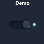 Pure CSS/CSS3 Smooth Toggle Switch
 iOS 7 Style Animated Switch Control With Javascript and CSS3