


Material Design inspired on / off switches which allows the visitor to toggle the state by clicking or tapping. This technique makes use of the CSS pseudo elements, input label tricks and CSS3 transitions / transforms.
How to use it:
Create a checkbox input with a label that will be converted into a toggle switch.
<input type="checkbox" id="unchecked" class="cbx hidden"/>
<label for="unchecked" class="lbl"></label>
The core CSS / CSS3 styles & rules for the toggle switch.
.lbl {
  position: relative;
  display: block;
  height: 20px;
  width: 44px;
  background: #898989;
  border-radius: 100px;
  cursor: pointer;
  transition: all 0.3s ease;
}
.lbl:after {
  position: absolute;
  left: -2px;
  top: -3px;
  display: block;
  width: 26px;
  height: 26px;
  border-radius: 100px;
  background: #fff;
  box-shadow: 0px 3px 3px rgba(0,0,0,0.05);
  content: '';
  transition: all 0.3s ease;
}
.lbl:active:after { transform: scale(1.15, 0.85); }
.cbx:checked ~ label { background: #6fbeb5; }
.cbx:checked ~ label:after {
  left: 20px;
  background: #179588;
}
.cbx:disabled ~ label {
  background: #d5d5d5;
  pointer-events: none;
}
.cbx:disabled ~ label:after { background: #bcbdbc; }
.hidden { display: none; }
See Also:
 Simple CSS Toggle Switch Library – a8z
 12 Animated Accessible Toggle Controls – Theme Toggles
 Create Custom Switches With Checkboxes – Toggle Switchy
 iOS Style Toggle Button In Pure CSS
 Checkbox Based Toggle Buttons with Pure JavaScript
 Pure CSS Switches For Checkbox and Radio Inputs
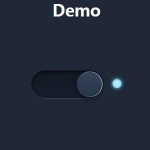 Pure CSS/CSS3 Smooth Toggle Switch
 iOS 7 Style Animated Switch Control With Javascript and CSS3
Nice and simple!! Thanks :)
Remove good comments? wtf
Exactly what I was looking for!! Thank you :)