


Theme Toggles is a set of 12 animated, customizable, accessible, SVG-based toggle controls written in HTML/CSS.
They’re easy to implement in various elements such as DIVs, Buttons, and even checkboxes. Can be used as theme toggles and dark mode switchers on websites or web applications.
How to use it:
1. Download and load the Theme Toggles from a CDN.
<link rel="stylesheet" href="https://cdn.jsdelivr.net/npm/theme-toggles@version/css/bundle.min.css" />
2. Or load a theme toggle of your choice in the document. Available toggles:
- around
- classic
- dark inner
- eclipse
- expand
- half sun
- horizon
- inner moon
- lightbulb
- simple
- within
<link rel="stylesheet" href="https://cdn.jsdelivr.net/npm/theme-toggles@version/css/around.min.css" />
<link rel="stylesheet" href="https://cdn.jsdelivr.net/npm/theme-toggles@version/css/classic.min.css" />
<link rel="stylesheet" href="https://cdn.jsdelivr.net/npm/theme-toggles@version/css/dark-inner.min.css" />
<link rel="stylesheet" href="https://cdn.jsdelivr.net/npm/theme-toggles@version/css/dark-side.min.css" />
<link rel="stylesheet" href="https://cdn.jsdelivr.net/npm/theme-toggles@version/css/eclipse.min.css" />
<link rel="stylesheet" href="https://cdn.jsdelivr.net/npm/theme-toggles@version/css/expand.min.css" />
<link rel="stylesheet" href="https://cdn.jsdelivr.net/npm/theme-toggles@version/css/half-sun.min.css" />
<link rel="stylesheet" href="https://cdn.jsdelivr.net/npm/theme-toggles@version/css/horizon.min.css" />
<link rel="stylesheet" href="https://cdn.jsdelivr.net/npm/theme-toggles@version/css/inner-moon.min.css" />
<link rel="stylesheet" href="https://cdn.jsdelivr.net/npm/theme-toggles@version/css/lightbulb.min.css" />
<link rel="stylesheet" href="https://cdn.jsdelivr.net/npm/theme-toggles@version/css/simple.min.css" />
<link rel="stylesheet" href="https://cdn.jsdelivr.net/npm/theme-toggles@version/css/within.min.css" />
3. Insert a theme toggle into your document.
<!-- Via Button-->
<button
  class="theme-toggle"
  type="button"
  title="Toggle theme"
  aria-label="Toggle theme"
>
  <svg
    xmlns="http://www.w3.org/2000/svg"
    aria-hidden="true"
    width="1em"
    height="1em"
    fill="currentColor"
    stroke-linecap="round"
    class="theme-toggle__classic"
    viewBox="0 0 32 32"
  >
    <clipPath id="theme-toggle__classic__cutout">
      <path d="M0-5h30a1 1 0 0 0 9 13v24H0Z" />
    </clipPath>
    <g clip-path="url(#theme-toggle__classic__cutout)">
      <circle cx="16" cy="16" r="9.34" />
      <g stroke="currentColor" stroke-width="1.5">
        <path d="M16 5.5v-4" />
        <path d="M16 30.5v-4" />
        <path d="M1.5 16h4" />
        <path d="M26.5 16h4" />
        <path d="m23.4 8.6 2.8-2.8" />
        <path d="m5.7 26.3 2.9-2.9" />
        <path d="m5.8 5.8 2.8 2.8" />
        <path d="m23.4 23.4 2.9 2.9" />
      </g>
    </g>
  </svg>
</button>
<!-- Via DIV -->
<div class="theme-toggle" title="Toggle theme">
  <span class="theme-toggle-sr">Toggle theme</span>
  <svg
    xmlns="http://www.w3.org/2000/svg"
    aria-hidden="true"
    width="1em"
    height="1em"
    fill="currentColor"
    stroke-linecap="round"
    class="theme-toggle__classic"
    viewBox="0 0 32 32"
  >
    <clipPath id="theme-toggle__classic__cutout">
      <path d="M0-5h30a1 1 0 0 0 9 13v24H0Z" />
    </clipPath>
    <g clip-path="url(#theme-toggle__classic__cutout)">
      <circle cx="16" cy="16" r="9.34" />
      <g stroke="currentColor" stroke-width="1.5">
        <path d="M16 5.5v-4" />
        <path d="M16 30.5v-4" />
        <path d="M1.5 16h4" />
        <path d="M26.5 16h4" />
        <path d="m23.4 8.6 2.8-2.8" />
        <path d="m5.7 26.3 2.9-2.9" />
        <path d="m5.8 5.8 2.8 2.8" />
        <path d="m23.4 23.4 2.9 2.9" />
      </g>
    </g>
  </svg>
</div>
<!-- Via Checkbox -->
<label class="theme-toggle" title="Toggle theme">
  <input type="checkbox" />
  <span class="theme-toggle-sr">Toggle theme</span>
  <svg
    xmlns="http://www.w3.org/2000/svg"
    aria-hidden="true"
    width="1em"
    height="1em"
    fill="currentColor"
    stroke-linecap="round"
    class="theme-toggle__classic"
    viewBox="0 0 32 32"
  >
    <clipPath id="theme-toggle__classic__cutout">
      <path d="M0-5h30a1 1 0 0 0 9 13v24H0Z" />
    </clipPath>
    <g clip-path="url(#theme-toggle__classic__cutout)">
      <circle cx="16" cy="16" r="9.34" />
      <g stroke="currentColor" stroke-width="1.5">
        <path d="M16 5.5v-4" />
        <path d="M16 30.5v-4" />
        <path d="M1.5 16h4" />
        <path d="M26.5 16h4" />
        <path d="m23.4 8.6 2.8-2.8" />
        <path d="m5.7 26.3 2.9-2.9" />
        <path d="m5.8 5.8 2.8 2.8" />
        <path d="m23.4 23.4 2.9 2.9" />
      </g>
    </g>
  </svg>
</label>
4. Reverse the theme toggle using the theme-toggle--reversed class.
class="theme-toggle theme-toggle--reversed"
See Also:
 Simple CSS Toggle Switch Library – a8z
 Creative Animated Toggle Switch In CSS
 Create Custom Switches With Checkboxes – Toggle Switchy
 iOS Style Toggle Button In Pure CSS
 Checkbox Based Toggle Buttons with Pure JavaScript
 Material Style Toggle Switches with Pure CSS / CSS3
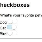 Pure CSS Switches For Checkbox and Radio Inputs
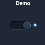 Pure CSS/CSS3 Smooth Toggle Switch