


Tiny-Tour.js is a tiny guided tour library for generating step-by-step tours to guide your users through your website or application’s new features or featured content, with basic styling meant to be customized to match your needs.
Features:
- Lightweight and easy to implement.
- Automatically highlights elements associated with the current step.
- Ensures that users stay on track by automatically scrolling the page to the current step’s element.
How to use it:
1. Install & download.
# NPM
$ npm i tiny-tour.js
2. Import the Tiny-Tour.js library.
<script src="tiny-tour.min.js"></script>
3. Create a tour by defining a series of steps. Each step consists of an element to highlight, a title (or an image), and a description.
<div id="target1" style="position:absolute;top:1000px;">
  Element 1
</div>
<div id="target2" style="position:absolute;top:300px;">
  Element 2
</div>
<div id="target3" style="position:absolute;top:300px;left:400px">
  Element 3
</div>
const stepList = [];
stepList.push(new Step('target1',`<img src="image.jpg">`,`Step 1 Description`))
stepList.push(new Step('target2','Step 2','Step 2 Description'))
stepList.push(new Step('target3','Step 3','Step 3 Description3'))
4. Initialize the TinyTour.
const tinyTour = new TinyTour(stepList);
5. Apply CSS classes to the tour.
#tiny-tour-box {
  max-width: 95%;
  height: auto;
  background-color: white;
  -webkit-box-shadow: rgb(33 33 33 / 80%) 0px 0px 1px 2px,rgba(9, 30, 66, 0.25) 0px 4px 8px -2px, rgba(9, 30, 66, 0.08) 0px 0px 0px 1px;
  box-shadow: rgb(33 33 33 / 80%) 0px 0px 1px 2px,rgba(9, 30, 66, 0.25) 0px 4px 8px -2px, rgba(9, 30, 66, 0.08) 0px 0px 0px 1px;
  width: 250px;
  border-color:black;
  position: absolute;
  z-index: 99999 !important;
}
#tiny-tour-header{
  display: -webkit-box;
  display: -ms-flexbox;
  display: flex ;
  -webkit-box-pack: center;
  -ms-flex-pack: center;
  justify-content: center;
  font-weight: bold;
  font-family: 'Segoe UI', Tahoma, Geneva, Verdana, sans-serif;
  height:-webkit-fit-content;
  height:-moz-fit-content;
  height:fit-content;
  margin-top: 0.5rem;
  padding: 0.5rem ;
  word-break: break-word;
}
.tiny-tour-buttons{
  display: -webkit-box;
  display: -ms-flexbox;
  display: flex;
  -ms-flex-wrap: wrap;
  flex-wrap: wrap;
  -webkit-box-pack: center;
  -ms-flex-pack: center;
  justify-content: center;
}
.tiny-tour-prev{
  -webkit-box-flex: 50%;
  -ms-flex: 50%;
  flex: 50%;
  background-color: #fff;
  border: 1px solid #d5d9d9;
}
.tiny-tour-prev:hover {
  background-color: #f7fafa;
  cursor: pointer;
}
.tiny-tour-prev:focus {
  border-color: #000000;
  background-color: #f7fafa;
  outline: 0;
}
.tiny-tour-next{
  -webkit-box-flex: 50%;
  -ms-flex: 50%;
  flex: 50%;
  background-color: #fff;
  border: 1px solid #d5d9d9;
}
.tiny-tour-next:hover {
  background-color: #f7fafa;
  cursor: pointer;
}
.tiny-tour-next:focus {
  border-color: #000000;
  background-color: #f7fafa;
  outline: 0;
}
#tiny-tour-close{
  position: absolute;
  border: none;
  top: 0.2rem;
  right: 0.2rem;
  width: 1rem;
  height: 1rem;
  background-color: transparent;
  background-size:cover;
  background-image: url("data:image/svg+xml,%3Csvg viewPort='0 0 12 12' version='1.1' xmlns='http://www.w3.org/2000/svg'%3E%3Cline x1='1' y1='11' x2='11' y2='1' stroke='black' stroke-width='2'/%3E%3Cline x1='1' y1='1' x2='11' y2='11' stroke='black' stroke-width='2'/%3E%3C/svg%3E");
  background-repeat: no-repeat;
}
#tiny-tour-close:hover{
  -webkit-filter: invert(64%) sepia(5%) saturate(142%) hue-rotate(22deg) brightness(90%) contrast(84%);
  filter: invert(64%) sepia(5%) saturate(142%) hue-rotate(22deg) brightness(90%) contrast(84%);
  cursor: pointer;
}
#tiny-tour-content{
  display: -webkit-box;
  display: -ms-flexbox;
  display: flex ;
  padding: 0.5rem;
  -webkit-box-pack: center;
  -ms-flex-pack: center;
  justify-content: center;
  word-break: break-word;
}
.tiny-tour-target{
  position: relative;
  -webkit-box-shadow: rgb(33 33 33 / 80%) 0px 0px 1px 2px, rgb(33 33 33 / 50%) 0px 0px 0px 5000px;
  box-shadow: rgb(33 33 33 / 80%) 0px 0px 1px 2px, rgb(33 33 33 / 50%) 0px 0px 0px 5000px;
  z-index: 99998 !important;
}
button {
  -webkit-appearance: none;
  -moz-appearance: none;
  appearance: none;
}
See Also:
 Lightweight Vanilla JS Library for Interactive Guided Tours – Boarding.js
 Lightweight User Tour/Onboarding Library for Web Apps – CodingIntroJS
 Build Interactive Product tours & User Onboarding with Cue.js
 Interactive Guided UI Tours with Target-Highlight.js
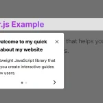 Create Interactive Web App Tours in Under 10KB – GTourJS
 Create Interactive Guided Tours In App – TourGuide.js
 Slider-style Guided Tour In Vanilla JavaScript – tourguide.js
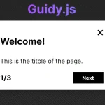 Creating Interactive Step-by-step User Guides with Guidy.js