


Stackgrid is a lightweight JavaScript library that makes it easier to create responsive, Masonry-style grid layouts for blog post lists, portfolio websites, and image galleries.
Unlike the traditional grid layout, it allows for elements of different sizes to be placed next to each other, creating a more natural and dynamic flow of content.
How to use it:
1. Load the stylesheet stackgrid.css and JavaScript stackgrid.js in the document.
<link rel="stylesheet" href="stackgrid.css" />
<script src="stackgrid.js"></script>
2. Add your content (images, videos, or text) to the Masonry grid.
- max-width: Set the column size to “2” when the screen size is small than 640px
- min-width: Set the column size to “1” when the screen size is large than 320px but small than 640px
- gutter: The space between cards
<div class="stack-container" max-width="640" min-width="320" gutter="5">
  <div class="stack-card">
    <div class="header">
      <div class="title">Card Title</div>
    </div>
    <div class="content">Card image description</div>
    <img src="1.jpg">
  </div>
  <div class="stack-card">
    <div class="header">
      <div class="title">Card Title</div>
    </div>
    <div class="content">Card image description</div>
    <img src="2.jpg">
  </div>
  <div class="stack-card">
    <div class="header">
      <div class="title">Card Title</div>
    </div>
    <div class="content">Card image description</div>
    <img src="3.jpg">
  </div>
  ...
</div>
See Also:
 Responsive Masonry Layouts with CSS Grid and Mason-it.js
 Responsive CSS Masonry Grid Layout – Grid Overflow
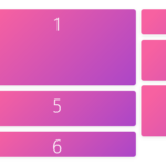 Minimal Masonry Web Layout In Pure JavaScript – MiniMasonry.js
 Minimalist Masonry Gallery Layout With CSS Grid – mm-masonry.css
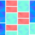 Tiny Responsive Masonry Grid Library – stack-up.js
 Simple Masonry Grid Layout With Flexbox – simple-masonry.js
 Mosaic Tiling With Image Lazy Loading – mosaicLayout
 Filterable Masonry Grid In JavaScript – Isolde