


A modern, responsive, mobile-first site navigation that collapses nav items into a sidebar off-canvas menu on mobile.
How to use it:
1. Create a navbar from a nav list as follows:
<nav class="navbar">
  <h1 class="navbar-brand">
    Navbar Here
  </h1>
  <ul class="nav-list">
    <li class="nav-item">
      <a class="nav-link active" href="#">
        home
      </a>
    </li>
    <li class="nav-item">
      <a class="nav-link" href="#">
        JavaScript
      </a>
    </li>
    <li class="nav-item">
      <a class="nav-link" href="#">
        CSS
      </a>
    </li>
  </ul>
</nav>
2. Insert a hamburger toggle button into the navbar.
<div class="menu-toggle">
  <div class="hamburger">
  </div>
</div>
3. The core CSS styles for the sidebar off-canvas menu and menu toggler.
.navbar {
  display: flex;
  justify-content: space-between;
  align-items: center;
  height: 8rem;
}
.navbar-brand {
  color: #ffffff;
  font-family: "Oswald", sans-serif;
  text-transform: uppercase;
}
.nav-list {
  list-style: none;
  position: fixed;
  top: 0;
  left: 0;
  width: 80%;
  height: 100vh;
  background-color: #222222;
  padding: 4.4rem;
  display: flex;
  flex-direction: column;
  justify-content: space-around;
  z-index: 1250;
  text-transform: uppercase;
  transform: translateX(-100%);
  transition: transform 0.5s;
}
.nav-link:hover {
  border-bottom: 3px solid #ffffff;
}
.active {
  font-weight: 700;
  border-bottom: 3px solid #ffffff;
}
.open .nav-list {
  transform: translateX(0);
}
.menu-toggle {
  position: relative;
  display: flex;
  flex-direction: column;
  justify-content: center;
  align-items: center;
  width: 3.2rem;
  height: 3.2rem;
  cursor: pointer;
  transition: all 0.5s ease-in-out;
}
.hamburger {
  width: 2.4rem;
  height: 3px;
  background-color: #ffffff;
  border-radius: 2px;
  border: none;
  transition: all 0.7s ease-out;
}
.hamburger::before,
.hamburger::after {
  content: "";
  position: absolute;
  width: 2.4rem;
  height: 3px;
  background-color: #ffffff;
  border-radius: 2px;
  border: none;
}
.hamburger::before {
  transform: translateY(-8px);
}
.hamburger::after {
  transform: translateY(8px);
}
4. Setup menu toggle animations in the CSS.
.open .hamburger {
  background: transparent;
}
.open .hamburger::before {
  transform-origin: (0, 0);
  transform: rotate(45deg);
}
.open .hamburger::after {
  transform-origin: (0, 0);
  transform: rotate(-45deg);
}
5. Apply the following CSS styles to the navbar when running on tablet or desktop.
@media screen and (min-width: 768px) {
  .nav-list {
    position: initial;
    width: initial;
    height: initial;
    background-color: transparent;
    padding: 0;
    justify-content: initial;
    flex-direction: row;
    transform: initial;
    transition: initial;
  }
  .nav-link {
    margin-left: 4rem;
    font-size: 1.6rem;
    transition: all 0.1s;
  }
  .menu-toggle {
    display: none;
  }
}
6. The JavaScript to enable the hamburger menu toggler.
const navbar = document.querySelector(".navbar");
const menuToggle = document.querySelector(".menu-toggle");
menuToggle.addEventListener("click", () => {
  navbar.classList.toggle("open");
});
See Also:
 Responsive Dropdown/Off-canvas Navigation In Vanilla JavaScript – Menue
 Responsive Multi-level Dropdown Menu With JavaScript And CSS – ozmenu.js
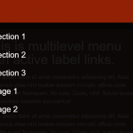 Mobile-friendly Hamburger Navigation With Submenus
 Convert Bootstrap 5 Navbar Into Offcanvas Menu
 Responsive Offcanvas Menu For Bootstrap 5
 Responsive Single-level Dropdown Menu With JavaScript
 Responsive Mobile Menu Using CSS Flexbox – ftwnav
 Responsive Multi-level Sidebar Menu With JavaScript/CSS