


magnit-modal is a JavaScript (ES6) modal web component designed for creating custom alerts, prompt dialogs, confirm popups, and content modals on the web app.
Features:
- 5 themes: Default, Info, Success, Warning, and Info.
- Modal In Modal. Allows multiple modals.
- Supports dynamic modal content.
How to use it:
1. Import the magnit-modal JavaScript library as a web component.
<script defer type="module">
  import MagnitModalComponent from './dist/magnit-modal.component.min.js';
</script>
2. Add the <magnit-modal /> component to the web app. Available slots:
- title-icon: Title icon
- title: Modal title
- controls: Custom controls displayed in the top-right of the modal. Useful for “close” or “settings” function
- content: Modal content
- choices: Useful for confirmation dialog (see below)
<magnit-modal class="simple" style="display:none;">
  <div slot="content">
    <div class="icon-container">
      <svg class="icon" xmlns="http://www.w3.org/2000/svg" width="24" height="24" viewBox="0 0 24 24"><path d="M16.142 2l5.858 5.858v8.284l-5.858 5.858h-8.284l-5.858-5.858v-8.284l5.858-5.858h8.284zm.829-2h-9.942l-7.029 7.029v9.941l7.029 7.03h9.941l7.03-7.029v-9.942l-7.029-7.029zm-5.971 6h2v8h-2v-8zm1 12.25c-.69 0-1.25-.56-1.25-1.25s.56-1.25 1.25-1.25 1.25.56 1.25 1.25-.56 1.25-1.25 1.25z"/></svg>
    </div>
    <div class="message">
      <h5 class="heading">Simple Modal</h5>
      <p class="detail">This is a simple message modal.</p>
    </div>
  </div>
</magnit-modal>
3. Show an ‘OK’ button inside the modal.
<magnit-modal class="simple" style="display:none;" type="message">
  ...
</magnit-modal>
4. Determine the theme of the modal:
<magnit-modal class="info" style="display:none;" type="message">
  ...
</magnit-modal>
<magnit-modal class="success" style="display:none;" type="message">
  ...
</magnit-modal>
<magnit-modal class="warning" style="display:none;" type="message">
  ...
</magnit-modal>
<magnit-modal class="error" style="display:none;" type="message">
  ...
</magnit-modal>
5. Available attributes to customize the modal.
- type: Set to message if you want to display an OK button
- close-button: Whether or not to show the Close button
- use-shade: Whether or not to dim the main content
- shade-close: Clicking anywhere on the shade element to close the modal
<magnit-modal class="info" style="display:none;" use-shade="true" type="message">
  ...
</magnit-modal>
6. Open the modal.
const $modal = document.querySelector('magnit-modal.simple');
$modal.open();
7. The example below shows how to create a confirmation dialog using the ask() method.
<magnit-modal class="choice" style="display:none;">
  <div slot="content">
    <h5 class="heading">Select One</h5>
  </div>
  <ul slot="choices">
    <li><button class="a" type="button">Choice 1</button></li>
    <li><button class="b" type="button">Choice 2</button></li>
    <li><button class="c" type="button">Choice 3</button></li>
  </ul>
</magnit-modal>
const $choiceModal = document.querySelector('magnit-modal.choice');
const $choice = await $choiceModal.ask();
console.log($choice);See Also:
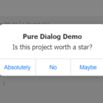 iOS Style Dialog Web Component – pure-dialog
 Auto-Generated Skeleton Loader Web Component for Any Framework – phantom-ui
 Conditional Content Visibility with show-when Web Component
 Custom Media Player Controls Using Web Components – media-chrome
 Dynamic Inline HTML Importing with i-html Web Component
 Animated Icon Component Library for React/Vue/Svelte/Solid/Web Component
 3D Card Flip with Touch & Mouse Drag – TouchFlip3D-Web
 Interactive And Customizable Data Table/Grid Web Component – Active Table