


When users perform actions like deleting data or submitting forms, you often need to confirm their intent. The browser’s built-in confirm() dialog is functional, but it lacks customization and visual appeal. This is where Confirmly-js comes in.
Confirmly-js is a lightweight JavaScript library that attaches customizable, responsive, themeable, popover-like confirmation popups to any elements you specify. It uses Popper.js library for precise positioning and is compatible with modern frameworks like TailwindCSS, Bootstrap, and more.
How to use it:
1. Install Confirmly-js using your preferred package manager:
# Yarn
$ yarn add confirmly-popup.js
# NPM
$ npm install confirmly-popup.js
# PNPM
$ pnpm install confirmly-popup.js
2. Import confirmly-popup.js into your project.
import { ConfirmPopup } from 'confirmly-popup.js';3. Or directly laod the following JavaScript and Stylesheet in the document.
<!-- Popover.js is required -->
<script src="https://unpkg.com/@popperjs/[email protected]/dist/umd/popper.min.js"></script>
<!-- confirmly-popup.js library -->
<script src="dist/confirmly-popup.umd.min.js"></script>
<link rel="stylesheet" href="styles/confirmly-popup.css" />
4. Create a basic confirmation popup attached to a trigger button:
const myPopup = new ConfirmPopup({
  targetElement: document.querySelector('#triggerButton'),
  onConfirm: () => {
    console.log('Confirmed!');
  },
  onCancel: () => {
    console.log('Cancelled!');
  },
});
5. Customize the confirmation popup with your own template and styling. All available options:
targetElement: (HTMLElement, Required) The HTML element that will trigger the confirmation popup when interacted with (e.g., clicked).template: (string) Custom HTML template to replace the default popup structure. Allows for full control over the popup’s appearance.buttonClasses: (object) CSS classes to apply to the confirm and cancel buttons. Use this to style buttons with your framework or custom styles. Example:{ confirm: 'btn btn-primary', cancel: 'btn btn-secondary' }.buttonContents: (object) Text content for the confirm and cancel buttons. Customize button labels. Example:{ confirm: 'Yes, proceed', cancel: 'No, go back' }.defaultPlacement: (string) The initial placement of the popup relative to thetargetElement. Options: ‘top’, ‘bottom’, ‘left’, ‘right’. Default: ‘top’.showError: (boolean) Determines whether to display console errors from Confirmly-js. Useful for development and debugging. Default:true.onConfirm: (function) A callback function that is executed when the user confirms the action by clicking the confirm button.onCancel: (function) A callback function that is executed when the user cancels the action by clicking the cancel button.
const myPopup = new ConfirmPopup({
  targetElement: document.querySelector('#triggerButton'),
  template: `
    <div class="my-custom-popup">
      <p>Are you really sure?</p>
      <div class="buttons">
        <button data-button="confirm">Yes</button>
        <button data-button="cancel">No</button>
      </div>
      <div data-popper-arrow></div>
    </div>
  `,
  buttonClasses: {
    confirm: 'btn btn-primary',
    cancel: 'btn btn-secondary',
  },
  buttonContents: {
    confirm: 'Yes, proceed',
    cancel: 'No, go back',
  },
  defaultPlacement: 'top',
  showError: true,
  onConfirm: () => {
    console.log('Action confirmed');
  },
  onCancel: () => {
    console.log('Action cancelled');
  },
});
6. When creating a custom template, follow this structure for proper functionality:
- The
data-button="confirm"anddata-button="cancel"attributes enable button functionality - The
data-popper-arrowelement creates the pointing arrow - Placeholders like
{{confirmClass}}are replaced with values from your options
<div class="confirmly__popup">
  <div class="confirmly__content">
    <p class="confirmly__message">Your confirm message here</p>
    <div class="confirmly__buttons">
      <button data-button="cancel" class="{{cancelClass}}">{{cancelContent}}</button>
      <button data-button="confirm" class="{{confirmClass}}">{{confirmContent}}</button>
    </div>
  </div>
  <div class="confirmly__arrow" data-popper-arrow></div>
</div>
7. API methods:
// This lets you reuse an existing popup instance and attach it to a new target element.
// You can also update the onConfirm and onCancel callbacks at the same time.
attach(element, onConfirm, onCancel);
// When you no longer need a popup, call destroy() to remove it from the DOM and prevent potential memory leaks.
destroy();
8. Override the default CSS variables to customize the appearance of the confirmation popups.
:root {
  /* Colors */
  --confirmly-bg-color: #ffffff;
  --confirmly-text-color: #374151;
  --confirmly-border-color: #e5e7eb;
  --confirmly-shadow-color: rgba(0, 0, 0, 0.1);
  /* Primary Button Colors */
  --confirmly-primary-bg: #3b82f6;
  --confirmly-primary-hover: #2563eb;
  --confirmly-primary-text: #ffffff;
  /* Secondary Button Colors */
  --confirmly-secondary-bg: #e5e7eb;
  --confirmly-secondary-hover: #d1d5db;
  --confirmly-secondary-text: #374151;
  /* Spacing */
  --confirmly-spacing-xs: 0.25rem;
  --confirmly-spacing-sm: 0.5rem;
  --confirmly-spacing-md: 1rem;
  --confirmly-spacing-lg: 1.5rem;
  /* Border Radius */
  --confirmly-radius-sm: 0.25rem;
  --confirmly-radius-md: 0.375rem;
  /* Font Sizes */
  --confirmly-font-sm: 0.875rem;
  --confirmly-font-md: 1rem;
  /* Transitions */
  --confirmly-transition: 200ms ease-in-out;
  /* Z-index */
  --confirmly-z-index: 9999;
}
9. All possible themes:
- Default: The standard theme with a blue confirm button and a clean, neutral design.
- Success: A green themed popup, visually indicating successful or positive actions.
- Warning: A red themed popup designed to highlight potentially dangerous or irreversible actions.
- Info: A blue themed popup for informational messages or neutral confirmations.
- Dark: A dark mode theme featuring light text on a dark background, suitable for dark UI designs.
- Material: A theme inspired by Google’s Material Design, offering a modern and flat aesthetic.
- Bootstrap: A theme styled to align with the visual style of the Bootstrap CSS framework.
- Rounded: A theme that applies extra rounded corners to the popup for a softer look.
See Also:
 Advanced Toast/Tooltip/Popover/Confirm/Modal Notification Library – toast-anchor
 Create Dynamic Draggable Alert/Confirm Popups – webcimes-modal
 Customizable Alert/Confirm Modal Library – modal-alert.js
 Simple Confirmation Dialogs on Click – Bootstrap 5 Confirm Popover
 Minimal Alert & Confirmation Modals in JavaScript – PopupJs.js
 Create Custom Stylish Dialogs with SnapDialog JavaScript Library
 Easily Build Confirmation Popups with the confirmDialog.js Library
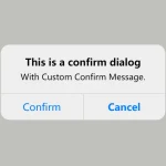 Create iOS-Style Popups & Notifications With Popup JS Library