


A highly customizable modal JavaScript library for creating animated, draggable alert/confirm popup boxes programmatically.
How to use it:
1. Install and import the webcimes-modal.
# NPM
$ npm i webcimes-modal
import {WebcimesModal} from "webcimes-modal";<!-- OR --> <script src="./dist/js/udm/webcimes-modal.udm.min.js"></script> <link rel="stylesheet" href="/dist/css/webcimes-modal.min.css" />
2. Create a basic alert dialog.
const myModal = new WebcimesModal({
      titleHtml: "Alert Dialog",
      bodyHtml: "Alert Body"
});
3. Create a confirmation dialog that loads content from the existing DOM within the document.
const myModal = new WebcimesModal({
      titleHtml: "Confirm Dialog",
      bodyHtml: document.querySelector(".test").outerHTML,
      onConfirmButton: () => {
        myModal.destroy();
      },
});
4. All possible modal options.
const myModal = new WebcimesModal({
      // assign a unique ID to the modal
      setId: null,
      // appy a CSS class to the modal
      setClass: null,
      // width/height
      width: 'auto',
      height: 'auto',

      // html for the cancel button
      buttonCancelHtml: "Cancel",
      // html for the confirm button
      buttonConfirmHtml: "Confirm",
      // close the modal after clicking the cancel button
      closeOnCancelButton: true,
      // close the modal after clicking the confirm button
      closeOnConfirmButton: true,
      // show the close button
      showCloseButton: true,
      // close the modal when clicking outside
      allowCloseOutside: true,
      // enable draggable
      allowMovement: true,
      moveFromHeader: true,
      moveFromBody: false,
      moveFromFooter: true,
      // stick the modal header to the top
      stickyHeader: true,
      // stick the modal footer to the bottom
      stickyFooter: true,
      // additional CSS styles
      style: null,
      // "animDropDown" or "animFadeIn"
      animationOnShow: 'animDropDown',
      // "animDropUp" or "animFadeOut"
      animationOnDestroy: 'animDropUp',
      // duration in ms
      animationDuration: 500,

});
5. Callback functions.
const myModal = new WebcimesModal({
      beforeShow: () => { },
      afterShow: () => { },
      beforeDestroy: () => { },
      afterDestroy: () => { },
      onCancelButton: () => { },
      onConfirmButton: () => { },
});
Changelog:
v2.0.0 (10/24/2025)
- Update
v1.2.3 (09/18/2025)
- Update
v1.2.0 (12/02/2023)
- Update
v1.1.1 (09/18/2023)
- Add source map for js and css
v1.1.0 (09/16/2023)
- Add support for udm and esm module, and minify all scripts and css
See Also:
 Customizable Alert/Confirm Modal Library – modal-alert.js
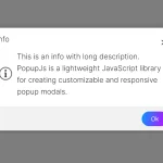 Minimal Alert & Confirmation Modals in JavaScript – PopupJs.js
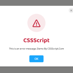 Create Custom Stylish Dialogs with SnapDialog JavaScript Library
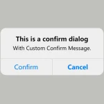 Create iOS-Style Popups & Notifications With Popup JS Library
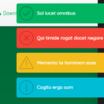 Elegant Notification Popup JavaScript Library – Notiflix
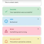 Simple & Stylish JavaScript Alert Notifications – SnapAlert.js
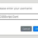 Async, Promise-based Alert/Confirm/Prompt Dialogs – Prompts.js
 Custom Alert/Confirm/Prompt Dialogs to Replace Native Popups – SWN.js