


Polipop.js is a plain JavaScript library for displaying modern, customizable notification popups or panels on the page.
Key Features:
- 3 themes: Minimal, Compact, and Default
- Fade and Slide animations.
- Auto dismisses after a timeout just like Android’s toasts.
- 5 notification types: Default, Warning, Success, Info, and Error.
- Countdown progress bar.
- Custom position. Inline mode is supported as well.
How to use it:
1. Install the library with NPM.
# NPM
$ npm i polipop
2. Import the Polipop.js.
import Polipop from 'polipop';
// Core stylesheet
@import "node_modules/polipop/src/sass/core";
// Default theme
@import "node_modules/polipop/src/sass/default";
// Minimal theme
@import "node_modules/polipop/src/sass/minimal";
// Compact theme
@import "node_modules/polipop/src/sass/compact";
3. Or insert the following JavaScript and CSS files into the document.
// Core JavaScript
<script src="/polipop/dist/polipop.min.js"></script>
// Core stylesheet
<link rel="stylesheet" href="/polipop/dist/css/polipop.core.min.css" />
// Default theme
<link rel="stylesheet" href="/polipop/dist/css/polipop.default.min.css" />
// Minimal theme
<link rel="stylesheet" href="/polipop/dist/css/polipop.minimal.min.css" />
// Compact theme
<link rel="stylesheet" href="/polipop/dist/css/polipop.compact.min.css" />
4. Create a new instance of the Polipop and specify the id of the element on which you want to instantiate the Polipop instance.
var polipop = new Polipop('myContainer', {
    // options here
});
5. Display a basic notification on the page.
polipop.add({
  // notification content
  content: 'Basic Notification.',
  // notification title
  title: 'Title',
  // default, info, success, warning or error
  type: 'default',
});
6. The default configuration options.
var polipop = new Polipop('myContainer', {
    /**
     * A DOM element or selector string representing the element where the Polipop
     * wrapper element will be appended to. Can only be set on class instantiation.
     *
     * @type {String}
     */
    appendTo: 'body',
    /**
     * The BEM block name which is used for generating css classes for all elements
     * within the wrapper element. Can only be set on class instantiation.
     *
     * @type {String}
     */
    block: 'polipop',
    /**
     * The position of the wrapper element within the viewport. Can only be set on
     * class instantiation. Accepted values:
     * - 'top-left'
     * - 'center'
     * - 'top-right'
     * - 'inline'
     * - 'bottom-right'
     * - 'bottom-left'
     *
     * @type {String}
     */
    position: 'top-right',
    /**
     * The layout of the Polipop wrapper. Can only be set on class instantiation.
     * Accepted values:
     * - 'popups'
     * - 'panel'
     *
     * @type {String}
     */
    layout: 'popups',
    /**
     * The css theme of the Polipop wrapper. Can only be set on class instantiation.
     * Accepted values:
     * - 'default'
     * - 'compact'
     * - 'minimal'
     * - or any custom theme
     *
     * @type {String}
     */
    theme: 'default',
    /**
     * A boolean designating whether each notification element displays an icon,
     * according to the notification type.
     *
     * @type {Boolean}
     */
    icons: true,
    /**
     * Designates whether a notification element should be appended or prepended to the
     * notifications container. Accepted values:
     * - 'after'
     * - 'before'
     *
     * @type {String}
     */
    insert: 'after',
    /**
     * The vertical spacing between the notification elements. Can only be set on class
     * instantiation.
     *
     * @type {Number}
     */
    spacing: 10,
    /**
     * Limits the number of concurrent notification elements that can be rendered
     * within the notifications container at any given time. A value of '0' means
     * that there is no limit.
     *
     * @type {Number}
     */
    pool: 0,
    /**
     * A boolean designating whether the notification elements should be removed
     * automatically when they expire or whether they should stay in the DOM until
     * they are removed manually.
     *
     * @type {Boolean}
     */
    sticky: false,
    /**
     * Expiration time for non-sticky notification elements in milliseconds.
     *
     * @type {Number}
     */
    life: 3000,
    /**
     * A boolean designating whether the life time progress bar will be displayed for
     * each notification element.
     *
     * @type {Boolean}
     */
    progressbar: false,
    /**
     * A boolean designating whether the notifications expiration control should pause
     * when hovering over the wrapper element. Can only be set on class instantiation.
     *
     * @type {Boolean}
     */
    pauseOnHover: true,
    /**
     * The text that is displayed inside the 'panel' layout header. Can only be set on
     * class instantiation.
     *
     * @type {String}
     */
    headerText: 'Messages',
    /**
     * A boolean designating whether the closer button element will be displayed when
     * there are rendered notification elements. Can only be set on class
     * instantiation.
     *
     * @type {Boolean}
     */
    closer: true,
    /**
     * The text that is displayed inside the closer button element when the
     * notifications queue is empty.
     *
     * @type {String}
     */
    closeText: 'Close',
    /**
     * The text that is displayed inside the closer button element when the
     * notifications queue contains queued notification objects.
     *
     * @type {String}
     */
    loadMoreText: 'Load more',
    /**
     * A boolean designating whether the 'panel' layout wrapper element will be hidden
     * when there are no rendered notification elements.
     *
     * @type {Boolean}
     */
    hideEmpty: false,
    /**
     * The time, in milliseconds, the timer should delay in between executions of the
     * _loop function. Can only be set on class instantiation.
     *
     * @type {Number}
     */
    interval: 250,
    /**
     * The animation effect when adding or removing notification elements.
     * Accepted values:
     * - 'fade'
     * - 'slide'
     *
     * @type {String}
     */
    effect: 'fade',
    /**
     * The rate of the animation's change over time. Accepted values:
     * - 'linear'
     * - 'ease'
     * - 'ease-in'
     * - 'ease-out'
     * - 'ease-in-out'
     * - or a custom 'cubic-bezier' value
     *
     * @type {String}
     */
    easing: 'linear',
    /**
     * The number of milliseconds each iteration of the animation takes to complete.
     *
     * @type {Number}
     */
    effectDuration: 250,
});
7. Callback functions.
var polipop = new Polipop('myContainer', {
    /**
     * A callback function invoked immediately after the wrapper element has been
     * rendered into the DOM.
     *
     * @type {function()}
     */
    ready: function () {},
    /**
     * A callback function invoked immediately after a notification object has been
     * added into the queue. The notification object is passed to the function as
     * argument.
     *
     * @type {function(object)}
     */
    add: function () {},
    /**
     * A callback function invoked immediately before a notification element has been
     * rendered into the DOM. The notification object and the notification element are
     * passed to the function as arguments.
     *
     * @type {function(object, Element)}
     */
    beforeOpen: function () {},
    /**
     * A callback function invoked immediately after a notification element has been
     * rendered into the DOM but before the element's opening animation has started.
     * The notification object and the notification element are passed to the function
     * as arguments.
     *
     * @type {function(object, Element)}
     */
    open: function () {},
    /**
     * A callback function invoked immediately after a notification element has been
     * rendered into the DOM and the element's animation has finished. The notification
     * object and the notification element are passed to the function as arguments.
     *
     * @type {function(object, Element)}
     */
    afterOpen: function () {},
    /**
     * A callback function invoked immediately after the 'Polipop.beforeClose' event
     * has been triggered on an element but before the element's closing animation has
     * started. The notification object and the notification element are passed to the
     * function as arguments.
     *
     * @type {function(object, Element)}
     */
    beforeClose: function () {},
    /**
     * A callback function invoked immediately after the element's closing animation
     * has finished, immediately before the element has been removed from the DOM. The
     * notification object and the notification element are passed to the function as
     * arguments.
     *
     * @type {function(object, Element)}
     */
    close: function () {},
    /**
     * A callback function invoked immediately after a notification element has been
     * clicked. The MouseEvent, the notification object and the notification element
     * are passed to the function as arguments.
     *
     * @type {function(MouseEvent, object, Element)}
     */
    click: function () {},
});
8. API methods.
// update option
polipop.setOption(key, value);
// get option
polipop.getOption(key, value);
// enable
polipop.enable();
// disable
polipop.disable();
// pause
polipop.pause();
// unpause
polipop.unpause();
// close all
polipop.closeAll();
// delete all notification objects from the queue
polipop.emptyQueue();
// destroy
polipop.destroy();
See Also:
 Lightweight Toast & Growl Notifications Inspired by macOS – Toastify
 Customizable Growl/Toast Alerts with LocalNotification.js
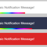 Auto-dismissable Notification Popup With Progress Bar – Notification.js
 Simple Interactive Snackbar & Toast Notification In Vanilla JavaScript – notifyjs
 Sleek Toast & Growl Alert Notification Library – Nostfly.js
 Customizable Stackable Toast & Growl Notification Library – yetialerts
 Lightweight Notification Popup JavaScript Library – X-Notify
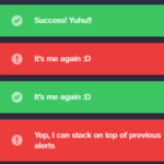 Growl And Toast Style Alert Notification Library – Notyf