


AST-Notif is a simple yet feature-rich notification library to create alert dialog, Microsoft style growl notifications, and Android Material style toasts & snackbars on the web.
How to use it:
1. Put the stylesheet ast-notif.css and JavaScript ast-notif.js on the HTML page.
<link rel="stylesheet" href="css/ast-notif.css" />
<script src="js/ast-notif.js"></script>
2. Create an alert dialog with AstNotif.dialog() function. Possible parameters:

- title: title
- message: message
- options: options object, see below
- callbackOK: callback function
- callbackCancel: callback function
// AstNotif.dialog(title: string, message: string, options[optional]: object, callbackOK: function, callbackCancel: function);
AstNotif.dialog('Alert Title', 'Alert Message', {
  // 'dark', 'success', 'danger', 'warning', 'primary', 'info', 'default'
  theme: 'default',
  bgheadcolor: THEMES.DEFAULT.bgcolor,
  bgbodycolor: "white",
  bgfootercolor: "white",
  color: THEMES.DEFAULT.color,
  // Has icons?
  icon: true,
  // Custom icon image
  imgIcon: getCurrentPath().split('/').slice(0, -1).join('/') +'/' + "../img/error_hitam_garis.png",
  // Icon size
  iconSize: "48px",
  // OK button text
  positive: "OK",
  // Cancel button text
  negative: "Cancel",
  // Font awesome class without "fa-"
  fa: "",
  // Is Dismiss able?
  dismissible: true
});
3. Create a POSTER dialog with AstNotif.poster() function.

- message: message
- options: options object, see below
- callbackOK: callback function
- callbackCancel: callback function
// AstNotif.poster(message: string, options[optional]: object, callbackOK: function, callbackCancel: function);
AstNotif.dialog('Alert Title', 'Alert Message', {
  // 'dark', 'success', 'danger', 'warning', 'primary', 'info', 'default'
  theme: 'default',
  bgcolor: "#02BAF2",
  color: THEMES.DEFAULT.color,
  // Has icons?
  icon: true,
  // Custom icon image
  imgIcon: "/path/to/icon.png",
  // Icon size
  iconSize: "48px",
  // OK button text
  positive: "OK",
  // Cancel button text
  negative: "Cancel",
  // Font awesome class without "fa-"
  fa: "",
  // Is Dismiss able?
  dismissible: true
});
4. Create an Android inspired toast message with AstNotif.toast() function.

// AstNotif.toast(message: string, options[optional]: object);
AstNotif.toast('Toast Message', {
// 'dark', 'success', 'danger', 'warning', 'primary', 'info', 'default'
theme: 'default',
// Time length, or whatever its called until the toast is gone.
length: 2000,
// Background and text color
bgcolor: THEMES.DEFAULT.color,
color: THEMES.DEFAULT.bgcolor,
// Reverse color
reverseColor: false,
// Transparency
alpha: 1,
// Border radius
borderRadius: 10,
// Bottom position, minus for top position
vdist: 10,
// Left position
hdist: 10,
// Margin
margin: 10,
// Position (cardinal point)
position: "s",
// Efek lebay *special effect
lebayify: 0
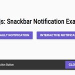
});5. Create an Android inspired snackbar with AstNotif.snackbar() function.

AstNotif.snackbar(message: string, options[optional]: object, action/callback: function);
AstNotif.snackbar('Snackbar Message', {
  // 'dark', 'success', 'danger', 'warning', 'primary', 'info', 'default'
  theme: 'default',
  // Snack position, either top or bottom.
  position: "bottom",
  // Time length, or whatever its called until the snack is gone.
  length: 2000,
  // Background and text color
  bgcolor: THEMES.DEFAULT.color,
  color: THEMES.DEFAULT.bgcolor,
  // Button color
  btncolor: THEMES.DEFAULT.btncolor,
  // Reverse color
  reverseColor: false,
  // Font awesome class without "fa-"
  fa: "",
  button: "",
  // Efek lebay *special effect
  lebayify: 0
});
6. Create a Microsoft Windows style growl notification with AstNotif.notify() function.

AstNotif.notify(title: string, message: string, footer: string, options[optional]: object, callback: function);
AstNotif.notify('Notify Title', 'Notify Message', {
  // Background and text color
  bgcolor: THEMES.DEFAULT.color,
  color: THEMES.DEFAULT.bgcolor,
  // Using icon?
  icon: true,
  // Custom icon image
  imgIcon: getCurrentPath().split('/').slice(0, -1).join('/') +'/' + "../img/error_putih_garis.png",
  // Font awesome, please strip the "fa-" from the argument
  fa: "",
  // Length the notify object, -1 for stay forever
  length: 2000,
  // Transparency
  alpha: 0.8,
  // Efek lebay *special effect
  lebayify: 0,
  // Position
  position: "right"
});
Changelog:
v0.1.2 (05/31/2021)
- Fix: Poster can’t have negative button callback. Worked now.
- Fix: Toast and Snackbar can now use reverseColor option after global theming feature added.
v0.1.1 (05/31/2021)
- Dialog: Add dismissible option.
- Poster: Add dismissible option.
v0.1.0 (05/28/2021)
- ADDED: Poster: The brand new notification family.
- ADDED: AstNotif: Main Settings for zIndex and theme.
- Adding theme option per module now can affect individual notification only instead of global.
- Assign length option for Toast, Snackbar, and Notify now case insensitive. You can either insert “short” or “SHORT” or “ShOrT”.
v0.0.5 (09/13/2020)
- Renamed options
- Bugfixes
See Also:
 Simple Interactive Snackbar & Toast Notification In Vanilla JavaScript – notifyjs
 Sleek Toast & Growl Alert Notification Library – Nostfly.js
 Advanced Toast/Tooltip/Popover/Confirm/Modal Notification Library – toast-anchor
 Advanced Alert Notification System For Bootstrap 5 – AvalynxAlert.js
 Lightweight Toast & Growl Notifications Inspired by macOS – Toastify
 Material Design Toast & Snackbar Library with Action Buttons – MiniSnackbar
 Lightweight JavaScript Notification System – Simple Display Alert
 Customizable Growl/Toast Alerts with LocalNotification.js